Download
1 / 4
40 likes | 139 Views
Top Three Web Design Misteaks (sic). And How To Avoid Them! Continuing Studies CS 03: Beginning Web Site Design July 2013. Top Ten Web Design Misteaks (sic): Misteak #1. Designing your website for your needs, not the needs of your visitors .

E N D
Top Three Web DesignMisteaks (sic) And How To Avoid Them! Continuing Studies CS 03: Beginning Web Site Design July 2013
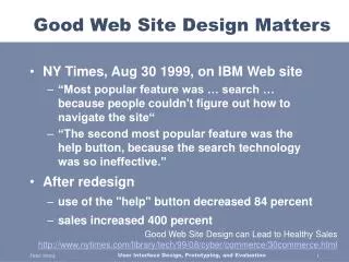
Top Ten Web Design Misteaks (sic): Misteak #1 • Designing your website for your needs, not the needs of your visitors. • A web site shouldn’t be just a marketing tool for you – it should be there to help your visitors achieve their goals. • People go to websites for one of 4 main reasons – don’t make it difficult for them! • They want to: • Get information. • Make a purchase or donation. • Be entertained. • Be part of a community. ‘bad’ examples: http://www.gotoscw.com/ -- try to buy items! http://tinyurl.com/old-brownuniversity -- try to click Annual Fund http://tinyurl.com/old-globalaigs ‘good’ examples: http://givingtostanford.stanford.edu/ http://babelfish.yahoo.com/ http://paypal.com/
Top Ten Web Design Misteaks (sic): Misteak #2 • Designing your site in a way that people can’t figure out what they’re supposed to do. • It should take no more than 10 seconds to be able to figure it what you can do on your web site. ‘good’ examples: http://www.learningguitarnow.com/ http://www.w3schools.com/ ‘bad’ examples: http://web.archive.org/web/20070115231803/http://www.marshill.org/ http://www.snarg.net/
Top Ten Web Design Misteaks (sic): Misteak #3 • Don’t use fonts or content that makes it difficult to read • Don’t make the font size any smaller than 80% of the default size for the browser. • Don’t use graphics as text • Don’t use dense text • Don’t do “mystery meat navigation”Use this tool to ensure that your text is in high contrast to the background: http://www.accesskeys.org/tools/color-contrast.html ‘good’ examples: http://metaverse.stanford.edu http://www.duckduckgo.com/ ‘bad’ examples: http://www.gostanford.com http://www.tjkdesign.com/ http://www.fiddlers.co.uk/ http://www.macys.com http://www.dokimos.org/ajff/ http://tinyurl.com/old-havenworks http://www.pinesol.com/ http://www.webpagesthatsuck.com/web-design-question-which-looks-like-a-dentist-1.html