Download
1 / 21
210 likes | 290 Views
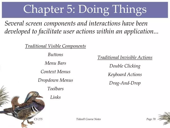
Chapter 5: Doing Things. Several screen components and interactions have been developed to facilitate user actions within an application. Traditional Visible Components Buttons Menu Bars Context Menus Dropdown Menus Toolbars Links. Traditional Invisible Actions Double Clicking

E N D
Chapter 5: Doing Things Several screen components and interactions have been developed to facilitate user actions within an application... Traditional Visible Components Buttons Menu Bars Context Menus Dropdown Menus Toolbars Links Traditional Invisible Actions Double Clicking Keyboard Actions Drag-And-Drop Tidwell Course Notes
Buttons • PROS: • More convenient than pulling down a menu and making a selection. • Fast means of performing common actions. • Highly visible mechanism for seeing what can be done. • When 3-D in appearance, aesthetically pleasing feedback for acknowledging that an action is being taken. To change properties To open a pop-up menu To start an action • CONS: • Screen space consumption. • Phrasing of button text may not be clear or concise. • Due to space and potential confusion, number of buttons must be limited. Tidwell Course Notes
Menu Bars Menu Bar • PROS: • Easily accessible. • Little wasted space. • Cascading facilitates implementing a hierarchical command structure. • Promotes both mouse and keyboard access to commands when supplemented with keyboard selection of menu items. Menu Items Cascading Sub-Menu • CONS: • Functionality is rather hidden. • Covers active screen elements when opened. • Cascading menu items can cause extra mental and physical labor for users. • Phrasing of menu header and item text may not be clear or concise. • Requires extra program logic to handle disabled menu commands. Tidwell Course Notes
Context Menus Context Menu, Opened Via Right-Button Click • PROS: • Provides easy access to context-specific functionality. • Uses screen real estate on an as-needed basis. Cascaded Sub-Menu • CONS: • Availability might be unknown to users. • Obscures active screen elements when opened. Tidwell Course Notes
Dropdown Menus • PROS: • Combo boxes provide flexibility (either text entry or list selection). • Conserves screen space by using significant space only when activated. • When obvious default value exists and is used, requires little or no user effort. Combo Box: Allows user to type entry or select from list Drop-Down List: Permits selection of one of several mutually exclusive choices • CONS: • Displaying the list requires extra work on the user’s part. • Small size may make control difficult to locate. Tidwell Course Notes
Toolbars • PROS: • Extremely space-saving. • Facilitates user customization of interface. • Work well when associated functionality possesses an obvious visual rendering. Iconic Buttons • CONS: • Icons often have obscure meaning; tooltips are pretty much required. • Must be grouped logically to facilitate user comprehension. • Can overwhelm users if employed excessively. Tidwell Course Notes
Links • PROS: • Traditional blue text is reminiscent of Web hyperlinks, providing familiarity to users. • Essentially equivalent to text-based buttons. Link to local application Link to external site • CONS: • Might be read as colored text instead of control widgets. • Web interaction often causes users to mistakenly expect full Web functionality (e.g., back buttons, separate pages, search capabilities). Tidwell Course Notes
Double-Clicking Double-clicking to open a folder Double-clicking to activate an application Double-clicking to make a selection Double-Clicking Drawback Fine motor skills are needed to double-click, and new users often have problems clicking fast enough or keeping the mouse still while double-clicking. Tidwell Course Notes
Keyboard Action Keyboard Action Drawback Many such “shortcuts” have no mnemonic assistance, so they’re often strictly for experienced users. Tidwell Course Notes
Drag-And-Drop Dragging a file onto an application Dragging an application onto a file Drag-And-Drop Drawback Imprecise movement can cause a dragging when the user merely intends to select; if the drop target is hidden from view, the user is inconvenienced. Tidwell Course Notes
Non-Traditional Interaction: VRML Other, non-traditional approaches to interaction are, of course, possible, but they should possess an intuitive aspect that facilitates their use by the intended users. Using a special plug-in for Web browsers, VRML, the Virtual Reality Modeling Language, makes it possible to create applications in which every 3D graphical object serves as a control (e.g., the volcanoes in this example). Tidwell Course Notes
Pattern #44: Button Groups When there are a small number of related actions that a user can perform, cluster the associated buttons into a self-contained unit. Example: The three buttons in the left tabbed form all relate to the data sources; the pair clustered at the top of the right tabbed form involves tracing; and the group of four buttons on the bottom sits outside the tabs, relating to the application as a whole. Tidwell Course Notes
Pattern #45: Action Panel When there are a large number of actions that a user can perform - actions that should always be visible - a panel containing a list of links is a good option. Example: The Slide Design panel in Microsoft PowerPoint allows the user to edit the design template, color scheme, and animation scheme of a slide presentation. Tidwell Course Notes
Pattern #46: Prominent “Done” Button The visual flow of the page should lead to a prominently displayed button that allows the user to exit the page or complete an action. Example: The CSU application at right relegates the Exit button to the rightmost position, while Macromedia’s Dreamweaver goes further and physically separates the Done button from the others on the form at left. Example: This PDA baseball game groups the game state in the upper left, the baseball field in the upper right, and the player action buttons along the bottom, leaving the middle left open for buttons to undo or complete particular plays. Tidwell Course Notes
Pattern #47: Smart Menu Items Dynamically adjust menu items to clarify exactly what invoking them will cause to happen. Example: In Microsoft Word, the Edit menu has different enabled items when no text has been selected (top), when a passage of text has been selected (middle), and after a passage has been cut from the document. Tidwell Course Notes
Pattern #48: Preview When the user is about to perform an expensive or time-consuming task, provide an opportunity to see what the effects will be. Example: The software for HP’s Precisionscan Pro scanner provides a preview of the scanned image, allowing the user to alter the quality and size of the scanned image before it is output. Tidwell Course Notes
Pattern #49: Progress Indicator When a time-consuming operation is being performed, provide the user with an animated indicator of how that operation is progressing, in order to prevent the user from getting impatient or confused. Example: Because decompressing a zipped folder might take a few seconds, the application form displays a progress bar to reassure the user that the task is indeed being performed. Tidwell Course Notes
Pattern #50: Cancelability When a time-consuming operation is being performed, provide the user with the means to cancel the operation without side effects. Example: In the “County Demographics” application, the user may cancel any of the time-consuming statewide displays by clicking on a county or one of the menu headers. Execute Tidwell Course Notes
Pattern #51: Multi-Level Undo When the use of an application involves extensive user interactions, provide a mechanism through which the user can reverse an entire sequence of operations. Example: Microsoft Visio’s Edit menu shows the user the last undoable action that was performed. Tidwell Course Notes
Pattern #52: Command History When the sequence of actions taken by a user is important, keep a record of that information for potential retrieval later. Example: RelyTec’s All-in-One Keylogger allows an employer to monitor every keystroke or Web access made by an employee. Tidwell Course Notes
Pattern #53: Macros When the sequence of actions taken by a user is likely to be performed repeatedly, provide a mechanism for recording that sequence and performing it in a simple manner. Example: Microsoft Word allows users to record command macros, in this case one that will convert the font for selected text at the push of a keyboard command. Tidwell Course Notes