Download
1 / 31
340 likes | 385 Views
Principles of Graphic Design Basics. Graphic Design. The process and art of combining text and graphics and communicating an effective message in the design of logos, graphics, brochures, newsletters, posters, signs, and any other type of visual communication. Building Blocks of Graphic Design.

E N D
Graphic Design • The process and art of combining text and graphics and communicating an effective message in the design of logos, graphics, brochures, newsletters, posters, signs, and any other type of visual communication
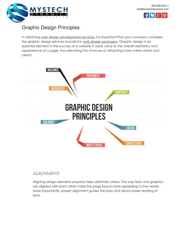
Building Blocks of Graphic Design • Elements of Art • Color, Line, Shape, Value, Texture, Form, Space • Principles of Design • Balance, Proportion/Scale, Movement/Rhythm, Unity, Variety, Emphasis, Repetition, Contrast • OUR FOCUS: Color, Balance, Proximity, Alignment, Repetition, Contrast, Space, and Hierarchy
Color (1) • Color can be used to ellicit specific emotions and reactions. • Red is typically thought of as an attention-grabbing, hot color. • Blues are more calming or convey stability. Some color combinations are used to create a specific identity (corporate colors, school colors) or may be used in conjunction with texture to simulate the look of other objects (the look of plain paper wrapping or neon lights, for example). • Color may provide cues for the reader.
Color • Color holds the most critical appeal to emotions out of all the elements of design!
Complementary Colors • Opposites on the color wheel • Used to offset the main color and are thought to complete each other • There are also split complementary colors which means that once you pick the complimentary you choose one of the colors next to it giving it a more subtle look
Analogous Colors • This is when you choose a color on the color wheel that is next to the color you are choosing. If we choose yellow the analogous colors would be yellow green and yellow orange. This type of color choice is great when you don’t want to match the exact color or if you want to use your art work and/or accessories to create the dramatic colors in the room highlighting the art. • Quite often neutrals are used when highlighting the art work such as white, off whites, grays and browns, even black.
Triad Colors • Choose a color on the color wheel then draw an equilateral triangle to find the two other colors. You will notice that each color has 3 colors between them to form the triangle. Let’s choose violet, the other two colors will be orange and green. These colors would be the secondary colors. The approach organizes the colors in terms of purity but can be a little more difficult to work with.
Color • This packaging uses the colors orange and green, two pieces of a triad (purple would be the other one). This produces an interesting and often unexplored combination; it’s not quite a complimentary, but the colors still go well together.
The Big Picture • Different instructors or designers have their own idea about the basic principles of design but most are encompassed in the 7 principles of: • balance • proximity • alignment • repetition or consistency • contrast • white space • heirarchy
Balance (2) • Primarily there are three types of balance in page design: • symmetrical • asymmetrical • radial • Additionally, we'll discuss: • the rule of thirds • the visual center of a page • the use of grids
Symmetrical Balance • In a design with only two elements they would be almost identical or have nearly the same visual mass. If one element was replaced by a smaller one, it could throw the page out of symmetry. To reclaim perfect symmetrical balance you might need to add or subtract or rearrange the elements so that they evenly divide the page such as a centered alignment or one that divides the page in even segments (halves, quarters, etc.).
Symmetrical Balance • Vertical Symmetry — Each vertical half (excluding text) of the brochure is a near mirror image of the other, emphasized with the reverse in colors. Even the perfectly centered text picks up the color reversal here. This symmetrically balanced layout is very formal in appearance.
Symmetrical Balance • Vertical & Horizontal Symmetry — This poster design divides the page into four equal sections. Although not mirror images the overall look is very symmetrical and balanced. Each of the line drawings are more or less centered within their section. The graphic (text and image) in the upper center of the page is the focal point tying all the parts together.
Asymmetrical Balance • This page uses a 3 column format to create a neatly organized asymmetrical layout. The two columns of text are balanced by the blocks of color in the lower left topped by a large block of white space. In this case, because the white space is in a block shaped much like the text columns, it becomes an element of the design in its own right.
Radial Balance • Here we have an example of radial balance in a rectangular space. The year represents the center of the design with the subtle color sections radiating from that center. The calendar month grids and their corresponding astrological symbols are arrayed around the year in a circular fashion.
Rules of Thirds • The rule of thirds says that most designs can be made more interesting by visually dividing the page into thirds vertically and/or horizontally and placing our most important elements within those thirds. • Take this concept a step further, especially in photographic composition, by dividing the page into thirds both vertically and horizontally and placing your most important elements at one or more of the four intersections of those lines.
Rules of Thirds • In this vertically symmetrical layout the headline appears in the upper third of the page, the logo in the middle third, and the supporting descriptive text in the lower third. The most important information is in that lower third and anchors the page.
Visual Center and Balance • Placing important elements or the focal point of the design within the visual center of a piece is another design trick. • The visual center is slightly to the right of and above the actual center of a page.
Grids and Balance • Sometimes the use of a grid is obvious. • This asymmetrically balanced design uses a simple three column grid to ensure that each text column is the same width and that it is balanced by the nearly empty column on the left. • The grid also dictates the margins and ensures that the page number and header appear in the same place on each page..
Proximity (3) • Keeping like items together and creating unity by how close or far apart elements are from each other.
Alignment (4) • While centered text has its place it is often the mark of a novice designer. • Align text and graphics to create more interesting, dynamic, or appropriate layouts.
Repetition/Consistency (5) • Consistent and balanced look through different types of repetition
Contrast (6) • Big vs. small, black vs. white. These are some ways to create contrast and visual interest
White Space (7) • The art of nothing is another description for this principle.
Visual Hierarchy in Text (8) • A logical way to express the relative importance of different elements by providing a visual guide to their organization • Helps make text clear, unambiguous, and easier to digest • Can be established by using different weights, sizes, styles, or colors • Sometimes built into systems (Heading 1, Heading 2, etc.)
Adobe Creative Suite • Illustrator • Vector graphics program • Business cards, Flyers, Logos, Illustrations • .ai, .eps, .pdf • Photoshop • Pixel graphic program • Manipulate images, jpg and tiff files • .psd, .pdf, .jpg, .tiff • InDesign • Multi page documents • .indd, .pdf
RGB vs. CMYK • Red, Green, and Blue are "additive colors". If we combine red, green and blue light you will get white light. This is the principal behind the TV set in your living room and the monitor you are staring at now. • Additive color, or RGB mode, is optimized for display on computer monitors, ie. Websites, powerpoints. • Cyan, Magenta and Yellow are "subtractive colors". If we print cyan, magenta and yellow inks on white paper, they absorb the light shining on the page. Since our eyes receive no reflected light from the paper, we perceive black... in a perfect world! • The printing world operates in subtractive color, or CMYK mode.
Always PRINT your digital images in CMYK mode! • One of the most common errors made by inexperienced graphic designers is submitting RGB files. As a result we must ask if they would like us to convert to CMYK before we send the files for film output. • Most of the time, the color change that will occur is slight. However, every once in a while, the color range after conversion is compressed during the transition to CMYK mode resulting in a complete change in color tones. • Be warned that there is absolutely no way to get that deep RGB blue using CMYK, no matter how much we want it