Download

1 / 8
80 likes | 330 Views
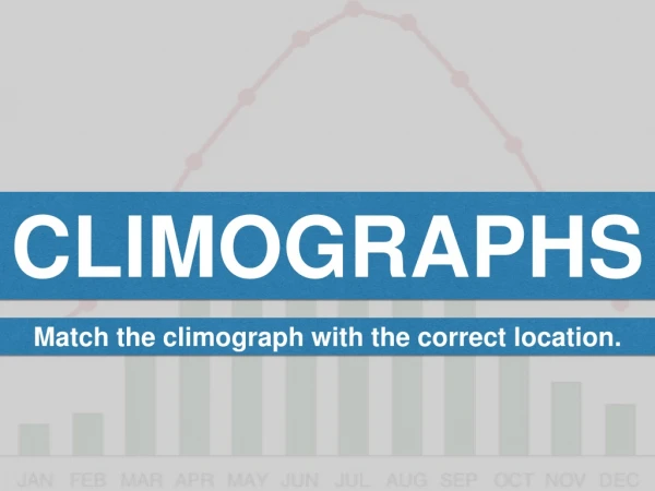
Climographs. AKA Climate Graph. What the????. To show climate info Line graph for temp Bar graph for rainfall Temps are mean average for each month. What do they show?. Regional Variations: differences in climate from place to place Seasonal Variations: in temp and rainfall

E N D
Climographs AKA Climate Graph
What the???? • To show climate info • Line graph for temp • Bar graph for rainfall • Temps are mean average for each month
What do they show? • Regional Variations: differences in climate from place to place • Seasonal Variations: in temp and rainfall • Geographers look at the seasons or months with the highest and lowest rainfall and how much the temperature changes from summer to winter? • http://www.weather.com/outlook/travel/vacationplanner/vacationclimatology/monthly/RPXX0017
Steps…… left foot first? • Draw a rectangle 60mm wide • 80mm high • Divide the rectangle into 12 vertical columns • Under each column label, in order, the months from January to December
Steps…… right foot next • On the right-hand axis from the bottom up draw a scale to show rainfall at 50mm intervals. Draw the intervals evenly. • Label the scale • On the left-hand axis in a scale at 5* intervals, starting with zero half way up the axis to allow for positive and negative temperatures. • Draw the intervals evenly • Label the scale
Steps…..put your left hand in! • Plot the rainfall data as you would for a bar or column graph. • Colour the bars • Plot the temperature as your would for a line graph. • Plot the points in the middle of the column • Smooth the line so it is curved
Steps…put your right hand in! • Your turn! • Fiumicino Italy 2011