Download
1 / 16
170 likes | 270 Views
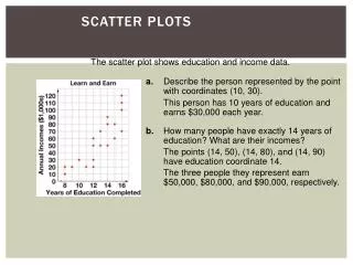
Scatter Plots at Arm’s R each. A lesson on Scatter Plots and Trend Lines. Warm Up. Plot the following points on a coordinate plane. (2,5)(8,1 ) Draw an example of positive slope and negative slope. Evaluate the equation y = -6x + 24 for the value x=4. Write the equation of the

E N D
Scatter Plots at Arm’s Reach A lesson on Scatter Plots and Trend Lines
Warm Up Plot the following points on a coordinate plane. (2,5)(8,1) Draw an example of positive slope and negative slope. Evaluate the equation y = -6x + 24 for the value x=4. Write the equation of the line for the graph to the right.
Vocabulary Scatter Plot Association Cluster Outlier Line of Best Fit (Trend Line)
Scatter Plot A scatter plotis a graph with plotted points to show the relationship between two sets of data.
Variable Association Positive Association As x increases, y increases. Negative Association As x increases, y decreases. No Association No obvious pattern. An association describes the relationship between two data sets.
Linear Association Nonlinear Association: The data points lie in the shape of a curve. Linear Association: The data points lie close to a line.
Other Patterns Outlier Cluster An outlieris a value that is significantly larger or smaller than the rest of the values. A cluster is a collection of points that are close together.
Identifying Associations and Patterns For the following scatter plots, identify the variable association, linear association, and other patterns. 1. 2. 3.
Line of Best Fit (Trend Line) A line of best fit is a line that can be used to describe the relationship between two sets of data. It is very close to the data points and has approximately the same amount of points above and below the line.
Writing the Equation of a Trend Line and Interpreting the Slope and Y-Intercept Choose any two points on the trend line (they may or may not be data points) to find the slope (m) of the line. Identify the y-intercept (b) of the trend line. Substituteyour values for m and b into slope intercept form (y = mx + b). Interpreting Slope: Remember slope is the change in y over the change in x, also known as the rate of change. Interpreting Y-Intercept: Remember that the y-intercept is the value of y when x = 0.
Draw and Assess a Trend Line 125 110 95 80 75 60 45 30 15 Average cost of cell phones 1 2 3 4 5 6 7 8 9 Draw a trend line for the given scatter plot. Write the equation of the line. Interpret the slope and the y-intercept. Years since 2006
Make a Prediction 125 110 95 80 75 60 45 30 15 Average cost of cell phones 1 2 3 4 5 6 7 8 9 Use the equation of the line in the previous example to predict what the average price of cellphones will be in the year 2014. Years since 2006
Does your height determine your arm span? Measure your partner’s height in inches. Measure your partner’s arm span in inches. Have your partner measure your height and arm span. Write down the four measurements in your notebook in a chart like the one below.
Height vs. Arm Span Scatter Plot 80 75 70 65 60 55 50 45 40 Arm Span (inches) 40 45 50 55 60 65 70 75 80 Height (inches)
Tell us about your data! • What is the independent variable and dependent variable for this data? • What does the slope of the trend line represent? • What does the y-intercept of the trend line represent? • Predict the arm span of a basketball player who is 7’4”. Show your work.
On your own: The data below shows how many ice creams an ice cream man sold each month for 10 months. • Use graph paper to create a scatter plot for the data. • Describe the association of your scatter plot. Identify any outliers or clusters. • Draw a trend line for the scatter plot. • Write the equation of the line for your trend line. • What does the slope represent? • What does the y-intercept represent? • Predict the number of ice creams sold in a month where there are 18 sunny days.