Download
1 / 36
390 likes | 444 Views
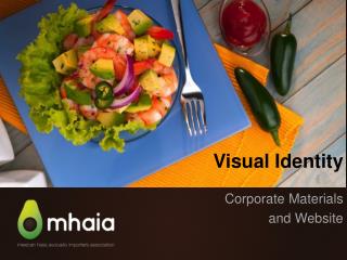
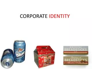
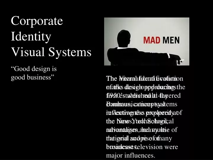
Corporate Identity Visual Systems. “Good design is good business”. The Visual Identification marks developed during the 1950’s were multi-layered communications systems reflecting the prosperity of the times, technological advantages and multi-national scope of many businesses.

E N D
Corporate Identity Visual Systems “Good design is good business” The Visual Identification marks developed during the 1950’s were multi-layered communications systems reflecting the prosperity of the times, technological advantages and multi-national scope of many businesses. The international evolution of the design approaches first established at the Bauhaus, conceptual inventiveness explored at the New York School, rationalism, heavy use of the grid and rise of broadcast television were major influences.
ART DIRECTORS Georg Olden—CBS 1945 William Golden—CBS 1945–1964 Lou Dorfsman—CBS 1964–1989
20-06 Georg Olden, television title for I've Got A Secret, 1950s. The zippered mouth becomes an immediate and unequivocal symbolic statement.
20-07 Georg Olden, stamp for the centenary of the Emancipation Proclamation, 1963. Olden reduced a complex subject, slavery’s end, to its most elemental expression.
William Golden—He is best known for his work at CBS Television Network. Golden gained a reputation of excellence by always striving for a perfect, simple solution to the problem at hand, producing an original and distinguished design to convey the message. Dr. Frank Stanton, president of CBS and a long-time friend, “Bill believed that the way to command attention and win approval was not by being sensational or shrill or obvious, but by being distinguished, subtle, and original.”
An antique weather vane is used as a symbol for the CBS communications program which included ads, brochures, and on-the-air titles for an early morning program.
Double-page ad which contained comments by critics, produced as a part of a campaign for the Omnibus program. Ad for a NY TV station showing Golden’s wit when using typography.
20-06 Louis “Lou” Dorfsman was a designer/art director who oversaw almost every aspect of the advertising and corporate identity for CBS in his 40 years with the network.
Chermayeff & Geismar, poster for a Mobil Oil sponsored TV series
Not much has changed in terms of the typeface since the first GE Logo was devised in 1890. The lowercase script depicting the “g” and “e” is still virtually the same. This is a testament to the maxim that simple is better—a recurrent theme in many of those that stand the test of time. Corporate Identity GE as a diversified company involved in many industries including lighting, industrial products, appliances transportation, power transmission, and medical equipment, health care, finance, energy, and nanotechnology development. No matter how tempting it must have been to overhaul the logo to match a new direction they stuck to the original, save for very minor tweaks. In fact today, according to Business Week, GE is the 4th most recognized brand in the world.
Corporate Identity The Nike brand, with the trademark of “Just Do It!” and the legendary Swoosh, is valued at $10.7 billion, making it the most valuable brand in the sports industry. It was conceptualized by a graphic design student named Carolyn Davidson in 1971 who was paid $35 for it. The Nike “Swoosh” (originally termed “the strip”) symbolizes the wing of the Greek Goddess of victory, Nike. “When we go to battle and win, we say it is Nike.” Traditionally only red and white were used. Red exemplifies passion, energy and joy, whereas the white stands for nobility, charm and purity. Until 1995, the logo used Futura Bold in uppercase characters.
Raymond Loewy The Man Who Shaped America,The Father of Streamlining and The Father of Industrial Design. Raymond Loewy
Raymond Loewy Raymond Loewy, Pennsylvania Railroad S1 Steam Locomotive, 1939
Raymond Loewy Visual Identity Marks Raymond Loewy
Corporate Identity Founded in 1907, the Shell brand is one of the most popular, valuable and recognized brands in the world. The current version of the logo was created in 1971 by Raymond Loewy. He simplified the shell’s crenate edges into a fluid semi-circle. He also cut down the emblem’s ridges from 13 to 7, and introduced a bold, red outline. The red and yellow colors were introduced in 1915, mainly due to the strong Spanish connections of the State of California. Futura Bold is the typeface.
Corporate Identity The Pepsi scribbled script logo was introduced in 1898, redesigned in1905 and again in 1906 to include the slogan “The Original Pure Food Drink”. During 1933,“Refreshing & Healthful” was added. A 12-oz. embossed bottle in 1940 came with a crown. The colors of the crown were soon changed to red, white and blue to immortalize patriotic war efforts. A “bottle cap” look was revealed in1943 and added “Bigger Drink, Better Taste”. In 1962, the two bulls-eye marks encircling “Pepsi” were added and in 1973, a boxed version. In 1991, in celebration of the evolution of the scripted logo an italic capital typeface was added. The 2005, 100th anniversary version of a three-dimensional globe against an ice blue background brought back the previously designed Pepsi typeface.
The current version was created by the Arnell Group, for a fee of $1 million and features a white band in the middle of the Pepsi circle, signifying a series of “smile” and comprises a less formal rounded typeface with lowercase characters.
Coca-Cola, is widely regarded as one of the most instantly recognizable logos ever created. Designed in 1885 by Frank Mason Robinson combined the two “Cs” with Spencerian, a mid- 19th century script. The iconic “hobble skirt” 1915 Coca-Cola bottle intended to signify the “youthful exuberance of America”. The red color symbolizes passion, determination, youthfulness and vitality, the white represents charm and elegance of the Coca-Cola brand.
Massimo Vignelli—193–2014 was an Italian designer who worked in a number of areas ranging from package design houseware and furniture design to public signage and showroom design. He was the co-founder of Vignelli Associates, with his wife, Lella.His ethos was, “If you can design one thing, you can design everything,” and this was reflected in the broad range of his work.
Vignelli's 1972, design for the NYC Subway map is a landmark in Modernist information design. Inconsistent and out-of-date signage and structural changes to the subway network in the 1960’s demanded a new map which was first, released in 1967 and used color-coding for the first time. It continues to be updated and is still in use today and the model by which numerous other maps are designed.
Massimo Vignelli (consulting designer), Vincent Gleason (art director), and Dennis McLaughlin (graphic designer), Unigrid system for the National Park Service, 1977. Design specifications for the Unigrid system and standard formats are presented on a large broadside.
20-40 Massimo Vignelli (consulting designer), Vincent Gleason (art director), and Dennis McLaughlin (graphic designer), Unigrid system for the National Park Service, 1977. The reverse side of previous slide demonstrates and specifies all graphic components on a sample broadside.
20-44 Lance Wyman, logo for the Nineteenth Olympiad, 1966
1972 The “8-bar” logo of IBM is uniquely reassuring, portraying reliability, trust, authenticity and impeccable quality of the brand and its tradition. It was introduced in 1924. The 1947 redesign incorporated simple lettering of the company’s name in the Beton Bold. In 1956, Paul Rand created a more solid, consistent, grounded and balanced feel by switching to City Medium. Rand was hired once again in 1972 and replaced the solid letters with horizontal stripes, symbolizing speed, dynamism, energy and modernity.
A primary constraint in the design process was the need for a logo simple enough that it could be stenciled onto trees and lumber intended for paper production. Designed by Lester Beall and Richard Rogers in 1960, the logo features the letters “I” and “P” which form a stylized arrow also resembling a tree surrounded by a circle.
20-63 Pat Gorman and Frank Olinsky of Manhattan Design MTV, “Colorforms” logo, 1985. Random patterns of geometric shapes convey a playful resonance.
20-64 MTV “puzzle” logo, 1985. The logo is assembled, dismantled, melted, and shattered without losing its ability to verify identity.
20-64 Jerzy Janiszewski, Solidarity, 1980