Download
1 / 11
110 likes | 254 Views
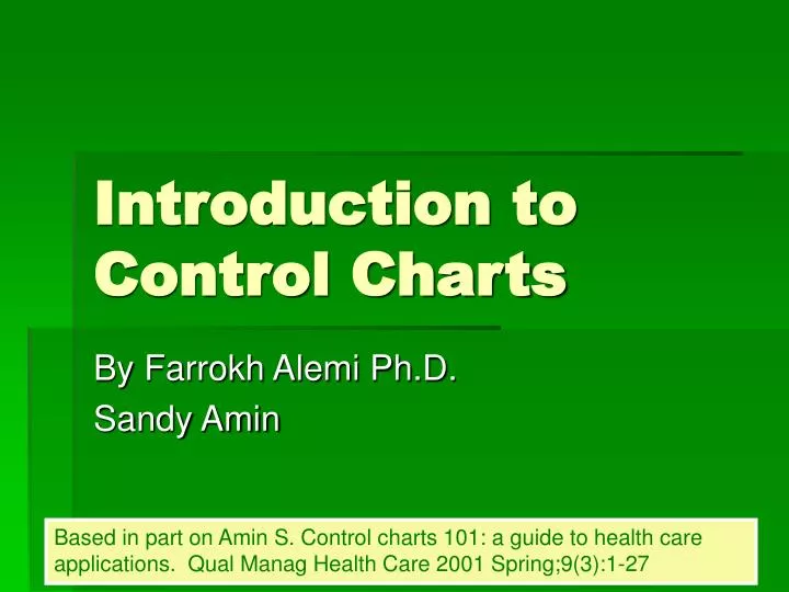
Introduction to Control Charts. By Farrokh Alemi Ph.D. Sandy Amin. Based in part on Amin S. Control charts 101: a guide to health care applications. Qual Manag Health Care 2001 Spring;9(3):1-27. Purpose. Provide an overview of control chart applications for common healthcare data.

E N D
Introduction to Control Charts By Farrokh Alemi Ph.D. Sandy Amin Based in part on Amin S. Control charts 101: a guide to health care applications. Qual Manag Health Care 2001 Spring;9(3):1-27
Purpose • Provide an overview of control chart applications for common healthcare data. • We assume: • User has a basic understanding of process variation • User has knowledge of simple statistics (i.e. measures of central tendency). • This lecture should help the user select the appropriate type of chart and understand the common rules of interpretation.
What is a control chart? • A graphical display of data over time that can differentiate common cause variation from special cause variation • In the late 1920’s, Walter Shewhart, a statistician at the AT&T Bell Laboratories, developed the control chart and its associated rules of interpretation.
UCL Observations LCL Components of Control Chart
Interpretation of Control Charts • Points between control limits are due to random chance variation • One or more data points above an UCL or below a LCL mark statistically significant changes in the process
Suggested Number of Data Points • More data points means more delay • Fewer data points means less precision, wider limits • A tradeoff needs to be made between more delay and less precision • Generally 25 data points judged sufficient • Use smaller time periods to have more data points • Fewer cases may be used as approximation The idea is to improve not to prove apoint
XmR X-bar Tukey Time-in-between P-chart Risk adjusted P-chart Risk adjusted X-bar chart Selecting Appropriate Chart
Length of stay Average length of stay Average age of a specific patient population Process turn around time Staff salaries Severity of medication errors Individual patient’s weights, blood sugars, cholesterol levels, temperatures, or blood pressures over time Patient Satisfaction Average Scores Infectious waste poundage generated Electrical usage Wait times Accounts receivable balances Time in restraints Time before hanging up the phone SF – 36 scores Number of employee accidents Number of patient falls Nosocomial infection rates Percent of patients in restraints Medication error rate Adverse event rate C-Section rates Number of dietary tray errors Numbers of delinquent medical records Percent of patients with insurance Percent of patients who rated the facility as excellent Telephone abandonment rates Pressure ulcer rates Employee injuries rates Percent of records that contains appropriate documentation Examples of Measures Continuous variables Rates and discrete events
Which Chart is Right? • If continuous variable • If one data point per time period • If outliers likely: Tukey chart • If outliers not likely: XmR chart • If multiple data points per time period: Xbar chart • If discrete event • If event is rare: Time-in-between chart • If event is not rare: P-chart If case mix changes over time, use risk adjusted control charts
Risk Adjustment • When case mix changes over time, use risk adjusted control charts • Instead of comparing to historical patterns, new observations are compared to expectations • Risk adjusted control charts are calculated by applying the formulas for control limits to the difference of observed and expected values