Download
1 / 17
180 likes | 343 Views
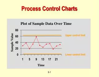
Control Charts. Control Charts. On a run chart the centerline is the median and the distance of a data point from the centerline is not important to interpretation

E N D
Control Charts • On a run chart the centerline is the median and the distance of a data point from the centerline is not important to interpretation • On a control chart, the centerline is the mean and the distance a data point is from the centerline is used to define special cause variation • The formula used to calculate the upper and lower control limits is specific to each type of control chart • Determined in part by whether the data plotted is continuous or discreet (measurement) or attributes (discreet or count) data • Determined in part by whether the data distribution is “normal” (bell-shaped curve) or not (binomial, geometric, Poisson)
Selecting Which Control Chart to Use • Is the data continuous (aka measurement or variables data) data or attribute data (aka discreet or count data)? • Continuous data is measured along a continuous scale • Wait times • Turnaround time for a service • BP, cholesterol, or body weight measurements • The duration of a procedure • The number of procedures or transactions per day or month • Attribute data can be classified into categories or “buckets” • Mortality • Pregnancy
Selecting Which Control Chart to Use • Attributes data are either defectives or defects • Defectives (nonconforming units) • Requires a count of the number of units that were acceptable and of those that were not. You know both the occurrences and the non-occurrences • The unacceptable units become the numerator and the total number of items observed becomes the denominator • Either plot the number of defectives or the percentage of defectives • The numerator and denominator have the same units • Example: the percentage of late food trays: numerator=late food trays and the denominator is the total number of food trays passed • Defects • Events that occur in which the non-events are unknown and unknowable
Selecting Which Control Chart to Use • Defects continued • The numerator is known but the denominator cannot be known • Example: Stains on the rug (you don’t know the number of non-stains); falls; medication errors; visits to the ED • Expressed as rates rather than percentages. Rates are ratios in which the numerator and denominator are of different units • Example: rate of falls has the # of falls in a month in numerator and the denominator is the average daily census for that month X 1000 also stated “falls per 1000 patient-days” • With a rate, the numerator can be larger than the denominator (e.g. 130 falls in 100 patients (some patients fell more than once) • Is there an equal opportunity from time period to time period for the event being measured to occur-e.g. regarding falls, is the hospital census similar from month to month?
Examples of Control Charts for Continuous Data XmR X-bar &S
Examples of Control Charts for Discreet Data u-chart c-chart p-chart
Rules for Determining Special-Cause Variation in a Control Chart
Rules for Determining Special-Cause Variation in a Control Chart • Tests for instability • Test #1-A single data point that exceeds the upper or lower control limit
Rules for Determining Special-Cause Variation in a Control Chart • Tests for instability • Test #2-Two out of three consecutive data points that fall in Zone A or beyond • Test #3-Four out of five consecutive data points that fall in Zone B or beyond
Rules for Determining Special-Cause Variation in a Control Chart • Tests for instability • Test #4-Eight or more consecutive data points that fall in Zone C or beyond
Rules for Determining Special-Cause Variation in a Control Chart • Tests for other unnatural patterns • Test #5-Stratification occurs when 15 or more consecutive data points fall in Zone C, either above or below the centerline
Rules for Determining Special-Cause Variation in a Control Chart • Tests for other unnatural patterns • Test #6-Eight or more consecutive points on both sides of the centerline with none of the points in Zone C
Rules for Determining Special-Cause Variation in a Control Chart • Tests for other unnatural patterns • Test #7-Systematic variation will be observed when a long series of data points (usually 14 or more) are high, then low, then high, then low, without any interruption in this regular pattern
Rules for Determining Special-Cause Variation in a Control Chart • Tests for other unnatural patterns • Test #8-A trend exists when there is a constantly increasing or decreasing series of data points
Rules for Determining Special-Cause Variation in a Control Chart • Tests that occur most often in healthcare applications • Test #1 • Test #4 • Test #8 • Tests occurring with less frequency in healthcare applications • Test #2 • Test #3 • Tests that do not occur very often in healthcare applications • Test #5 • Test #6 • Test #7