Download
1 / 31
310 likes | 472 Views
More on Links. As we discussed already, links can either be Absolute – the link contains the full path starting with http and includes webserver , directory and file name Relative – the link specifies the file along with its location relative to where the current page resides

E N D
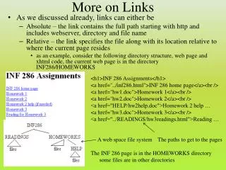
More on Links • As we discussed already, links can either be • Absolute – the link contains the full path starting with http and includes webserver, directory and file name • Relative – the link specifies the file along with its location relative to where the current page resides • as an example, consider the following directory structure, web page and xhtml code, the current web page is in the directory INF286/HOMEWORKS <h1>INF 286 Assignments</h1> <a href="../inf286.html">INF 286 home page</a><br /> <a href="hw1.doc">Homework 1</a><br /> <a href="hw2.doc">Homework 2</a><br /> <a href="HELP/hw2help.doc">Homework 2 help … <a href="hw3.doc">Homework 3</a><br /> <a href="../READINGS/hw3readings.html">Reading … A web space file system The paths to get to the pages The INF 286 page is in the HOMEWORKS directory some files are in other directories
Targets and Anchors • The target property of the <a> tag specifies where you want a given page loaded • The most common values are • top – replace the current page with the new page • this is used if you have implemented frames • frame – the name of a frame, the new web page is loaded into the specified frame – note, this is not the word “frame”, but a name that you have specified • blank – open a new window/tab • Anchors are locations in a web page specified using <a></a> • but in this case, there is no href, nor text between the open and close tags • given an anchor in a page, you can specify a link to that anchor using the address #name where name is given in the anchor with BOTH an id property and a name property • <a id=“section2” name=“section2”></a> • <a href=“#section2”>Go to Section 2</a> • where the anchor tag and the href tag are both on the same page • You can also link to an anchor reference on another page by specifying the file name and the anchor name • <a href=“somepage.html#section2”>Go to some page’s section 2</a>
Making Links Stand Out • So far we have provided ordinary text links or image links • We can also make links stand out by giving them borders and padding, just like we have for headings or paragraphs or list elements, etc • For instance, in css, we might define • a { border: 2px solid black; } • here, links will have a border around them making them look like buttons • a { border: 2px solid black; padding: 5px; background-color: yellow; } • for this one, the link looks even more like a button
Link Appearances • A link can be in one of four states • Link – the default state for a link not yet visited • Visited – the state if that particular link has already been clicked sometime in the near past (this information is stored in a history for about 1 month) • Hover – the state when the user is currently clicking on the link • Active – the state once the link has been activated but the web page has not yet been loaded • Focus – the state when the link is focused on, this is the case when you use the tab key to move from one link to the next • You can assign different attribute values to a link in each of the four states • e.g., different colors, different text styles or fonts • commonly people either leave the links alone or change their colors • To provide different values, use the properties a:link, a:hover, a:visited, a:active as in • a:visited { color: #00FFFF; } • a:hover { color: #FF0000; }
Changing The Cursor • Another attribute that you can specify is cursor • this allows you to change what the cursor looks like when you point at a link • legal values are • auto or default (default, the browser sets the cursor) • crosshair • help – adds a ? with the typical arrow • e-resize, n-resize, nw-resize, se-resize, sw-resize, nw-resize • the cursor is a double arrow horizontally (e or w), vertically (n or s), diagonally (nw, se, sw, nw) • progress – adds an hour glass (wait) symbol next to the arrow • wait – the hour glass symbol replaces the cursor • text – cursor appears as vertical “edit” prompt (like you see in MS Word) • For instance, you might define • a:hover {cursor: help;} • a:active {cursor: wait; }
Example • Here, we see that the link and cursor will change when the mouse cursor hovers over the link, clicks the link, or is a link that has already been visited a:active { cursor:wait; color:green; font-weight: bold; } a:visited { cursor:text; color:#333333; } a { line-height: 50px; border: 4px inset red; padding: 4px; } a:hover { cursor:crosshair; color: #cccccc; font-style: italic; }
Different Formats for Links • Links can appear as • Normal text • Images • “Buttons” by using a border and padding • We can also create our own “buttons” by making an image of the text (e.g., in Paint) • We can display our links inside of lists using <ul> where each <li> has our <a href>label</a> tag • By using list-style-type: none, we can remove the bullets from our list • By using display: inline; we can make our list appear on a single line • By using display: none; and positioning, we can create drop down menus • examples follow
Example: Links in a List (part 1) <dl> <dt>General News</dt> <dd><a href="http://www.cnn.com">CNN</a></dd> <dd><a href="http://www.msnbc.com" target="_blank">MSNBC</a></dd> <dt>Education Sites</dt> <dd><a href="http://www.nku.edu">NKU</a></dd> <dd><a href="http://www.uc.edu">UC (Cincinnati)</a></dd> <dd><a href="http://www.osu.edu">OSU (Ohio)</a></dd> <dd><a href="http://www.berkeley.edu">UC Berkeley</a></dd> <dd><a href="http://www.muohio.edu">Miami (Ohio)</a></dd> <dt>Miscellaneous Links</dt> <dd><a href="http://www.netvibes.com">Netvibes</a></dd> <dd><a href="http://www.penny-arcade.com">Penny Arcade</a></dd> <dd><a href="http://www.google.com">Google</a></dd> <dd><a href="http://www.apple.com">Apple</a></dd> <dd><a href="http://www.microsoft.com">Microsoft</a></dd> </dl>
Example: Links in a List (part 2) <ul> <li>General News</li> <ul><li><a href="http://www.cnn.com">CNN</a></li> <li><a href="http://www.msnbc.com" target="blank">MSNBC</a></li></ul> <li>Education Sites</li> <ul><li><a href="http://www.nku.edu">NKU</a></li> <li><a href="http://www.uc.edu">UC (Cincinnati)</a></li> <li><a href="http://www.osu.edu">OSU (Ohio)</a></li> <li><a href="http://www.berkeley.edu">UC Berkeley</a></li> <li><a href="http://www.muohio.edu">Miami (Ohio)</a> </li></ul> <li>Miscellaneous Links</li> <ul><li><a href="http://www.netvibes.com">Netvibes</a></li> <li><a href="http://www.penny-arcade.com">Penny Arcade</a></li> <li><a href="http://www.google.com">Google</a></li> <li><a href="http://www.apple.com">Apple</a></li> <li><a href="http://www.microsoft.com">Microsoft</a></li></ul> </ul>
Example: Links in a List (parts 3-5) By keeping the code from the previous slide the same, we can modify how lists will appear by adding an li entry to a style section in our header So, adding to the <head>…</head> tag <style> li { list-style-type: none; } </style> gives us this Or, changing li to be li { list-style-type: none; display: inline; } gives us this We can also replace the bullet with an image using <style> li { list-style-image: url(ball.gif); } </style>
Buttons as Links <style> .button { border: 2px inset #CCCCCC; width: 100px; padding: 3px 15px; color: #FFFFFF; background-color: #006600; font-family: Arial,sans-serif; font-size: 16px; font-weight: bold; font-align: center; text-decoration: none; } a.button: link {color : #FFFFFF; } a.button: visited {color : #CCCCCC; } a.button: hover {color : #66CC33; border 2px outset #CCCCCC;} </style> Here, we define a class called .button and use it in conjunction with the a tag for our CSS rules We alter our <a href> statements to include class=“button”
Complete Example • Many sites place links on several parts of the page • Across the top, along both sides, in the middle • Here we have an example of a page divided into four sections • At the top is a heading and some links in a row • Along the left side are some links as buttons • Along the right side are more links as buttons • In the middle is text and images • As this is a skeleton of an example, text and actual references for links are omitted We create three areas, left, center and right We define two types of “buttons” to use in the left and right areas
CSS Code h1 { border: 5px 7px; border-style: groove; border-color: #FFCC99; padding: 10px; background-color: #CCAACC; text-align: center; } .b1 { border: 2px inset #006600; margin-left: 5px; color: red; background-color: #33CCCC; text-align: center; text-decoration: none; } a.b1: link {color: #FF3333;} a.b1: visited {color: #33FFFF;} a.b1: hover {color: #333333;} .b2 { border: 5px groove #006600; padding: 5px 10px; color: blue; background-color: #FFFF00; text-align: center; text-decoration: none; } a.b2: link {color: #33FF33;} a.b2: visited {color: #FF33FF;} a.b2: hover {color: #333333;} .left { float: left; width: 100px; } .right { float: right; width: 100px; } .center { margin: 0 100px 0 100px; } body { margin: 0; }
XHTML Code <h1>Lots of links example</h1> <div class="center" align="center"> <a href="">link 1</a> <a href="">link 2</a> <a href="">link 3</a> <a href="">link 4</a> </div> <div class="left"> <a href="" class="b1">link 1</a><br /> <a href="" class="b1">link 2</a><br /> <a href="" class="b1">link 3</a><br /> <a href="" class="b1">link 4</a><br /> </div> <div class="right"> <a href="" class="b2">link 1</a><br /><br /> <a href="" class="b2">link 2</a><br /><br /> <a href="" class="b2">link 3</a><br /><br /> <a href="" class="b2">link 4</a><br /><br /> </div> <div class="center"> <p></p><p>other stuff can go here</p> </div> See pages 278-283 for a different example
More Variations for Links • As we saw, we can control what a link will look like when you hover over it or click on it • We can extend these ideas in three ways • When you hover over or activate a link, remove the underline • Use text-decoration: none as in • a:hover {text-decoration: none; } • Or combine this with other changes like the font color and font size • a:hover {text-decoration:none; font-size: 14pt; color: brown;} • Use an image for the link and then change the image when hovered over or clicked • we see how to do this next using JavaScript • When hovered over, the link becomes a drop-down menu • we can do this in several ways including CSS • we explore the CSS way in a few slides
Changing Links on Mouse Rollover • This is a topic covered in chapter 14.6 as it is part of JavaScript, but the topic fits better here • Ever been to a website where the link is a graphic but when you roll the mouse over the graphic it changes? • This is done via JavaScript using event handlers • What is an event? A situation that the web browser is looking for such as moving a mouse to a particular region, or clicking the mouse button • What is an event handler? Code that is executed when the associated event occurs • We can enhance our <a href> tags to include onmouseover and onmouseout properties • These properties can be used to specify alternate image files (one for mouse over, one for mouse out) • This requires a little extra code, but not much
How it Works • As before, we will use an image for our link: • <a href …><imgsrc=“…” /></a> • We have to give the <img> tag an id and name • In the <a href> tag, we add the following • onmouseover=“document[‘name’].src=‘onimagename’;” • onmouseout=“document[‘name’].src=‘outimagename’;” • name is the name specified in the <img> tag • onimagename and offimagename are the two image files <a href="http://www.nku.edu/~foxr/teaching.html" onmouseover="document['teaching'].src='images/teachingon.gif';" onmouseout="document['teaching'].src='images/teachingoff.gif';"> <img src="images/teachingoff.gif" name="teaching" id="teaching"></a> mouse out: mouse over:
Drop Down Menus • You’ve visited web sites before where, when you point your mouse cursor at a link, a menu appears • How do they accomplish that? • there are several ways, here we look at how to implement this solely with css • The basic idea revolves around the property display • two options, none or block • if none is selected, the text does not appear • if block is selected, the text will appear • What we will do is use an unordered list inside a div section that we define with a new class (for instance, .menu) • we will specify that list items will have a display: none • we will define a hover for our div section that will change display to block • We can use this for ordinary text but mostly, we will use it for links so that it operates much like a drop down menu • this gets complicated, there are a lot of things to define
Combining Multiple Tags in a Rule • We have already seen notation like a.button where we define a class button and then combine it with a rule for a tags • A variation of this is to list a class and then a class’ tag as in the class .menu and the tag li which becomes .menu li {…} • To accomplish the pull down menus, we need to define the class (for instance, .menu) and then tags for ul, li and also for actions like hover • Start with a definition for .menu -- how do we want the menu’s header to appear (width, background color, font info, etc) • Next, define .menu li – here, we want to make sure that list-style-type is none and display is none • Since the default for the menu list items (li) is to not display, we now have to make them display which we do by defining .menu:hoverli by using display: block;
The CSS code: .menu {font-family:sans-serif; font-size:12pt; width:120px; background-color:orange;} .menu li {list-style-type:none; background-color:yellow; width:80px; display:none;} .menu:hover li{display:block; width: 80px;} <div class="menu"> Here is a header <ul> <li>item 1</li> <li>item 2</li> <li>item 3</li> </ul></div> Here is some text that follows the menu. You will see the text shifts downward when we hover over the menu. We don't want this, so we will have to fix it. </body> Menu Example
Positioning • To fix the problem of displacing the text underneath the drop down menu, the fix is simple • Add position: absolute; to the .menu rule • We also have to force the text that follows the header to be moved lower so we add • .text {position: absolute; top: 25px; } • And add <div class=“text”>…</div> around the text that follows the list • This has two undesired side effects • First, the menu appears over the text making both hard to read • When you move your mouse cursor down over the menu items, the menu disappears because its over the “text” portion, not the “menu” portion
Fixing These Problems • Both of the problems have the same fix, but first lets consider why the problems arose • We have stated that the text that follows the menu has an absolute starting position • The menu is also fixed in place • When the list items appear, they must appear below the menu’s header and the text must stay where it has been, thus we get the confused output • Since the hover rule is part of menu, the hover rule is only enacted while the menu is being hovered over, but the menu now extends into the text area and so even though we see the drop down portion of the menu, it is not considered as part of the .menu class since it is also part of the .text class • The solution is simple: move the .text class down below where the menu will appear by using top: 100px; or some value like that
The New Page • Altering .text to have top: 120px; gives us the following without hovering (left) and with hovering (right) • This doesn’t necessarily look very good because we have a big blank gap in the way • Go to www.jpl.nasa.gov. How do they solve the problem? By inserting an image underneath the menu and before the text • The image ensures that the text is still readable while the gap before the following section ensures that the hover command works appropriately
Adding Links and Menus • Adding the links to our drop down menu is simply a matter of changing the text in the list items to include <ahref> tags • However, because these links are already inside of borders and in a drop down menu, you might want to remove the underlines • add .menu a {text-decoration: none;} • How do you add additional drop down menus? • If we just added more headings and <ul><li>…</li></ul> listings they would appear down the page, not horizontally across the page • So we need to position items across the page to create a navigation bar where each item, when hovered over, displays a drop-down menu
Solution • The new solution is different from the previous examples • Define .menu as before but with float: left; to allow successive <div> sections to line up across • Define .menu ul with display:none; position: absolute; list-style: none; and a border and background-color if desired • Define .menu ulli to have display: block; a border (and padding if desired) • Define div.menu:hoverul – this is the rule that will cause the list to appear when you hover over the area • This rule will have display: block; and should also have a margin and padding to properly line up the list under the heading • For the .text class, remove the absolute positioning and replace t with clear: left; • In html, we now define each menu using • <div class=“menu”><ul><li><a href=“…”>item 1</a></li><li><a href=“…”>item 2</a></li>…</ul>menu item 1</div> • And after the menu, we use <div class=“text”> to clear the float
Controlling Printing of Web Pages • Usually when you print a web page, you have no or little control over what is printed or on what pages the web page is printed • With CSS, you have some control using the link tag • Recall that the link tag allows you to include a separate CSS file that defines the format of your tags and classes • Another property of the link tag is media • media=“screen” means that this definition is used when the xhtml page is displayed in the browser • media=“print” means that this definition is used when the xhtml page is printed • media=“handheld” means that this definition is used when the xhtml page appears on a handheld device (e.g., cell phone, PDA) rather than computer monitor • In this way, you can alter how the page appears when it is printed
The Cascaded in CSS • The word “cascaded” means “to apply one on top of another” • Using CSS, we have several different locations where we might define formatting for a given tag or location of a web page • Browser defaults • for instance, font face given type such as serif • External style sheet • using the <link> tag • Embedded style • using the <style> tag in the <head> section • Inline style • using the style property inside of certain inline tags like <p> • Xhtml tag • using one of the in-line properties (many of these are deprecated in favor of css, but many still exist)
What Happens When You Cascade? • The idea behind cascading is that you could potential have a rule for the same tag defined in multiple places • Such as having it defined in-line and also in an external style sheet • Each format is applied as defined going down the list from the previous slide • The lower (lowest) definition overrides any earlier definition(s) • if you define body in an external css file, it will be applied • if you define body in an embedded style tag in the xhtml code, it will override the body from the css file • if you define within a body an inline style, it will override the style tag • Although it seems ridiculous to override a style that you set up, remember that you might work with others such that someone else has defined the css file that you are applying
Example • In a css file, the body is defined as follows: • body { border: 3px inset #00CCAA; font-face: “Verdana”, sans-serif; font-size: 16px; color: #00FF00; } • In the style tag, <p> is defined as follows: • p { font-face: “Times New Roman, serif; font-size: 12px; color: red; } • In the body of your file, you have: • <font color="blue">text</font> • The result will look like this:
A Few Last Comments • Using the notation a.button: • This may look a little like calling an object in Java (as in name.length( ) and rightly so, what you have is a pseudo-class and a selector of that class • In this case, .button is the class, and a is the tag from which the following definition will take affect • When using a link to anchor point • If the anchor point is near the bottom of the current window or if the page is not more than 1 screen in height, clicking the link may not appear to do anything • Linking to anchor points on the same page is only useful when the page is several screen lengths in height • You can define the same format for multiple tags as shown below • p, li { color: #FF00FF; } • h1, body { font-family: sans-serif; }
A Comment About Caching • Cache (pronounced “cash”) is fast memory • Main memory stores all of our program code and data, so the processor continually needs things from memory • But main memory is slow, so we supplement our computer with 1 or more caches – we keep things we need right now in cache, which is faster memory but more expensive, so our computers don’t keep a lot of it • We use the same idea in telecommunications by caching web page components that we have recently visited • Both pages and images are placed in cache • The problem though is that when you revisit a page that you visited recently, chances are you are going to retrieve the cached version on your local computer • Rather than going across the Internet to reload the page • The problem is that, if the page has been modified, you will see the old version, not the new version!