Download
1 / 7
70 likes | 249 Views
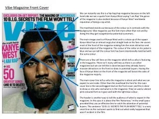
Magazine front covers. Nowhere in a magazine is the interaction of words and pictures more important than on the FRONT COVER.

E N D
Magazine front covers Nowhere in a magazine is the interaction of words and pictures more important than on the FRONT COVER. The cover has to do TWO jobs for a magazine: “It has to sell the general concept of the publication as well as to reflect, through its design, the intellectual level of the editorial content” (Swann 1991) Other commentators suggest that it has more personal then intellectual functions: “It is the magazine’s face . . Like a person’s face it is the primary indicator of a personality” (Click and Baird 1990)
Magazine front covers What’s more, the magazine front cover has to attract a potential reader instantly in an environment where the newsagent’s customers are browsing and where there are shelves of hundreds of rival magazines, including all the competing rivals in a given field. If it’s doing its job right, then the cover will tempt the reader away from its rivals. “The fundamental thing is for the cover to sell the issue, both to your regular readers . . . and to people’s readers, who might be looking for a change” (Moorish 1996)
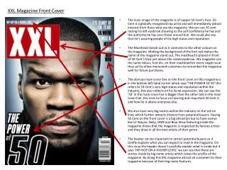
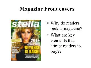
Magazine front covers • Use a strong image • Make sure that the masthead is clearly identifiable. This does not mean that the whole word has to be visible but enough of its distinctive lettering should be there to make clear to the readers which title they are looking at. • Make sure that cover lines are legible from about 2 metres away. Some publishers refer to this as the floor test. If you throw a magazine on a carpet you should be able to read the cover lines without bending down.
Magazine front covers • Promise a clear benefit to the reader. • Offer something for beginners or new readers. • Create strong links to the contents page. Readers are irritated if the fascinating story on the cover page is impossible to find in the contents list, perhaps because it is given a different title. • Deliver everything you promise. • Put the emphasis on the left hand side of the cover, as that is the part which will show when it’s on the newsagent’s shelf. The other important site is the top, which is why you don’t see many title pieces at the bottom of the page.
Magazine front covers Cover lines Writing good cover lines (the name for the words on the cover) is a craft in itself. There is a temptation to try out clever word play, similar to that found in newspapers, but in Morrish’s view this should be resisted: “They are there to tempt and intrigue and invite further scrutiny. They should be positive and enthusiastic. Above all they need to be short, snappy, colloquial and absolutely straightforward . . . Readers need to look at the line once to understand what it means” (Morrish 1996)
Magazine front covers Marjorie Ferguson (1980, 227) identified four types of facial expression in the cover photos of British women’s magazines. ‘Chocolate Box’: half or full smile, lips together or slightly parted, teeth barely visible, full or three-quarter face to camera. Projected mood: blandly pleasing, warm bath warmth, where uniformity of features in their smooth perfection is devoid of uniqueness or of individuality. ‘Invitational’: emphasis on the eyes, mouth shut or with only a hint of a smile, head to one side or looking back to camera. Projected mood: suggestive of mischief or mystery, the hint of contact potential rather than sexual promise, the cover equivalent of advertising’s soft sell.
Magazine front covers ‘Super-smiler’: full face, wide open toothy smile, head thrust forward or chin thrown back, hair often wind-blown. Projected mood; aggressive, ‘look-at-me’ demanding, the hard sell, ‘big come-on’ approach. ‘Romantic or Sexual’: a fourth and more general classification devised to include male and female ‘two-somes’; or the dreamy, heavy-lidded, unsmiling big-heads, or the overtly sensual or sexual. Projected moods: possibly ‘available’ and definitely ‘available’.