Download
1 / 17
170 likes | 246 Views
Music Magazine Front Cover Research and Analysis. All of these magazines are music magazines that are each specific to a certain set of music. . VIBE.

E N D
All of these magazines are music magazines that are each specific to a certain set of music.
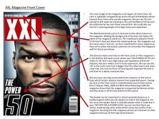
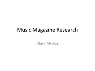
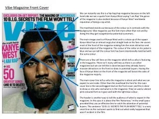
VIBE The magazine shows to be a serious looking and appeals to rapping as it has Kanye West on the front cover who is a rapper and also appeals to people liking things in the hip hop department. The photograph creates a sort of serious look to the atmosphere of the reader.
Colours and Fonts The colours in some areas do stand out from each other, mainly the pink fonts. But the masthead doesn’t really stand out from the white background as it is a light blue colour. It stand out but it isn’t the main eye catcher. The colours a fairly similar to each other as in they are mainly on the same side of the spectrum with each other. The only colour that isn’t is the pink font. The font is done in capitals as it is ,one of an eye catcher than having lower cased font. The font shows what needs to be more appealing to the viewer and they mostly related to either Kanye West.
The Layout The layout allows the viewer to able to see the main picture and does not have any writing disrupting the view of the picture. All headings are placed around the picture as that is the main eye catcher for this front cover. The Masthead on the other hand is placed behind the main picture. The main picture is the main dominator of the cover. It shows attitude towards the viewer
Language The language that the front cover uses is English. It is formal English that everyone can understand and does not have any elements of slang, abbreviations and confusing symbols that people may not understand. The structure of language of the magazine is short and brief so the viewer does not have to read to much about the article until they open the magazine, if the text was to long it may discourage the viewer from buying the magazine.
The Commercial Element The commercial elements that this cover has isn’t existent. The cover does not have any as this is a special issue and can only be bought online.
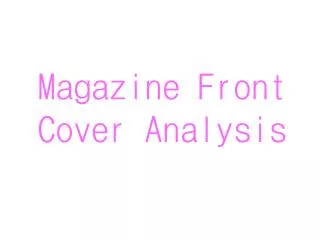
Q magazine is a music magazine that talks abut all types of music, from hip hop to rock. But this particular issue focuses more on rock than other elements of music Q
Colours and Font The colours are used not very affectively. The colour in my opinion are very dull and do not really catch my eye. There are not really any colours that stand out and really catch the eyes of the user. The font of this front cover is not the main eye catcher of the cover. The font is used to show information within the magazine there is use of Italicsthis is used to show the emphasis of the speakers voice. Overall the font is modern and not very appealling.
Layout The layout of the cover is more of an organised layout. Everything on the cover is put in a neat, straight fashion and ds not have any elements of informality. The main picture of this cover is the main appealer to the reader as the model points towards the viewer. He does this in a sort of swag pose. Showing a more relaxed mood towards the viewer.
Language The language of this magazine is used in a formal manor. The language and punctuation of the magazine is in some areas used in dramatic manors wit the use of exclamation marks .
Commercial Elements The main and only commercial element of this magazine is the bar code. This shows that this issue of the magazine is sold within stores an shops.
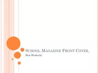
KERRANG KERRANG is mainly aimed at rock fans of music as its main element is rock.
Colour and Fonts The colours of the cover make the atmosphere fairly dark. It gives that heavy rock feeling. The colours of the magazine do not really appeal to the viewer, but they are not the main eye-catcher. The fonts of this magazine are very eye catching, they are not normal fonts that you would find on normal magazines. The fonts are very effective towards the atmosphere and puts the magazine in that more rundown, serious look.
The layout of karrang is more different than normal magazine covers. It only has one main heading which is the “100 greatest gigs ever” Layout
The language of the magazine makes the magazine appeal more to the reader by the use of cliff hanger techniques. It uses the sell line of “YOUR VOTES ARE IN! AND THE WINNERS ARE...”. This makes the reader want read more about the mageazine. Language
The main commercial element of this magazine is that it allows the public o vote for winners within competitions as it says that “THE VOTES ARE IN! this shows that the public can vote on certain things that the magazine allows them to vote on. The other commercial element of this magazine is the bar code this shows that the magazine is able to be sold in shops. Commercial Elements