Download

1 / 23
260 likes | 483 Views
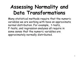
Assessing Normality and Data Transformations. Role of Normality. Many statistical methods require that the numeric variables we are working with have an approximate normal distribution .

E N D
Role of Normality • Many statistical methods require that the numeric variables we are working with have an approximate normal distribution. • For example, t-tests, F-tests, and regression analyses all require in some sense that the numeric variables are approximately normally distributed. Standardized normal distribution with empirical rule percentages.
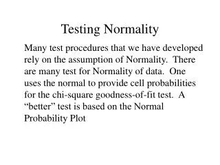
Tools for Assessing Normality • Histogram and Boxplot • Normal Quantile Plot (also called Normal Probability Plot) • Goodness of Fit TestsShapiro-Wilk Test (JMP) Kolmogorov-Smirnov Test (SPSS) Anderson-Darling Test (MINITAB)
Histograms and Boxplots The cholesterol levels of the patients appear to be approximatelynormal, although there is some evidence of right skewness as the mean is larger than the median. The redcurve represents a normal distribution fit to these data and the blue curve the density estimate for these data, these curves should agree if our data is normally distributed.
Histograms and Boxplots The systolic volumes of the male heart patients in this study suggest that they come from a right skewed population distribution. The red curve represents a normal distribution fit to these data and the blue is the estimated density from the data which does not agree with the imposed normal. Outliers are not consistent with normality.
Normal Quantile Plot • Basically compares the spacing of our data to what we would expect to see in terms of spacing if our data were approximately normal. If our data is approximately normally distributed we should spacing similar to what I attempted to show on the normal curve on the right. Very few observations in both tails and increasingly more observations as we move towards the mean from either side. Also remember the spacing must be symmetric about the mean.
Normal Quantile Plot THE IDEAL PLOT: Here is an example where the data is perfectly normal. The plot on right is a normal quantile plot with the data on the vertical axis and the expected z-scores if our data was normal on the horizontal axis. When our data is approximately normal the spacing of the two will agree resulting in a plot with observations lying on the reference line in the normal quantile plot. The points should lie within the dashed lines.
Normal Quantile Plot THE IDEAL PLOT: Here is an example where the data is perfectly normal. The plot on right is a normal quantile plot with the data on the vertical axis and the expected z-scores if our data was normal on the horizontal axis. When our data is approximately normal the spacing of the two will agree resulting in a plot with observations lying on the reference line in the normal quantile plot. The points should lie within the dashed lines.
Normal Quantile Plot (right skewness) The systolic volumes of the male heart patients are clearly right skewed. When the data is plotted vs. the expected z-scores the normal quantile plot shows right skewness by a upward bending curve.
Normal Quantile Plot(left skewness) The distribution of birthweights from this study of very low birthweight infants is skewed left. When the data is plotted vs. the expected z-scores the normal quantile plot shows left skewness by a downward bending curve.
Normal Quantile Plot(leptokurtosis) The distribution of sodium levels of patients in this right heart catheterization study has heavier tails than a normal distribution (i.e, leptokurtosis). When the data is plotted vs. the expected z-scores the normal quantile plot there is an “S-shape” which indicates kurtosis.
Normal Quantile Plot(discrete data) Although the distribution of the gestational age data of infants in the very low birthweight study is approx. normal there is a “staircase” appearance in normal quantile plot. This is due to the discrete coding of the gestational age which was recorded to the nearest week or half week.
Normal Quantile Plots IMPORTANT NOTE: • If you plot DATA vs. NORMAL as on the previous slides then: downward bend = left skew upward bend = right skew • If you plot NORMAL vs. DATA then: downward bend = right skew upward bend = left skew
Tests of Normality There are several different tests that can be used to test the following hypotheses: Ho: The distribution is normal HA: The distribution is NOT normal Common tests of normality include: Shapiro-Wilk Kolmogorov-Smirnov Anderson-Darling Lillefor’s Problem: THEY DON’T ALWAYS AGREE!!
Because p < .0001 we have strong evidence against normality for the systolic volume population distribution using the Shapiro-Wilk test. Tests of Normality Ho: The distribution of systolic volume is normal HA: The distribution of systolic volume is NOT normal
We do not have evidence at the a = .05 level against the normality of the population systolic volume distribution when using the Kolmogorov-Smirnov test from SPSS. Tests of Normality Ho: The distribution of systolic volume is normal HA: The distribution of systolic volume is NOT normal
We have no evidence against the normality of the population distribution of cholesterol levels for male heart patients (p = .2184). Tests of Normality Ho: The distribution of cholesterol level is normal HA: The distribution of cholesterol level is NOT normal
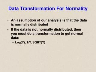
Transformations to Improve Normality (removing skewness) Many statistical methods require that the numeric variables you are working with have an approximately normal distribution. Reality is that this is often times not the case. One of the most common departures from normality is skewness, in particular, right skewness.
Tukey’s Ladder of Powers Left skewed We goupthe ladder to removeleft skewnessanddownthe ladderto removeright skewness. Middle rung: No transformation (l = 1) Right skewed UP . . . . Here V represents our variable of interest. We are going to consider this variable raised to a power l, i.e. Vl Bigger Impact Bigger Impact DOWN . . . .
Tukey’s Ladder of Powers • To remove right skewness we typically take the square root, cube root, logarithm, or reciprocal of a the variable etc., i.e. V .5, V .333, log10(V) (think of V0), V -1, etc. • To remove left skewness we raise the variable to a power greater than 1, such as squaring or cubing the values, i.e. V 2, V 3, etc.
Removing Right Skewness Example 1: PDP-LI levels for cancer patients In the log base 10 scale the PDP-LI values are approximately normally distributed.
sysvol .333 sysvol .5 sysvol log10(sysvol) Removing Right SkewnessExample 2: Systolic Volume for Male Heart Patients 1/sysvol
1/sysvol Removing Right SkewnessExample 2: Systolic Volume for Male Heart Patients The reciprocal of systolic volume is approximately normally distributed and the Shapiro-Wilk test provides no evidence against normality (p = .5340). CAUTION:The use of the reciprocal transformation reorders the data in the sense that the largest value becomes the smallest and the smallest becomes the largest after transformation. The units after transformation may or may not make sense, e.g. if the original units are mg/ml then after transformation they would be ml/mg.