Download
1 / 24
240 likes | 249 Views
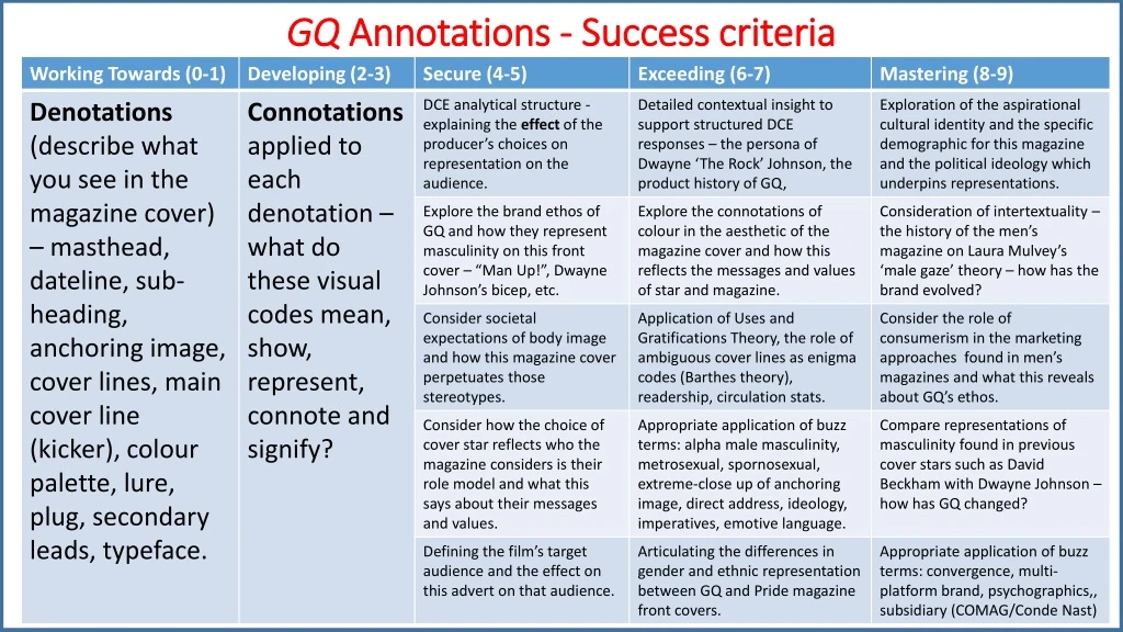
GQ Annotations - Success criteria. The ‘Special Issue! Mind Body & Masculinity’ strapline reinforces the messages and values of the magazine: being a man requires being physically strong and emotionally tough.

E N D
The ‘Special Issue! Mind Body & Masculinity’ strapline reinforces the messages and values of the magazine: being a man requires being physically strong and emotionally tough. The plug ‘Hero Worship’ encourages the reader to view The Rock as a masculine role model to idolise. [LEVEL 7 ANNOTATIONS] The ‘Man Up! How to be a man in 2016’ coverlinereinforces the alpha male masculinity values of the magazine. Previously, GQ has adopted ‘metrosexual’ values but now traditional macho representations are underlined. The GQ (acronym for Gentleman’s Quarterly) masthead features in the top left hand corner of the cover in bold capital red letters. Red has connotations of strength and passion which are emphasised by GQ magazine’s ethos. The dateline ‘July 2016’ signposts the monthly issue as a summer edition. The ‘essential wellness gadgets’ coverline unites technology with fitness so that readers can keep fit in an advanced way (appealing to a male love of gadgets and fitness). The red, white and black aesthetic of the magazine uses bold contrast in order to stand out. The anchoring image of Dwayne ‘The Rock’ Johnson is a striking image where he gives direct address with a stern expression whilst showing off his bulging bicep. The coverline‘Your ideal beach watch’ highlights the importance of fashion to GQ. The fact that its price limit is “under £300” suggests that the magazine is for an upmarket professional audience. The main coverline (kicker) ‘The ROCK!’ is written is large white typography. The exclamation mark enforces how exciting it is to have a ‘World Exclusive’ feature with him. The Rock is Dwayne Johnson’s wrestling alter ego. ‘The Style Manual’ lure is illustrated in a circular graphic to establish that it will be a separate special section in the magazine. The fact that it says it is a ‘rebooted fashion guide’ suggests the GQ is going in a new direction with its fashion advice. The sub-heading ‘How Dwayne Johnson became Hollywood’s most bankable star’ emphasises the capitalist ethos of GQ magazine (due to the focus on marketability). The secondary lead on the ‘Viola Beach tragedy’ suggests that there will be a variety of different articles on various topics within the magazine. The serious subject matter enforces that the audience will care about serious issues as well as fashion, celebrities and macho masculinity. The bull iconography which is used as a stylised exclamation point is a reference to the star’s bull tattoo.
Component 1: Exploring the Media Front Cover of ‘GQ’ – July 2016 [MEDIA LANGUAGE – MEANING]– The overarching theme for this issue appears to surround ideas of masculinity. • The strapline tells us it is a special issue dealing with ‘Mind, Body & Masculinity’. • The extreme close-up of Dwayne Johnson with his huge bicep in the foreground. • The cover line to the right tells the reader to “Man up! How to be a man in 2016”. • If we consider the selection process that takes place when creating a magazine cover, there was clearly a conscious decision to associate ideas of masculinity with physical strength. [SEMIOTIC ANALYSIS] • The red, black and white colour palette used for this cover supports the ideology of power – red is associated with strength and the black emphasises bold strength. • Johnson is giving a direct address to the audience – a common convention of magazines and helps to add to the more personal approach of this format – the intensity of his stare and the lack of a smile suggests how seriously he expects to be taken seriously – just as the readers should with regards to their own bodies. • Johnson’s experience as a professional wrestler earned him the ring name ‘The Rock’ which has connotations of strength and stability. • This name is used prominently across his image with his actual name appearing smaller and below it – perhaps he is more famous as ‘The Rock’ or perhaps the magazine is suggesting that his persona and look are more important than the man beneath. Context[PRODUCT]– Launched in 1931, GQ began its life as a quarterly publication called Gentleman’s Quarterly, aimed specifically at fashion industry insiders. - Its popularity with customers caused its rebranding in 1967 to GQ. • Produced by Conde Nast, today GQ is a multi-platform brand (published in print and on the iPad, as a website, iPhone apps, and an annual event called ‘GQ Men of the Year’. • GQ has an average circulation of around 115,000 and a readership of almost 400,000 through its various platforms. • GQ’s catchphrase is ‘the magazine for men with an IQ’. – the brand is built around more traditional ideas of masculinity.- coverage: executive concerns, targets the serious minded, conservative, older reader – other magazines like Loaded and FHM reach a more laddish audience. [PART 1: STARTING POINTS – MEDIA LANGUAGE][SOCIAL AND CULTURAL CONTEXTS]- In 1994, Mark Simpson (author and journalist) coined the term ‘Metrosexual’ in an article for the Independent newspaper after he attended Britain’s first GQ style exhibition – he said “I had seen the future of masculinity and it was moisturised” – David Beckham popularised the concept of the ‘metrosexual’ making it more socially acceptable for men to openly care about their looks, clothing and skincare regime. • Men’s magazines embraced this through their content and advertising – the primary role of these magazines is to encourage spending amongst its readers. • In 2014, Simpson introduced the term ‘spornosexuals’ – men who are extremely body-focused – who spend all their time at the gym and make their bodies their best accessory – the GQ cover shot (with Johnson’s bicep in the foreground and the rest of the image secondary to it and the coverlines around it support this concept.
Component 1: Exploring the Media Front Cover of ‘GQ’ – July 2016 [PART 2: STARTING POINTS – REPRESENTATION] [HISTORICAL AND POLITICAL CONTEXTS] - African Americans have had a long and complex history in the motion picture industry – start of 20th century – many films depicted black characters with stereotypes: incompetent, hyper-sexualised and/or criminals.- The Civil Rights Movement – push against the status quo – still some way to go.- 2015 – April Reign (Broadway Black managing editor) created the hashtag #OscarSoWhite to bring attention to the Academy’s tendency to overlook performances and achievements by non-white professionals.- 2016 – little had changed – actors/actresses branded the Oscars ‘racist’ and ‘too white’. [REPRESENTATION OF ETHNICITY AND GENDER]- Hugely successful black cover star (Dwayne Johnson is half Samoan and half African-American) as GQ’s dominant image shows that GQ is presenting a role model for its readers – someone to aspire to be like.- Johnson’s Hollywood success might be outside most reader’s possibilities but his work ethic and desire to want to better himself isn’t.- Johnson’s success as a wrestling character – mainstream culture – black actors – always been paid less than their white counterparts and so for Johnson to be considered one of the most bankable Hollywood stars is an achievement and his success is even greater than one first realises – his iconic bicep with its Brahma bull tattoo reinforces the stereotype of men as having to be hyper masculine, strong and muscular. Social, cultural, political – societal expectation of body image and consumerism, image as commodity and ‘Uses and Gratifications Theory’. [MEDIA LANGUAGE - MEANING]– The strapline on the right third of the cover – “Your ideal beach watch. The best for under £300” should be considered when thinking about the magazine’s target audience. • Modern print magazines survive predominantly because of their advertising revenue – they are adept at selling you things you didn’t even know you wanted – a £300 watch specifically for the beach implies a certain level of wealth of the target audience. • Another coverlineadvertises ‘The Style Guide’ – a new section – in today’s competitive society which focuses heavily on aesthetic and where having the right look is perceived as ‘very important’, the reader then begins to think of this magazine as a casual ‘how to’ guide when it comes to being a man. • Newsworthy topic – positioned at the bottom of the page – “the extraordinary truth behind the Viola beach tragedy” – reference to the band ‘Viola Beach’ who all died in a tragic car crash in Sweden – speculation around the crash and this cover line suggests that GQ has the answers – serious journalism juxtaposes entertainment and fashion advice – magazine is broadening its range of offerings for its audience members. [FURTHER INVESTIGATION] • Genre codes and conventions of the magazine cover, layout, use of cover star, house style, mastheads, ever-changing hybridity, journalism features as well as entertainment and fashion advice – magazine is broadening its range of offerings for audience members. • Comparing men’s magazines – FHM – consumerism with images and cover lines that inform men about what they supposedly need – “the essential wellness gadgets” – “your ideal beach watch”. • Cover line – “How Dwayne Johnson became the Hollywood’s most bankable star” – reader understands this to mean that he is a success in Hollywood – he brings in a lot of revenue of film companies – reinforcing capitalist ideology – for a man to be thought of as successful, you must be wealthy and make a lot of money. • Narrative – cover lines on the front cover tease people to want to read certain stories within the magazine (could be linked to Roland Barthes’ enigma codes).
Useful information on GQ • – Launched in 1931, GQ began its life as a quarterly publication called Gentleman’s Quarterly, aimed specifically at fashion industry insiders. • - Its popularity with customers caused its rebranding in 1967 to GQ. • Produced by Conde Nast, today GQ is a multi-platform brand (published in print and on the iPad, as a website, iPhone apps, and an annual event called ‘GQ Men of the Year’. • GQ has an average circulation of around 115,000 and a readership of almost 400,000 through its various platforms. • GQ’s catchphrase is ‘the magazine for men with an IQ’. – the brand is built around more traditional ideas of masculinity.- Coverage: executive concerns, targets the serious minded, conservative, older reader – other magazines like Loaded and FHM reach a more laddish audience.- Men’s magazines embraced this through their content and advertising – the primary role of these magazines is to encourage spending amongst its readers. • GQ have explored representations of the male gender in a variety of issues – metrosexuals (men who groom themselves) and spornosexuals (men obsessed with fitness training) – recently, GQ have moved away from metrosexual representation, focusing on alpha male macho men.
Criticisms of GQ – Sexist representation • According to feminist theory, GQ has a history of objectifying women in its magazine, which promotes a chauvinist attitude towards women (see: Mulvey’s object of the male gaze theory). • Beginning in the 1990s, the magazine pivoted from a near-strict pattern of men-only on the cover to introducing including some female actors, models, and music artists on the cover. • While the men on the covers remained clothed, the photographs of women were mostly shot less than fully clothed. • Present day GQ magazines frequently depict women drastically different than how it depicts men. • Some women are nude not just on the cover but also within the magazine and on the magazine's website. • In fact, the magazine's website has an entire section dedicated to women (but not targeted to women readers). GQ also publishes a yearly list of "Sexiest Women" with accompanying photos. This is in sharp contrast to how men appear on the covers - all four of the "Men of the Year" appeared fully clothed for their covers.
This hyperlink connects the magazine to its official website. Pride is aware of the emerging market for online magazines as well as print media publishing. The strapline ‘Celebrating 24 years at the top!’ highlights how Pride magazine has existed since 1990. Pride is a UK monthly women’s lifestyle magazine primarily targeting women of colour with a readership of 146,000 and is distributed by COMAG (part of Condé Nast). The superimposition of the anchoring image of Naomie Harris over the PRIDE masthead suggests that her star power supersedes the magazine. Also, it shows that the magazine has confidence with their brand reputation that they are not concerned by her head obscuring it. The ‘PRIDE’ masthead is aligned at the top of the cover in bold red font which connotes confidence and passion. ‘The Wig Revolution is Here!’ coverlineseems like a reference to Naomie’s altered hair style in the anchoring image. The politics of hairstyles in Black female communities means there are many different attitudes to Afros, wigs and straightened hair. The dateline (November 2015) and priceline(£3) is linked to the masthead, along with the tagline and hyperlink. These two coverlineshighlight a key value within Pride magazine: feminism. The magazine intends to develop a dialogue between black women about racial and gender identity. There is a challenge against objectification (relating to Mulvey’s theory of the male gaze) and This coverlineshows that the magazine points readers towards the emerging issues of cold, winter months. There are a variety of articles with different purposes. This coverlinetackles a serious societal issue: FGM (Female Genital Mutilation). The fact that Pride is tackling controversial political topics suggests that the magazine will tackle ‘hard news’ as well as fashion, celebrity and ‘soft news’ topics. The coverline‘How Far would you go to be beautiful?’ uses a rhetorical question to pose a challenging question to the reader. Notions of ‘beauty’ are explored in the magazine beyond shallow stereotypes. The main coverline (kicker) of ‘Naomie Harris: Bond and Beyond’ refers to the anchoring image of the celebrity actress. She has been chosen as the cover star because she is seen as an icon and role model within the Black British female community. She plays a Bond girl but the alliterative sub-heading ‘Bond and Beyond’ suggests that she is not defined solely by this franchise and role. She was Oscar nominated for her role in ‘Moonlight’ and has starred in other franchises such as ‘Pirates of the Caribbean’ . This barcode identifies that this is the print version of the magazine. The anchoring image of Naomie Harris features her in an elegant white dress which highlights the length of her torso. She is posing with one hand on her hip (her elbow out), her hair is straightened, she gives direct address and a rye smile to show her confidence. The red, black and white aesthetic of the magazine cover shows how the colour palette is simple and bold. The contrast between typography, background, image, titles and sub-headings is distinctive. [LEVEL 7 ANNOTATIONS]
Component 1: Exploring the Media Front Cover of ‘Pride’ – Nov 2015 [MEDIA LANGUAGE – MEANING]– Title of the magazine, Pride, has connotations of self-respect, self-esteem, dignity and strength – subtext of resistance and affirmation of cultural identity. • Some of the masthead is lost behind the cover star’s head (superimposition) – this suggests her dominance and shows how confident the magazine is that their readers will still recognise their brand, despite not being able to see the whole title.- The strapline is “celebrating 24 years at the top!” – this claim encourages the read to feel part of something despite its ambiguity. The suggestion is that racial pride and confidence is stronger than ever – and that the cultural revolution of the 1960s continues to gain momentum thanks to magazines like ‘Pride’.- The red and black colour palette is used for the cover lines and helps to support the idea of pride - red is associated with pride and strength and black is a strong, bold statement which is perhaps representative of the target audience – women of colour. • The pose used by the cover star, Naomie Harris (hand on her hip) suggests confidence and sass – a photographer’s trick is to lengthen the appearance of the torso (to make her look taller and slimmer) to accentuate her beauty as an aspiration for the target audience. • Harris is giving a direct address to the audience – a common convention of magazines which helps to add to the personal approach of the format. Context[PRODUCT]– Pride is a UK monthly women’s lifestyle magazine primarily targeting women of colour.- Publication since 1990 – circulation of 300,000 copies per month and a readership of 146,000.- Pride is distributed in the UK by COMAG (part of Condé Nast).- It is easy to see how people often mistake Pride for an LGBTQ+ magazine as the term ‘pride’ has become synonymous with the gay community over recent decades.- In fact, the modern gay movement has its roots in the black liberation movement of the 1960s as Gay Pride borrowed its name from Black Pride.[SOCIAL/CULTURAL]- 1950s/60s – women’s magazines moved away from articles on homemaking and moved towards articles on beauty. - Fashion also moved up the agenda – less about how to make it and more about how to wear it. - Consumption was at the top of the agenda – less about how to make and more about how to wear. - Readers reminded they should look/feel the best they could and the best way to achieve a ‘look’ was cosmetics and hair care (often advertised within the magazine’s pages) which remains its ethos. - The ‘Uses and Gratifications Model’ suggests that audiences interact with texts for different reasons (information, personal identity, social interaction and entertainment) – personal identity is arguably the main one in relation to the appeal of ‘Pride’ to its readership – the USP is that it is the only black media company that remains in black British ownership.
[MEDIA LANGUAGE – MESSAGES AND VALUES]– Many of the cover lines focus on body image reminding readers that they could and should look better, and that they will be judged on their appearance. - One cover line reference Female Genital Mutilation (but only uses the acronym FGM). – there’s an assumption that the reader will understand this and so have a certain level of understanding. – the acronym also has a euphemistic quality meaning that the harrowing message regarding a controversial topic doesn’t become over-bearing (it is an example of serious investigative journalism amongst the more light-hearted and fashion-based messages amongst the content). - it is also a compliment to the maturity of the readership – that they can handle such topics and are educated enough to engage with it. - Harris cover line, “Bond and Beyond”, suggests that her role as Eve Moneypenny in the Bond film was a defining role for her and her career has continued to improve ever since - She has been in other blockbuster franchise such as Pirates of the Caribbean and has since starring in the Oscar-winning drama Moonlight). - Her role as a ‘Bond girl’ has associations with beauty, femininity andovert sexuality. [FURTHER INVESTIGATION] • Genre codes and conventions of magazine covers, layout, use of cover star, house style, mastheads, hybridity of magazine development. • Narrative – cover lines on the front cover give enigma codes about content within the magazine (a teaser). • Function of magazines – “to provide readers with a sense of community, comfort and pride in this mythic feminine identity” (Media Semiotics, Bignell, 1997, p61). - magazines promote a “feminine culture” and “define and shape the woman’s world” (Feminism and Youth Culture, McRobbie, 2000, p69) • Theoretical perspectives on representation (Stuart Hall) – stereotyping, selection and the magazine’s subversion from typical representations of ethnicity and gender and the unintentional reinforcing of them. • The role of the image as a commodity and the decision to tackle FGM seriously. Component 1: Exploring the Media Front Cover of ‘Pride’ – Nov 2015 [PART 2 – STARTING POINTS - REPRESENTATION] • Support for ‘Black Lives Matter’ which campaigns against violence and systematic racism towards black people - movement started in 2013 with hashtag #blacklivesmatter after the controversial acquittal of George Zimmerman in the shooting of Trayvon Martin. - now internationally recognised (social media and street demonstration which grows after examples of police brutality and unjust deaths of black people. • The dominance of this movement on social media may have something to do with the huge number of Twitter followers and Facebook likes Pride magazine now has. - According to their website, they have 300% more followers and likes than any other title in the ethnic market. [HISTORICAL AND POLITICAL CONTEXT] - 1960s Civil Rights Movement – Black Pride was a response to dominant white cultures and ideologies that encouraged celebration of black culture and embracing African heritage. - the Afro hairstyle – associated with everything natural – came to symbolise Black Pride and Power – in contrast to the artificial hairstyles of those wearing wigs or having relaxed hair (both of which were seen as pandering to European notions of beauty). - this text has a cover line which references ‘the wig revolution’ and Harris has straight hair rather than her natural curls. - does this relate to the consumerist context of the magazine – which is filled with hair care products such as relaxers and photos of black women with long, flowing, straightened hair. [REPRESENTATION OF ETHNICITY AND GENDER] - Cover star – successful, Black, British – role model for readers, from their community.- Harris was raised in a single-parent household and came from a working class background.- Magazine declares itself “the fact of this new young, Black Britain; outgoing, confident and ambitious whilst still maintaining pride in their culture and origins – Harris epitomises this.
The ‘PRIDEMAGAZINE.COM’ hyperlink features above the masthead as a web address which highlights the magazine’s modern appeal and for readers to access for additional content or an online version of the magazine. It shows that there are multiple methods of accessing magazine content. EXAMPLE ANSWER The strapline ‘Celebrating 26 years at the top!’ features on the top left above the masthead. This reinforces the magazine’s long-term success as a leading representative for Black British women. Readers are reassured by the magazine’s proven track record, which makes it more appealing. The PRIDE masthead is positioned at the top of the page, written in turquoise uppercase text. The masthead suggests that the magazine has a sense of confidence in its identity. The effect on the reader is identification and inclusion, particular for the magazine’s target audience: Black British women. The dateline ‘November 2017’ shows that this is a recent issue and the ‘£3’ pricelinealso illustrates that this is an affordable magazine for its target audience. ‘The Cost of Standing Up To Racism’ coverline in blue uppercase font represents one of the magazine’s key values: pride in racial identity and rebuking racism. The effect on the reader is to challenge them to respond actively to a major issue in society. ‘Confessions of a Black Actress’ coverlinereinforces the magazines two main themes: racial and gender identity. The audience will enjoy the personal nature of these articles, highlighted by the term ‘Confessions’. The direct address black and white photography anchoring image of Naomi Campbell features her looking over her shoulder wearing a fur coat with her hair pulled back shows a confident Black British celebrity (fashion model) who acts as a role model for the target audience. PRIDE intend to celebrate Campbell’s success and show her as an example of what readers can also achieve. The ‘101 ways to Stand Up and Be Heard’ coverlineemphasises a key idea for the magazine: pride, self-esteem, confidence and courage. The quantity of ideas will appeal to readers who can appreciate the amount of options they have to make an impact. The coverline ‘How healthy is your makeup bag?’. shows that the magazine wishes to cater for fashion and beauty enthusiasts and encourage further consumerism.It challenges readers to self-evaluate. The coverline: ‘Hair: Liven up your winter with colour’ (which is written in white and orange cursive font) highlights the magazine’s interest in fashion and beauty. It shows that PRIDE realises that its target audience are interested in hairstyles, and provides them with ideas in order to encourage diverse creativity with fashion. The main coverline ‘Naomi speaks out’ is written in gold cursive font and shows that the magazine wants to give the fashion icon a platform to share what matters to her.It encourages readers to find platforms themselves as Naomi and the magazine clearly want to empower other black British women. The bar code features on the bottom right of the page. This shows that this version of the magazine is the print edition. This magazine has a readership of 250,000 every year which shows it is popular. The sub-heading ‘on diversity, acting and being herself’ highlights how the magazine is interested in the star’s response to her racial identity, what it is like to be a celebrity and how to remain authentic in such a competitive world. The reader will appreciate the down-to-earth approach of the magazine which hopes to reveal the real Naomi behind the media persona. Extended analysis: C&C design, the magazine’s ideology, the overall aesthetic, social/historical context of the magazine, the impact of its representations, industry information.
How and why are women presented differently on GLAMOUR and PRIDE front covers?
Compare and contrast front covers in table form. List 5 reasons in each box. Similarities: Both focus on fashion, beauty, relationships, icons to admire, and use a C&C cover design with a direct address anchoring image. Differences: The main difference would be regarding representations of racial identity.
Challenging stereotypes Successful, powerful, wise, patient, intelligent leader Angry, irrational, impulsive, immature, unwise, tyrant Challenge to patriarchy and white supremacy
Gender representation Alpha Dominant, outgoing, strong, powerful, confident, elite, cold, competitive, bossy, aggressive Beta Sensitive, quirky, geeky, collaborative, empathic, idiosyncratic, sometimes neurotic Omega Neurotic, lazy, dysfunctional, nerdy, eccentric, unsuccessful, heart of gold, funny, rough diamond
Generation Types • Gen Z, iGen, or Centennials: Born 1996 and later. • Millennials or Gen Y: Born 1977 to 1995. • Generation X: Born 1965 to 1976. • Baby Boomers: Born 1946 to 1964. Traditionalists or Silent Generation: Born before 1946.
Demographics NRS SOCIAL GRADE
CONTROL dictate NATIONALISMstate focused AUTHORITARIANanti-freedom NATIONALCOMMUNISM FASCISM NATIONALISM TOTALITARIANISM NATIONALISTICSOCIALISM FUNDAMENTALISM TRADITIONALISM COMMUNISM REPRESENTATIONIdeology AUTHORIT-ARIANISM STATISM CONSERVATISM SOCIALISM NEOLIBERALISM Right LEFt SOCIAL DEMOCRACY COMMUNITARIANwelfare of the people ECONOMY TARIANwelfare of the economy LIBERALISM PROGRESSIVISM DEMOCRATICSOCIALISM LIBERTARIANCAPITALISM LIBERTARIANSOCIALISM LIBERTARIANISM ACTIVISM ANARCHO-COMMUNISM ANARCHO-CAPITALISM ANARCHO-SOCIALISM INDIVIDUALISM SYNDICALISM MUTUALISM ANARCHO-COLLECTIVISM ANARCHISM LIBERTARIANfreedom of the individual CHAOISManti state CONNECT relate