Download

1 / 14
140 likes | 251 Views
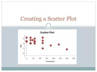
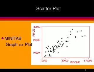
Creating a Scatter Plot . On a Mac. Data in Excel Spreadsheet. Insert the variable you want on the x-axis in the left column Insert the variable you want on the y-axis in the right column. Create the Chart. Highlight both variables, TV and GPA Charts Scatter Marked Scatter.

E N D
Creating a Scatter Plot On a Mac
Data in Excel Spreadsheet • Insert the variable you want on the x-axis in the left column • Insert the variable you want on the y-axis in the right column
Create the Chart • Highlight both variables, TV and GPA • Charts Scatter Marked Scatter
Add Axis Titles • Chart Layout Axis Title • Horizontal Axis Below Axis “TV (minutes)” • Vertical Axis Rotated Title “GPA”
Delete Gridlines • Chart Layout Gridlines Horizontal Gridlines None
Chart Title • Chart Layout Chart Title Above Chart
Change Colors • Click on any point in the scatter plot • Format Fill Choose color
Legend • Chart Layout Legend No legend
Add a Trendline • Chart layout trendline linear trend
Add the Equation of the Line • Chart Layout trendlinetrendline options • Click on options • Check display equation of the line
Add r-squared value • Chart Layout trendlinetrendline options • Click on options • Check display r-squared value
Line Color, Weight, etc. • Chart Layout TrendlineTrendline Options • Click on Line change color • Click on weights make thicker