Download
1 / 19
190 likes | 410 Views
Poster Design. Kira Jones Oral Communication Instructor KiraSJones@gmail.com. Poster Design. How do you make the visual elements of your document get your message across? The visual presentation of a text affects our opinion about the topic and the person who created the text.

E N D
Poster Design Kira Jones Oral Communication Instructor KiraSJones@gmail.com
Poster Design • How do you make the visual elements of your document get your message across? • The visual presentation of a text affects our opinion about the topic and the person who created the text.
Poster Design • The First thing we notice about visual texts is how they look. • The Second, we notice if the message is accessible and easy to understand. • Third, we might actually read the text if we are still interested.
Poster Design • Creators of visual texts must consider the PURPOSE for which they are produced, the AUDIENCE for which they are intended, and the CONTEXT in which they will be seen. • The purpose of the visual elements of a document is to aid in clearly presenting the message.
Poster Design • Effective visual presentation of texts basically comes about because of attractive and easy to read • FONTS, • ARRANGEMENT AND BALANCE, • CONTRAST, • And if COLOR is used, pleasing color combinations.
Fonts • Serif fonts • such as Times New Roman or Garamond look business-like. • Those which are not too pleasing to the eye are courier and STENCIL.
Fonts • San Serif fonts • A san serif font has clean lines that can reduce clutter in a document, especially documents that are complex. • This font is often considered less formal. • EX: Arial Black, Comic Sans • Yet, they are often used in heading and titles that need to be read quickly.
Fonts • Regardless the font that is chosen for your poster, it should be consistently used throughout the document. • 2-3 fonts may be used, but more than three can become confusing.
Fonts • Font size and conventions such as bold, Underline, or Italics can make important parts of the message stand out.
Font Size 12pt Font 14pt Font 16 pt Font 18pt Font 20 pt Font 24pt Font 32 pt Font
Font Size • When choosing a font size, remember: • your audience should be able to read your poster from 6-12 feet away. • Use a larger font size (NOT 12pt) under pictures/graphs.
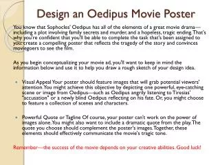
Format for Poster Four Examples
Arrangement and Balance • Information can be condensed into shorter sentences, bulleted, and/or numbered. • Information should build logically to a conclusion, moving left to right and from top to bottom. • Remember: • Units of text don’t carry the visual weight that graphics and charts do. SPACING IS KEY.
Headings and “Captions” • Headings • Use creative headings that draw your audience in. • If possible move away from traditional headings such as: Abstract, Introduction, Methods, Results.
Headings and “Captions” • “Captions” • Thinks of your accompanying text as a “newspaper caption.” More people look at photos/visual images and read the caption, than read large bodies of text. • Captions should state what the figure is and also draw a small conclusion from each figure.
Contrast/Color Combinations • Background Colors • Darker/cooler text on lighter/warmer backgrounds are easier to read • But lighter/warmer text on Darker/cooler may create a richer effect. • Avoid busy backgrounds! • Darker (black, dark blue, dark green) or more intense colors (red, fuchsia, royal blue) weigh more than lighter colors (pale yellow, light blue, light green, white). • Important when choosing titles, headings, graphics and backgrounds.
Contrast/Color Combinations • Pleasing combinations • Light tan background, dark gray text, dark red highlights. • Dark blue background, white text, light yellow highlights. • Light yellow background, dark blue text, dark orange highlights. • Dark green background, white text, gold highlights.
Printer Instructions • Refer to handout (can also be found online).