Download

1 / 87
870 likes | 897 Views
CHAPTER 11 CONTENT PANELS. Content panels let you showcase extra information in a limited amount of space. Accordions feature titles which, when clicked, expand to show a larger panel of content.

E N D
Content panels let you showcase extra information in a limited amount of space.
Accordions feature titles which, when clicked, expand to show a larger panel of content.
Tabbed panels automatically show one panel, but when you click on another tab, switch to showing a different panel.
Modal windows (or ‘lightboxes') display a hidden panel on top of the page content when their links are activated.
Photo viewers display different images within the same space when the user clicks on the thumbnails.
Sliders show multiple panels of content that slide into view as the user navigates between them.
When creating content panels, remember to maintain a separation of concerns:Content in HTML filePresentation in CSS rulesBehaviors in JavaScript
It is also important to keep your code accessible:If users can interact with an element, use <a> or a button.Make sure content is available if JavaScript is disabled.
When the user clicks on a label, an anonymous function gets the label the user clicked on. It selects the panel after it and either shows or hides it.
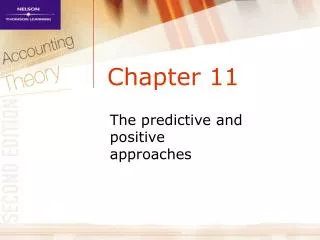
ACCORDIAN WITH ALL PANELS COLLAPSED LABEL 1 LABEL 2 LABEL 3
ACCORDIAN WITH FIRST PANEL EXPANDED LABEL 1 CONTENT 1 LABEL 2 LABEL 3
ACCORDIAN WITH SECOND PANEL EXPANDED LABEL 1 LABEL 2 CONTENT 2 LABEL 3
ACCORDIAN WITH THIRD PANEL EXPANDED LABEL 1 LABEL 2 LABEL 3 CONTENT 3
jQuery’s show(), hide(), and toggle() methods animate the showing and hiding of elements.They also calculate the size of the box including its content and any margins and padding.
BOX PADDING BORDER MARGIN BOX HEIGHT
HTML specifies the structure:<ul class=“accordion”> <li> <button class=“accordion-control”>Label 1 </button> <div class=“accordion-panel”><!-- Content goes here --> </div> </li></ul>
jQuery handles the click event:$(‘.accordion’).on(‘click’, ‘accordion-control’, function(e) { e.preventDefault(); $(this) .next(‘.accordion-panel’) .not(‘animated’) .slideToggle();});
The default action of the link is stopped:$(‘.accordion’).on(‘click’, ‘accordion-control’, function(e) { e.preventDefault(); $(this) .next(‘.accordion-panel’) .not(‘animated’) .slideToggle();});
Open or close panels:$(‘.accordion’).on(‘click’, ‘accordion-control’, function(e) { e.preventDefault(); $(this) .next(‘.accordion-panel’) .not(‘animated’) .slideToggle();});
Tabs have a similar concept but only one panel is shown at a time.
FIRST TAB SELECTED TAB 1 TAB 2 TAB 3 CONTENT 1
SECOND TAB SELECTED TAB 1 TAB 2 TAB 3 CONTENT 2
THIRD TAB SELECTED TAB 1 TAB 2 TAB 3 CONTENT 3
HTML specifies the structure. Here are the tabs:<ul class=“tab-list”> <li class=“active”> <a class=“tab-control” href=“#tab1”>Tab 1</a> </li> <li> <a class=“tab-control” href=“#tab2”>Tab 2</a> </li> <li> <a class=“tab-control” href=“#tab3”>Tab 3</a> </li></ul>
The panels follow the tabs:<div class=“tab-panel active” id=“tab-1”> <!-- Content for the first panel goes here --></div><div class=“tab-panel” id=“tab-2”> <!-- Content for the second panel goes here --></div><div class=“tab-panel” id=“tab-3”> <!-- Content for the third panel goes here --></div>
CSS hides all of the panels except for the active one:.tab-panel { display: none;}.tab-panel.active { display: block;}
The same code is run for each set of tabs:$(‘.tab-list').each(function() { // Find lists of tabs var $this = $(this), // Store this list var $tab = $this.find('li.active'), // Get the active li var $link = $tab.find('a'), // Get its link var $panel = $($link.attr('href')); // Get active panel $this.on('click', '.tab-control', function(e) { // Click tab e.preventDefault(); // Prevent link var $link = $(this); // Store current link var id = this.hash; // Get clicked tab if (id && !$link.is('.active')) { // If not active $panel.removeClass('active'); // Make panel and $tab.removeClass('active'); // tab inactive $panel = $(id).addClass('active'); // Make new panel and $tab = $link.parent().addClass(‘active'); // tab active } });});
The variables are set:$(‘.tab-list').each(function() { // Find lists of tabs var $this = $(this), // Store this list var $tab = $this.find('li.active'), // Get the active li var $link = $tab.find('a'), // Get its link var $panel = $($link.attr('href')); // Get active panel $this.on('click', '.tab-control', function(e) { // Click tab e.preventDefault(); // Prevent link var $link = $(this); // Store current link var id = this.hash; // Get clicked tab if (id && !$link.is('.active')) { // If not active $panel.removeClass('active'); // Make panel and $tab.removeClass('active'); // tab inactive $panel = $(id).addClass('active'); // Make new panel and $tab = $link.parent().addClass(‘active'); // tab active } });});
The default action of the links are stopped:$(‘.tab-list').each(function() { // Find lists of tabs var $this = $(this), // Store this list var $tab = $this.find('li.active'), // Get the active li var $link = $tab.find('a'), // Get its link var $panel = $($link.attr('href')); // Get active panel $this.on('click', '.tab-control', function(e) { // Click tab e.preventDefault(); // Prevent link var $link = $(this); // Store current link var id = this.hash; // Get clicked tab if (id && !$link.is('.active')) { // If not active $panel.removeClass('active'); // Make panel and $tab.removeClass('active'); // tab inactive $panel = $(id).addClass('active'); // Make new panel and $tab = $link.parent().addClass(‘active'); // tab active } });});
The panels are shown or hidden:$(‘.tab-list').each(function() { // Find lists of tabs var $this = $(this), // Store this list var $tab = $this.find('li.active'), // Get the active li var $link = $tab.find('a'), // Get its link var $panel = $($link.attr('href')); // Get active panel $this.on('click', '.tab-control', function(e) { // Click tab e.preventDefault(); // Prevent link var $link = $(this); // Store current link var id = this.hash; // Get clicked tab if (id && !$link.is('.active')) { // If not active $panel.removeClass('active'); // Make panel and $tab.removeClass('active'); // tab inactive $panel = $(id).addClass('active'); // Make new panel and $tab = $link.parent().addClass(‘active'); // tab active } });});
A modal window is content that appears “in front” of the rest of the page.It must be closed before the rest of the page can be interacted with.
PAGE CONTENT BUTTON USED TO OPEN MODAL WINDOW
PAGE CONTENT MODAL CONTENT APPEARS ON TOP OF PAGE CLOSE BUTTON USED TO OPEN MODAL WINDOW
HTML specifies the structure:<div class=“modal”> <div class=“modal-content”> <!- - Content goes here - -> <button class=“modal-close”>close</button> </div></div>
CSS positions the modal on top of all of the other content:.modal { position: absolute; z-index: 1000;}
The JavaScript to create a modal window runs when the page loads.
Opening the modal window:(function() { // Remove modal content from page and store in $content var $content = $('#share-options').detach(); // Click handler calls open() method of modal object $('#share').on('click', function() { modal.open({content: $content, width:340, height:300}); });}());
The modal object is a custom object. It is created in another script and can be used on any page of the site.
The modal object’s methods:open()open modal windowclose()close modal windowcenter()center modal window on pagePeople who use the script to create a modal window only need to know how to call the open() method because the other methods are used by the script.
The modal object starts with variables only available within the object. They create the modal window and its close button:var modal = (function() { var $window = $(window), var $modal = $('<div class="modal"/>'), var $content = $('<div class=“modal-content"/>'), var $close = $('<button role=“button” class=“modal-close">close</button>'); $modal.append($content, $close);}
If the user clicks on the close button, an event handler will close the modal window by calling the close() method:$close.on('click', function(e) { e.preventDefault(); modal.close(); });