Download
1 / 19
190 likes | 303 Views
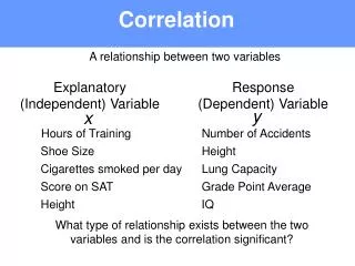
Correlation . The apparent relation between two variables . . Trend . A pattern of average behaviour that occurs over time. Which of the scatter plots indicate the strongest trends?. Which of the scatter plots do not indicate a trend?.

E N D
Correlation The apparent relation between two variables.
Trend • A pattern of average behaviour that occurs over time
If a line of best fit were drawn on each of the scatter plots that show a trend, describe the slope of each line.
Which do you think show strong positive correlation and which shows strong negative correlation?
Make your own scatter plot and examine the trends • http://staff.argyll.epsb.ca/jreed/math9/strand4/scatterPlot.htm
Correlation Coefficient , r • A number from +1 to -1 that gives the strength and direction of the relationship between two variables.
Positive Correlation • If there is a positive correlation, the coefficient is a number between 0 and 1. If there is no relationship between the predicted values and the actual values the correlation coefficient is 0 or very low (the predicted values are no better than random numbers). As the strength of the relationship between the predicted values and actual values increases so does the correlation coefficient. A perfect fit gives a coefficient of 1.0. Thus the higher the correlation coefficient the better.
Negative Correlation • If there is a negative correlation, the coefficient is a number between 0 and -1. If there is no relationship between the predicted values and the actual values the correlation coefficient is 0 or very low (the predicted values are no better than random numbers). As the strength of the relationship between the predicted values and actual values increases so does the correlation coefficient. A perfect fit gives a coefficient of -1.0. Thus the higher the correlation coefficient the better.
Coefficient of Determination, r2 • A number from 0 to +1 that gives the relative strength of the relationship between two variables. • If r2 = 0.44, this means 44% of the variation of the dependent variable is due to variation in the independent variable.
Example • r=.9 • This means there is a strong positive correlation. • Calculate r2 and explain what it means.
Residual Plot Residual Value – the vertical distance between a data point and the line of best fit
To do: Make a scatter plot using Open Calc for the data below • Enter data for x vertically in Column 1 • Enter data for y vertically in Column 2 • Highlight data and click INSERT and then CHART • Select XY(Scatter) to get a scatter plot • Click, NEXT, NEXT, FINISH
To do: Make a line of best fit using Open Calc for the data below • Highlight the graph • Click INSERT, TREND LINE • Choose LINEAR • Click SHOW EQUATION and SHOW COEFFICENT before pressing OK • What is the equation? • What is R2 • What does R2 tell you about the correlation
To do: Make a scatter plot using Open Calc for the data below • Enter data for x vertically in Column 1 • Enter data for y vertically in Column 2 • Highlight data and click INSERT and then CHART • Select XY(Scatter) to get a scatter plot • Click, NEXT, NEXT, FINISH
To do: Make a scatter plot using Open Calc for the data below • Highlight the graph • Click INSERT, TREND LINE • Choose LINEAR • Click SHOW EQUATION and SHOW COEFFICENT before pressing OK • What is the equation? • What is R2 • What does R2 tell you about the correlation
Compare Graph 1 and 2 • Which one of your two graphs show stronger correlation? How can you tell???