Download
1 / 46
490 likes | 672 Views
7 QC Tools are simple statistical tools used for problem solving. Nilesh Arora presented basics of 7 QC Tool training and details about Pareto Diagram.

E N D
“TQM / 7 QC Tools” by Best Performing Consulting Organization AddingValueInTotality!!
Introduction • The 7 QC Tools are simple statistical tools used for problem solving • Inspired after seven famous weapons of Benkei. Viz • Masakari-Broad Axe • Kumade- Rake • Nagihama - Sickle weapon • hizuchi- Wooden mallet • Nokogiri- Saw • Tetsubo- iron staff • sasumata- Half moon spear • It was possibly introduced by Kaoru Ishikawa who in turn was influenced by a series of lectures W. Edwards Deming had given to Japanese engineers and scientists in 1950
Conti… • “The term “7 tools for QC” is named after the 7 tools of the famous warrior,Benkei. Benkei owned 7 weapons, which he used to win all his battles. Similarly, from my own experience, you will find that you will be able to solve 95% of the problems around you if you wisely use the 7 tools of QC.” - ISHIKAWA KAORU, Professor Emeritus, University of Tokyo • These tools have been the foundation of Japan's astonishing industrial resurgence after the second world war.
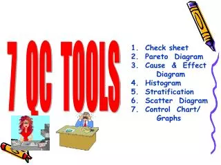
Basic QC Tools • The following are the 7 QC Tools : 1.Pareto Diagram 2.Cause & Effect Diagram 3.Histogram 4.Control Charts 5.Scatter Diagrams 6.Flowchart 7.Check Sheets
Pareto Diagram 1/2 • Origin of the tool lies in the observation by an Italian economist Vilfredo Pareto that a large portion of wealth was in the hands of a few people. • Dr.Juransuggested the use of this principle to quality control for separating the "vital few" problems from the "useful many". • Also referred as 80/20 rule viz your 80% of problems are due to 20% of cause. • It is used in the field of materials management for ABC analysis. 20% of the items purchased by a company account for 80% of the value. These constitute the A items on which maximum attention is paid • It works on cumulative frequency and shows how few items exert maximum influence
Pareto Diagram 2/2 For E.g • 80 % of sales revenue is earned by 20% of firm’s products • 20 % of the items in a factory Store may account for 80 % of the volume of items issued • 80 % of defects are caused by 20% of the possible defects type • Also used in conjunction with Brainstorming, Cause and Effect Analysis and Cumulative Line Chart. The Diagram displays, in decreasing order, the relative contribution of each cause or problem to the total • The relative contribution can be based on the number of occurrences, the quality damage or the cost associated with each cause or problem
Pareto Diagram No. of Defects Types of Defects
Cause & Effect Diagram 1/2 • It is called Fish-Bone Diagram due to the shape of the completed structure. • This was proposed by Kaoru Ishikawa in the 1960s,hence also referred as Ishikawa Diagram • The Ishikawa diagram shows the causes of a certain event. A common use of the Ishikawa diagram is in product design, to identify potential factors causing an overall effect • It shows the relation between a quality characteristics and factors • Causes in the diagram are often based on a certain set of causes, such as the 5M+1E,8 P's or 4 S's • Cause-and-effect diagrams can reveal key relationships among various variables, and the possible causes provide additional insight into process behaviour.
Cause & Effect Diagram 2/2 • Causes in a typical diagram are normally grouped into categories, the main ones of which are: • The 5M+1E- recommended for the manufacturing industry Machine, Method, Materials, Measurement, Men and Environment • The 8 P's - recommended for the administration and service industries Price, Promotion, People, Processes, Place / Plant, Policies, Procedures, and Product (or Service) • The 4 S's - recommended for the service industry Surroundings, Suppliers, Systems, Skills • Causes should be specific, measurable, and controllable derived from brainstorming sessions. Then causes should be sorted through affinity-grouping to collect similar ideas together. These groups should then be labeled as categories of the fishbone.
Procedure for making C&E diagram • STEP 1: • Determine the Pain point/ characteristic • STEP 2: • Draw in the backbone from left to right, and enclose the characteristic in a square • Next, write the primary causes which affect the characteristics as big bones also enclosed by squares • STEP 3: • Write the causes (Secondary Causes) which affect the big bones (Primary Causes) as medium sized bones • Write the causes (Territory Causes) which affect the medium sized bones as small bones.
Conti… • STEP 4: • Assign an importance to each factor, and mark the particularly important factors that seem to have a significant effect on the quality characteristics. • STEP 5: • Record any necessary information
Histogram 1/2 • Histogram is a graphical technique to represent dispersion of data • Ideallyit will have symmetrical shape tapering away on both sides from target value • For E.g • Production from same production line usually differs slightly in dimensions, hardness, or others qualities • when we commute to work every day, the time required varies from one day to other Thus , Histogram can be used to • To find out if the lot has acceptance dispersion • To compare with target value and specification limits to identify special causes of variation
Histogram 2/2 • Histogram is a graph that represents the class frequencies by vertical adjacent rectangles in a frequency distribution. • In a histogram, the magnitude of the class interval is plotted along the horizontal axis and the frequency on the vertical axis • Since each class has lower and upper values, hence two equal vertical lines represent the frequency. • Upper ends of the two lines representing the class interval are joined together. The height of rectangle thus obtained are proportional to their frequencies.
Methodology for drawing Histogram 2 1 How to calculate frequency in Excel Select the cell Go to Formulas/More Functions/ Statistical/Frequency Select the Data & Bin limits You will have the frequency 5. Select the cell range of FREQ equal to BIN LIMITS 6. Go to Formula Bar in Excel and press ctrl+shift+enter 7. You will have FREQ for defined range
HISTOGRAM 3. Draw the Bar graph and set the limits. You will have a histogram Almost a TWIN PEAK Case
Types of histograms E. Plateau Type F. Twin-peak Type G. Comb Type B. Isolated-peak Type • General Type D. Left hand precipice type C. Positively skew Type
Control Charts 1/2 • Variability is inherent in all manufacturing processes. These variations may be due to two causes : i. Random / Chance causes (un-preventable) ii. Assignable causes (preventable) • Control charts was developed by Dr. Walter A. Shewhartduring 1920's while he was with Bell Telephone Laboratories. • These charts separate out assignable causes. • Control chart makes possible the diagnosis and correction of many production troubles and brings substantial improvements in the quality of the products and reduction of spoilage and rework. • It tells us when to leave a process alone as well as when to take action to correct trouble
Control Charts 2/2 • Control chart is a chart to examine whether a process is in a stable condition. • The control limits are drawn for the process characteristics to be controlled. • Data is of two types : • Variable - measured and expressed quantitatively • Attribute - qualitative • The elements of a control chart - Mean is the average of a sub-group R - Range is the difference between the minimum and maximum in a sub-group 1. CL - Center line: This is the expected mean of the process 2. UCL - Upper Control Limit and 3. LCL - Lower Control Limit These are limit to maximum expected variation of the process.
Sample Statistics 1 2 3 4 5 Sample Number Control Chart Upper control line Upper warning line Target Lower warning line Lower control line Lower control line
Interpreting Control Chart One point outside control limit UCL UWL Statistics LWL LCL 1 2 3 4 5 6 7 8 Sample Number
Interpreting Control Chart Two points out of three consecutive points between warning limit and corresponding control limit UCL UWL Statistics LWL LCL Sample Number 1 2 3 4 5 6 7 8
Interpreting Control Chart Two consecutive points between warning limit and corresponding control limit UCL UWL Statistics LWL LCL Sample Number 1 2 3 4 5 6 7 8
Interpreting Control Chart Seven consecutive points on one side of the centre line UCL UWL Statistics LWL LCL 1 2 3 4 5 6 7 8 Sample Number
Interpreting Control Chart Seven consecutive points having upward trend UCL UWL Statistics LWL LCL 1 2 3 4 5 6 7 8 Sample Number
Interpreting Control Chart Seven consecutive points having downward trend UCL UWL Statistics LWL LCL 1 2 3 4 5 6 7 8 Sample Number
Scatter Diagram 1/2 • A relationship may or may not exist between two variables • If a relationship exists, it may be positive or negative, it may be strong or weak and may be simple or complex • A tool to study the relationship between two variables is known as Scatter Diagram • Examples: • The relationship between moisture content in threads and elongation. • The relationship between an Ingredient and Product Hardness. • The relationship between cutting speed and variations in the length of parts.
Scatter Diagram 2/2 • The method consists of plotting the two series on a graph and fitting a Line of Best Fit free hand • The direction of line shows the extent of correlation. If the line goes upward from left to right, it means the correlation is positive. • If the line goes downward from left to right, it means the correlation is negative. • If the points on the plot are scattered largely, it shows little or no correlation. • Although Scatter Diagrams are very convenient tools for asserting two-way relationships, they don’t provide formal measures of these relationships. • Scatter Diagrams also don’t provide any means of establishing whether any apparent associations are actually due to chance or not.
How to draw scatter diagram 2 1 Select the Sales & Profit column and insert a Scatter chart Add the axis label & Trend line 3 Strong Positive correlation
Various plot patterns of scatter diagrams Y Y Y X X X Positive correlation may be present No correlation Positive correlation Y Y Y X X X Negative correlation present Negative correlation may be present Strong Curvilinear Association
Flow chart 1/2 Purpose: Visual illustration of the sequence of operations required to complete a task • To develop understanding of how a process is done • To study a process for improvement • To communicate to others how a process is done • When better communication is needed between people involved with the same process • To document a process • When planning a project Benefits: • Identify process improvements • Understand the process • Shows duplicated effort and other non-value-added steps • Clarify working relationships between people and organizations • Target specific steps in the process for improvement.
Flow chart 1/2 Benefits • Show what actually happens at each step in the process • Show what happens when non-standard events occur • Graphically display processes to identify redundancies and other wasted effort How is it done? • Write the process step inside each symbol • Connect the Symbols with arrows showing the direction of flow Toolbox
Check sheet WHAT IS A CHECK SHEET ? A Check Sheet is a method for collecting the right data in a simple manner. Classification of check sheets according to functions: • Recording check sheet (A) Defective Item Check Sheet (B) Defective Cause Check Sheet (C) Production process distribution Check Sheet 2. Inspection Check sheet (A) Check up Confirmation Check Sheet (B) Evaluation item inspection Check Sheet
How to make check sheet • Clearly indicate the purpose of the data collection • Decide on how to collect data • Estimate the total quantum of data • Decide on the Check Sheet form • Enter the data and draw up the Check Sheet. • Check if it meet the objectives. Is it easy to record? If there are any improvement points, freely amend it. • Reading and using the check sheet: • Read the whole picture • To see the time series of time, day and month • Tie-up the use of other tools
Recording check sheet 1/2 1. Defective Item Check Sheet for a motor
3. Production process distribution Check Sheet Recording check sheet 2/2 2. Defective Cause Check Sheet
1. Check up Confirmation Check Sheet 2. Evaluation item inspection Check Sheet Inspection Check sheet
ADDVALUE Services VALUE ADDED COACHING-VAC® BUSINESS COACHING LIFE COACHING Operation Excellence Counselling Team Excellence Therapy AddingValueInTotality!! Business Excellence Astrology
AddValue at a glance Best Performing Consulting Organization Business Coaching Life Coaching