Download
1 / 73
1.05k likes | 1.64k Views
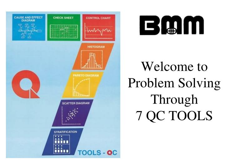
Welcome to Problem Solving Through 7 QC TOOLS. 7 QC Tools. Pareto Diagram Cause & Effect Diagram Graphs Check Sheet / Check List Scatter Diagram Histograms Control Charts. TOOLS.

E N D
7 QC Tools • Pareto Diagram • Cause & Effect Diagram • Graphs • Check Sheet / Check List • Scatter Diagram • Histograms • Control Charts TOOLS
“The term “7 tools for QC” is named after the 7 tools of the famous warrior, Benkei. Benkei owned 7 weapons, which he used to win all his battles. Similarly, from my own experience, you will find that you will be able to solve 95% of the problems around you if you wisely use the 7 tools of QC.” - ISHIKAWA KAORU, Professor Emeritus, University of Tokyo
COURSE OBJECTIVE • Impart a practical understanding in using Seven QC Tools • Enable participants to deploy efficient and effective problem solving methods in BMM
COURSE CONTENTS Chapter 1 : Problem Solving Process Chapter 2 : 7 QC Tools : Check Sheets Chapter 3 : 7 QC Tools : Pareto Chart Chapter 4 : 7 QC Tools : Histograms Chapter 5 : 7 QC Tools : Cause and Effects Diagrams Chapter 6 : 7 QC Tools : Scatter Diagrams Chapter 7 : 7 QC Tools : Graphs Chapter 8 : 7 QC Tools : Control Charts
The details Pareto Diagram The Pareto Diagram is a bar graph with a cumulative curve connecting the different points. To draw this diagram, the problems need to be first categorized according to phenomenon or causes such as defects and corrections, before data is collected and arranged in order of the number of defects or the number of corrections. This order is then expressed with the bar graph.
Cause and Effect Diagram The cause and effect analysis which was first developed by Professor Kaoru Ishikawa of the University of Tokyo in the 1940s, is also known as the ‘Fishbone Diagram’ or the ‘Ishikawa Diagram’ This tool is a picture of lines and symbols designed to represent the relationship between the effects as problems and the causes influencing them.
Graphs Graphs refer to the results of statistical analysis of data (numbers) which are shown in diagrammatic form to communicate information. There are numerous types of graphs : Bar Graph Belt Graph Line Graph Radar Graph Pie Graph
Check Sheet Check Sheets are sheets that are designed in advance to collect the necessary data easily and systematically, which allow the efficient checking of all items for inspection and verification.
Scatter Diagrams The scatter diagram is a diagram where the relationship between two characteristic values are plotted on a graph paper and analyzed as to whether a correlation exists between the 2 sets of data.This analysis of correlation will enable you to take the necessary steps to control and improve the required process.
Histogram A histogram is a type of bar graph which displays a range of data that has been grouped into certain classes. It is a useful tool to study the dispersion of data and analyze certain quality characteristics of the product or service to which the data in the histogram refers.
Control Charts The control chart is a chart to examine whether a process is in a stable condition, or to ensure that the process in maintained in a stable condition. The chart collects in time series the movement of data and indicates any abnormality and normality in the control limit lines. The objective of control chart is to control the process through ‘accurate judgment, investigating the real cause, taking prompt measure by showing the appropriate indicators.
Q U A L I T Y CHAPTER 1 PROBLEM SOLVING PROCESS
Q U A L I T Y WHAT IS A PROBLEM ? • Difficult matter requiring a solution • Something hard to understand or accomplish • Whatever stop us doing things better or more effective • An opportunity for improvement
Q U A L I T Y DEFINITION OF “ PROBLEM SOLVING” • A process to analyze problems, to determine and eliminate root causes.
Q U A L I T Y PROBLEM SOLVING MODEL • Problem Identification • Causal Identification • Causal Analysis • Solution Implementation • Standardization • Status Monitoring
Q U A L I T Y POOR PROBLEM SOLVER • Don’t believe that they can solve problems • Are impatient and give up quickly • Are careless readers and may begin working before they know what the problem is • Jump to conclusions and expect to go immediately from what is given to the answer • Carelessly organise their work or do not organise at all • Seldom check their work • Have only one method of working, usually trying to recall a formula and quitting if they can’t
Q U A L I T Y GOOD PROBLEM SOLVER • Believe they can solve just about any problems if they work at it long enough • Work for long time on a problem before they give up • Read problem carefully, often several times, to be certain of what is asked • Break problems into small steps, solve the steps one by one, and look for relationships as they work • Organise their work carefully so they can stop at any point and trace their steps • Check their steps along the way and check their final answer • Use mental models or drawings to visualise the problems, and try to remember simpler problems that are related
Q U A L I T Y PROBLEM SOLVING APPROACH • Traditional • Scientific • Supernatural • Intuition
Q U A L I T Y SCIENTIFIC PROBLEM SOLVING APPROACH • A disciplined process ( e.g PDCA) • Extensive data collection • Utilize suitable statistical tools to perform data analysis and monitoring ( e.g 7 QC Tools) • Conclude facts based on analysed results • Periodically review results
WHAT Definition of problem WHY PLAN Analysis of problem HOW Identification of causes Planning countermeasure DO Implementation CHECK Confirming effectiveness ACT Standardizations Q U A L I T Y PDCA APPROACH
Q U A L I T Y PDCA Vs QC 7 TOOLS
Q U A L I T Y CHAPTER 2 CHECKSHEET
Q U A L I T Y Description • Structure form for collecting and analyzing data. It can be used to confirm and record that steps of a process was done Purpose • Check sheets are used to systematically collect data. The data collected may be used to plotting histograms, pareto charts, etc. • Can be used as an inspection checksheet, to ensure that all related items are checked.
Q U A L I T Y TWO BASIC TYPE OF CHECKSHEET • Data collecting checksheet • - Process distribution • - Defective items • - Defect location • - Defect cause • Confirmation checksheet • - Inspection
Q U A L I T Y Data Collecting Checksheet – (1) PROCESS DISTRIBUTION CHECKSHEET • Used for continuous data e.g weight, length, time, energy etc. • Used when individual data are not of major importance. • Used when need to establish the distribution and relationship to the specifications.
Q U A L I T Y SAMPLE CHECKSHEET FOR PROCESS DISTRIBUTION
Q U A L I T Y PROCESS DISTRIBUTION CHECKSHEET ANALYSIS • Distribution resemble bell shape, single-peaked, symmetrical ? • Centre of the distribution at nominal value ? • The spread of the data wider than the specification limits ?
Q U A L I T Y CONFIRMATION CHECKSHEET • Used to confirm that the requirements are fulfilled. • Used to enable all necessary items are checked without omission.
Q U A L I T Y EXAMPLE OF CONFIRMATION CHECKSHEET
Q U A L I T Y DISADVANTAGE OF CHECKSHEET • Cannot reveal any changes overtime. • Possibility of checks not entered by data collector. • Need to analyse several sheets arranged in chronological order to determine the trend. • Misinterpreting the data due to different influencing conditions are present.
Q U A L I T Y CHAPTER 3 PARETO CHART
Q U A L I T Y DESCRIPTION • Pareto chart is a bar graph with a cumulative curve • The length of the bars represent frequency of occurrence or cost. • The pareto chart visually shows which are the most significant problems, cause or situations.
Q U A L I T Y HISTORY • Vilfredo Pareto, a 19th century economist observed that 80% of wealth was owned by only 20% of the populations. • 1950 Dr. J.M.Juran discovered that if quality problems were arranged in order of frequency of occurrence, relatively few causes accounted for the bulk of the problems.
Q U A L I T Y PARETO CHART APPLICATION • Identify the major problem or concern for improvements. • Can be applied for improvement in all areas. • Shows whether the actions taken are effective.
Q U A L I T Y CONSTRUCTION OF PARETO CHART Step 1 Determine the problem to be studied Step 2 Identify the data to be used, frequency cost, etc Step 3 Identify the categories Step 4 Decide the period for data collection ( If comparing the results or different Pareto chart, the time period should be the same) Step 5 Collect the data and total the frequency of occurrences in each category
Q U A L I T Y Step 6 • Arrange the categories in descending order, calculate the percentage and cumulative percentage for each category. • Example : Cause of Machine Breakdown
Q U A L I T Y Step 7 • On a piece of graph, draw the vertical axis and horizontal axis. 15 10 5
Q U A L I T Y Step 8 • Place the categories in the horizontal axis in the descending order, the category having maximum count on the left and so on. ( keep all the horizontal scale same width for all categories )
Q U A L I T Y Cause of Machine Breakdown 20 A - Component failure B - Program Hang C - Elec. Contact D - Elec. Component E - Jammed F - Operation G - Others 15 10 5 A B C D E F G
Q U A L I T Y Step 9 Draw the right vertical scale for cumulative percentage, set the maximum value (100%) on the scale corresponding to the left vertical axis. Plot the cumulative percentage line on the chart Step 10 Give title to all the axis and chart
Q U A L I T Y Cause of Machine Breakdown 100 CUM.PERCENTAGE % FREQUENCY 50 20 A - Component failure B - Program Hang C - Elec. Contact D - Elec. Component E - Jammed F - Operation G - Others 15 10 5 A A B B C C D D E E F F G G
Q U A L I T Y SPECIAL NOTES : • Choose the categories carefully, ensure that the categories represent the problem under study. Eg : To study the high defective rate problem, the categories should be the type of defect. • Make sure the terms used are consistent between data collected and the Pareto chart • The vertical may represent the followings :- • Number of defects, reworks or complaint from customer • Cost • Time lost or waiting • Cases of accident
Q U A L I T Y SPECIAL NOTES (CONT.) : • The horizontal axis may represent the followings :- • Type of defects • Cause of defects • Different materials • Different locations, people, machine • The trick : “ study the data before start plotting the pareto chart “ • Use Pareto chart to compare before and after improvement, make sure the data collection processes are the same.
Q U A L I T Y EXERCISE 3a
Q U A L I T Y CHAPTER 4 HISTOGRAM
Q U A L I T Y Description • Histogram is a bar graph that shows the distribution of a set of data • The shape of the histogram will tell the consistency of one product or process behavior
Q U A L I T Y Application • To show the variability of a process, product, material, vendor, etc • To show the central tendency ( mode and mean ) of a set of measurements. • To illustrate whether product specifications are met. • To understand the characteristics of the populations from which the sample are taken.
Q U A L I T Y CHARACTERISTICS • Data are displayed as a series of rectangles of equal width and varying heights. • Width represents and interval within the range of data. • Height represents the number of data values within a given interval. • Pattern of varying heights shows the distributions of data values. • Pattern provide information on the process behavior.
Q U A L I T Y SAMPLE OF HISTOGRAM Frequency Class Interval