Download
1 / 39
390 likes | 489 Views
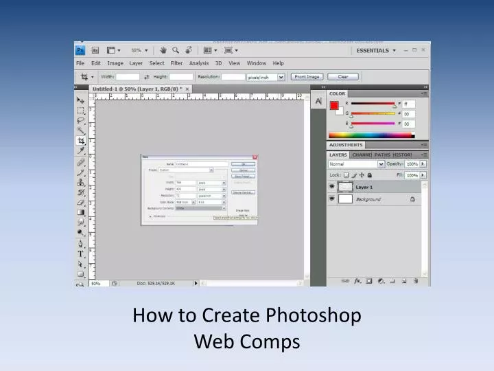
How to Create Photoshop Web Comps. Main Ideas. You will create an image in Photoshop that will look exactly like your web site will look, created in the exact dimensions. Create all imagery on separate layers (do not flatten)

E N D
Main Ideas • You will create an image in Photoshop that will look exactly like your web site will look, created in the exact dimensions. • Create all imagery on separate layers (do not flatten) • Know how to set up the document with the proper dimensions. . . .
1024 x 768 px screen = 955 x 600 design (pixels) (accounting for browser area)
50-30-20 screen real estate ratio(50% Content 30% Navigation 20 % Other Is Ideal)
50-30-20 screen real estate ratio(50% Content 30% Navigation 20 % Other Is Ideal) 50% Content (minimum)
50-30-20 screen real estate ratio(50% Content 30% Navigation 20 % Other Is Ideal) 20% Navigation 50% Content (minimum)
30% “Other” 50-30-20 screen real estate ratio(50% Content 30% Navigation 20 % Other Is Ideal) 20% Navigation 50% Content (minimum)
This is what your viewers see at 1024 x 768 (955 x 600 viewing area)
This is what your viewers see at 1024 x 768 (955 x 600 viewing area)
Currently, CL’s advertisers are paying for ad space that viewers can’t see, unless they have a superwide screen. This image was supposed to be visible in the upper-right-hand corner, but was cut off,even at 1024 x 768.
Creative Loafing’s Current Site at 800 x 600 (760 x 420 viewing area)The site needs to be meaningfully viewable at this dimension as welleven though the ads on the right will be cut off.
This is what people see at 800 x 600 full screen (768 x 420 within brower elements) Considering the 50-30-20 rule (50% content, 30% navigation, 20% other at 800 x 600), we have 5% content (most is not legible), 0% navigation, and 95% other.
Poynter Institute’s EyeTrack07 Studyhttp://eyetrack.poynter.org/keys_01.html • “Whereas headlines and photos were the first visual stop for print readers, navigation was the first stop for online readers. “ • Jakob Nielsen’s findings show that readers will not scroll for navigation. Therefore, usable navigation appears either across the top or upper left. (Note: They will scroll to read a story that interests them, but Poynter shows that they seek first to navigate TO a desired story.) • Jakob Nielsen’s findings show that “Mega Drop-Down Navigation Menus Work Well “ http://www.useit.com/alertbox/mega-dropdown-menus.html • The presence of headlines alone did not engage viewers as much as briefs with images (increased viewership by 34% above expected rate). • “Large photos and documentary photos drew more eyes than small photos or staged photos. “ (Need consistently engaging visuals for top stories) • “Voice of the reader” elements in broadsheets drew 68 percent more attention than expected based on the number of those elements available to be seen. (Option to run viewer comments down the front page).
1024 x 786 Screen Size (955 x 600 viewing area)Navigation, ads, and full content in view
800 x 600 Screen Size (760 x 420 viewable area)Approx. 50% content, 30% navigation (w/dropdowns open), 20% “other” (ads)
Option: Slide show w/ top stories | BTW: Real pages will be longer
Summary of New Design Strengths • Proper dimensions are employed for 1024 x 768 (955 x 600) and 800 x 600 (760 x 420) • Proper screen real estate ratios are used for the 800 x 600 (50% content, 30% navigation, 20% other) • Header Banner is used to unify the page so layout is no longer chaotic. • Navigation Bar is most important element for viewers (according to Poynter). • Drop-down menus will appear on rollover and contain the links that are currently featured on CL's home page for each category, if they still want to keep them as they are-see example). Key links that have been missing will be added (e.g., movie reviews). • Top story brief allows viewers to get engaged and click into the site (Poynter study) • News briefs with images will engage viewers (Poynter study) • News is accessible 5 different ways (editor’s choice, people’s choice, breaking news, drop-down menus, content area points of entry) • Unique and trusted “voice” is present on the home page in blurbs; local writers are signified by CL icon (Callbuz). • “Look and feel" are now consistent with Creative Loafing's branding • Internal search at top right (instead of Google search), so viewers can access archives and search current articles of interest (very important for return viewership).
Remember, viewers are: • Impatient • Evil • Dumb (about navigation) • Spoiled • Lazy • (Give them what they want and need)
3-5 seconds • You have 3-5 seconds to establish trust with a visitor to your site.
This is an 800 x 600 view within that. Considering the 50-30-20 rule (50% content, 30% navigation, 20% other), we have 0% content (because it’s not legible), 0% navigation, and 100% other.
1024 x 768 Screen This is an 800 x 600 view (within box) Considering the 50-30-20 rule (50% content, 30% navigation, 20% other), we have 0% content (because it’s not legible), 0% navigation, and 100% other.