Download
1 / 32
320 likes | 481 Views
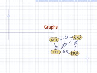
Tables & Graphs. Outline. 1. Tables as representations of data 2. Graphs Definition Components 3. Types of graph Bar Line Frequency distribution Scattergram. summarize data (no need to look at each individual data point). show numerical relationships in a matrix.

E N D
Outline 1. Tables as representations of data 2. Graphs • Definition • Components 3. Types of graph • Bar • Line • Frequency distribution • Scattergram
summarize data (no need to look at each individual data point). show numerical relationships in a matrix. advantage – effect sizes computable disadvantage – patterns in data more difficult to see than with graphs Tables present data
Data in msec Effect sizes (msec) An example Stimulus size Small Medium Large Familiar 460 420 400 Unfam 550460420 90 40 20
Graphs are visual representations of a set of data points. Most graphs are two-dimensional, using Cartesian co-ordinate system (X and Y). Data are represented as a function relating X to Y. 2. Graphs – Definitions
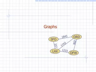
X (horizontal) axis = independent variable. Y (vertical) axis = dependent variable Y X 2. Graphs – Components
Bars or lines Bars indicate height of function at levels of I.V. Y X 2. Graphs – Components
Bars or lines Lines indicate what happens to D.V. at points on I.V. between observations (interpolation) Y X 2. Graphs – Components
3. Types of graphs • Bar graphs. • Line graphs • Frequency distributions • Scattergrams
3a – Bar Graphs • Bar graphs • Data represented as bars • height indicates D.V. • location along X axis indicates I.V. • Use when data are categorical rather than quantitative. • Example on next slide.
Graph shows average # for each of our samples – one of women and one of men # pairs of shoes owned Female Male
Show D.V. as a function of I.V. Points show actual data Lines connecting points show interpolations Use when response varies continuously with I.V. – but be careful about interpolation and extrapolation. 3b – Line graphs
3b – Line Graphs • Spatial relationships illustrate quantitative relationships • Slope • Y-intercept
3b – Line Graphs • Note the equation for a line: Y = ax + b a = slope and b = intercept.
the rate of change in X with change in Y (or vice-versa). tells us how much change on Y scale is associated with a one-unit change on X slope can be positive or negative Slope
Y Y 6 5 4 3 2 1 6 5 4 3 2 1 X X Positive slope – as Y gets Negative slope – as Y gets larger, X gets larger.larger, X gets smaller.
Y 6 5 4 3 2 1 X Zero slope – no relation between X and Y.
the value of Y when X = 0, so that the line intercepts the Y axis. shows minimum (or maximum) value of Y Intercept
Y 6 5 4 3 2 1 X Y-Intercept
Linear functions: a unit change in X is associated with a unit change in Y. e.g., for each dollar, you get one chocolate bar. Y 6 5 4 3 2 1 X 3b – Line Graphs
Non-linear functions: amount of change in Y for a unit change in X depends upon where you are on X scale. e.g., the more chocolate bars you buy, the less each one costs. 3b – Line Graphs
The Yerkes-Dodson law relates arousal to stimulation – an example of a nonlinear function in Psychology
Show frequency with which different observations happen Y axis = how many scores there are at each X value in the data set. 3c – Frequency Distributions
3c. Frequency distributions • Show how many scores occur in various ranges Range# of scores 1 – 3 5 4 – 6 8 7 – 9 12 10 – 12 9 13 – 15 4
Normal distributions Y-axis measures frequency with which scores are found Observations near average are common. Those at extremes are much less common
Show X-Y relation for individual cases That is, these show I.V. – D.V. relation for cases E.g., on next slide, we see relationship between IQ (Y axis) and spatial ability (X axis) 3d - Scattergrams
A good graph or table helps you understand your results. Similarly, a good graph or table helps you explain your results to someone else. Consider the following three ways of presenting roughly the same information: 3e Importance of Tables and Graphs
“High frequency words are read faster than low frequency words, but the difference is greater if the words are irregular in spelling than if they are regular in spelling.”
Typical average reading times (msec) HF LF IRR 475 600 125 REG 450500 50 25 100 IRR = irregularly spelled words HF = high frequency REG = regularly spelled words LF = low frequency
RT IRR REG HF LF
Tables and graphs summarize data Tables allow quick computation of effect sizes Graphs use spatial relationships to show relationships among variables in the data Graphs show patterns in the data Review