Download
1 / 44
440 likes | 564 Views
ArrayTrack 3.4.0 Demonstration. National Center for Toxicological Research U.S. Food and Drug Administration 3900 NCTR Road, Jefferson, AR 72079. ArrayTrack Overview. Microarray DB Library Tool. An integrated environment for microarray data management,

E N D
ArrayTrack3.4.0 Demonstration National Center for Toxicological Research U.S. Food and Drug Administration 3900 NCTR Road, Jefferson, AR 72079
ArrayTrack Overview Microarray DB Library Tool An integrated environment for microarray data management, analysis and interpretation. Using ArrayTrack, the user can apply analysis method from Tool to microarray DB and then get information from the linked LIB for biological interpretation
ArrayTrack Overview Microarray DB Libraries Tools
Microarray DB Data is organized as a hierarchical tree structure: Exp owner Exp Name Significant Gene List Hyb Name Raw Data Normalized Data
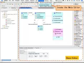
Exploring DB • Right-click exp, hybridization, raw data and normalized data to access various functions
Exploring DB Experiment design
Searching Libraries • There are nine libraries in ArrayTrack. • All the libraries are interlinked. • The libraries integrate gene, protein, pathway • and other data allowing data interrogation and • mining of data across data types. • Several ways to activate these libraries • From library panel • From the Library pull-down menu • From the results of analysis (e.g. T-test)
Analysis Tools • Tools: • Quality Tools • Provides various visual plots and numerical parameters for measuring the quality of a hyb, and filtering the unwanted spots. • Normalization Methods • Correct systematic variations in microarray data introduced by experimental factors • Analysis • Provides different methods to evaluate the microarray data • Visualization Tools • Provides a direct view to identify abnormalities within data.
Microarray Data Processing • Importing data • Normalization • Gene Selection • Interpretation Loading array data into AT Ensure cross-chip comparison Identify a list of significant genes Interpret data using pathways and GO
Importing Data • Create experiment • Create array type (if not existed in AT Chip LIB) • Use batch import wizard (see detail in Tutorial 9)
Normalization • To remove systematic variations across chips and ensure a valid cross-chip comparison • Right-click an experiment • Select “raw datasets…”
Normalization (-continued) 3.Right-click any highlighted raw data 4. Select “Normalize…”
Normalization (-continued) • Choose normalization method • For Affy data, choose “Mean/Median Scaling” • For 2-channel data, the default • method is “Lowess”
Gene SelectionsDetermining a list of genes that are differentially expressed between Strain A and Strain B Two types of experiment:Error rate for the exp Single testing: 1 gene P<0.05 low error rate Multiple testing: n genes P= nPi If Pi=0.05, high error rate e.g., If n=10 and Pi=0.05, P=0.5 for family-wise error Select a gene list based on: P value Bonferroni correction Pi/n Low sensitivity Low power False discovery rate (e.g., Benjamini & Hochberg, p-value plot) Permutation t-test (e.g., SAM) Volcano plot (combination of p and fold change)
Gene Selection • Highlight and Right-click the experiment. • Select “Normalized datasets…” and click “OK” • Right-click the highlighted normalized data • Choose “Analysis->T-test”
Gene Selection (-continued) Assign the data into 2 groups -different dose -different time -or different animal Note: always put control in group 2
Gene Selection (-continued) Parameters used to filter the genes to get significant gene list Access other analysis methods like HCA, PCA, Volcano plot, etc.
Gene Selection (-continued) Volcano Plot
Create Display Import Export Delete Significant Gene List
Significant Gene List(-cont) • Create significant gene list From T-test/Anova result set filter criteria e.g. P-value, fold change to get significant gene list Create significant gene list Filter criteria
Significant Gene List(-cont) • Display/Import/Export/Delete Significant Gene List Right-click the experiment name select Significant Gene Lists select Display Import Export Delete
Significant Gene List(-cont) • VennDiagram - get common genes from 2~3 significant gene lists
Interpretation Link the significant genes to Gene Library for data interpretation
Interpretation (continued) • The significant genes • are listed here in Gene Library. • Can search and sort the Gene library • There are links to other Libraries(Kegg, • Pathart)
Interpretation (continued) • KEGG – Kyoto Encyclopedia of Genes and Genomes http://www.genome.jp/kegg/ • KEGG is a suite of databases and associated software. • KEGG Pathway database provides the information of metabolic, regulatory and disease pathways; Most of them are metabolic pathways.
Interpretation (continued) • PathArt (Jubilant) – a pathway database • The Pathways (over 600 mammalian disease and signaling) • The Pathways is a collection of manually curated information from literature and public domain databases. • In ArrayTrack
Interpretation (continued) Kegg Pathway name Genes involved in a pathway Statistical significance of the pathway Pathway category Kegg Pathway
Interpretation (continued) Kegg Double-click a specific pathway, the pathway map will be displayed and the genes involved in the pathway are highlighted.
Interpretation (continued) PathArt Genes Pathways Physiology/disease Statistical significance of the pathway
Interpretation (continued) GOFFA • GOFFA – Gene Ontology For Functional Analysis • Developed based on Gene Ontology(GO) database • Grouping the genes into functional classes • GO- three ontologies -Molecular function: activities performed by individual gene products at the molecular level, such as catalytic activity, transporter activity, binding. -Biological process: broad biological goals accomplished by ordered assemblies of molecular functions, such as cell growth, signal transduction, metabolism. -Cellular component: the place in the cell where a gene product is found, such as nucleus, ribosome, proteasome.
Data Exploring • Scatter Plot plot the fluorescence intensity data of Cy3 vs Cy5 for the same array • Mixed Scatter Plot compare two arrays in one plot, applies to both 2-channel and 1-channel data. • Correlation Matrix Correlation Matrix shows the correlation between column i and column j of the original matrix. It visually shows the correlation between two groups of data. • Bar Chart displays expression data for a single gene across multiple arrays within the same experiment or across different experiment. • Principal Component Analysis (PCA) PCA is a way of identifying the data patterns and highlighting the data’s similarity and difference • P-value Plot visual interpretation of P-value. • HCA is comprised of agglomerative methods and divisive methods that finds clusters of observations within a data set.
Data Exploring Bar chart Access Bar chart from T-Test results. Bar chart – display expression data for a single gene across multiple arrays in the same experiment or across different experiments.
Data Exploring Bar chart continued Grouping multiple arrays marked in different colors. Group color could be saved. Standard deviation bar chart for the above groups. The bar height represents the mean intensity, while the T-line above the bar stands for the value of SD. The color for each bar echoes the color of the bar chart at the top, in the same order.
Data Exploring P-value plot Some effect Slightly or no effect P plot curve is closer to diagonal line, the less treatment effect there is.
Data Exploring PCA • Commonly used before gene selection • To investigate the inter-sample relationship • based on the gene expression profile • Identify the outliers in biological/technical replicates • View the variance of a multidimensional data PCA 3-D view
Accessing ArrayTrack • FDA Internal: http://weblaunch.nctr.fda.gov/jnlp/arraytrack/index.html http://weblaunch.nctr.fda.gov/jnlp/arraytrack/citrix/index.html • FDA External: http://edkb.fda.gov/webstart/arraytrack/index.html
Technical Support NCTRBioinformaticsSupport@nctr.fda.gov ArrayTrack is developed by the U.S. Food and Drug Administration, National Center for Toxicological Research (FDA/NCTR). FDA/NCTR reserves all rights for the software .
Thank you! National Center for Toxicological Research U.S. Food and Drug Administration