Download
1 / 13
140 likes | 236 Views
A Spatial Analysis of Orange Line Rider Demographics. November 1, 2012. By Tamar Sarkisian. Background. 2011 Federal Transit Administration Report: “Metro Orange Line BRT Project Evaluation”. On-Board Survey Results:. Income

E N D
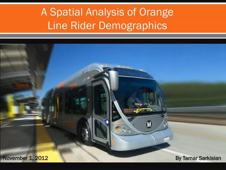
A Spatial Analysis of Orange Line Rider Demographics November 1, 2012 By Tamar Sarkisian
Background 2011 Federal Transit Administration Report: “Metro Orange Line BRT Project Evaluation” On-Board Survey Results: • Income • 72% of Orange Line riders’ annual household income is $35,000 or less • Quantity of Vehicles Owned • 78% of Orange Line riders’ households own 0-1 vehicles • 22% of Orange Line riders’ households own 2 or more vehicles • Use of Public Transit • 30% of Orange Line riders use public transit 5 days per week • More than half of surveyed riders use public transit 5-7 days per week • 49% of riders use the Orange Line for part of their trip • 49% of riders used another public transit to get to the Orange Line • 50% of riders are using the Orange Line to go to work
Project Focus Where do these Orange Line riders most likely live? Are they located near (i.e. a half-mile radius around) the Orange Line stations? How far away do they live from the stations?
Area of Analysis: San Fernando Valley, Los Angeles, CA
Area of Analysis: Orange Line Bus Rapid Transit Line
Concentration of People Whose Household Income is $35,000 or Less
How Concentrated is this Income Group, around the Orange Line Stations?
Income Distribution Compared to the Concentration of Households with 0-1 Vehicles Percentage of Households with Incomes of >$35K Percentage of Households with 0%-20% 0-1 Vehicles 20.1-40% 0-20% 40.1%-60% 20.1%-40% 60.1%-80% 40.1%-60% 60.1%-80% 80.1%-100%
Legend Below Average Equal toAverage Above Average Percentage of People Who Use Public Transit to Travel to Work, Compared to the Average Percentage for Los Angeles County
The Distance of These “Hot Spots” from the Orange Line Stations Legend Below Average Equal toAverage Above Average ~7.5 Miles 4 Miles 4 Miles 2.5 Miles 2.5 Miles 1 Mile 1 Mile
What’s Next? • Looking further into access to the Orange Line stations: • What are the main public transit routes that connect riders to the Orange Line? • How long does it take most riders to arrive at the Orange Line using these other forms of public transit? • What is the total trip time for riders who are going to work? • Taking these into consideration, is this system efficient? • Development as a method to improve access to the Orange Line? • Evaluating the potential for transit oriented development (TODs) by current housing stock, land use patterns, etc.
Skills Used What next? • Inset Map: • To show the location of the San Fernando Valley in relation to the entire county of Los Angeles • Point Graduated Symbol: • To illustrate the distribution and propensity of households that own 0-1 vehicles • Aggregating Attribute Fields: • To create the aggregated field, “Percentage of Households Earning $35K or Less,” I added the attribute fields for “Percentage of Households Earning $15K or Less,” “Percentage of Households Earning $15K-$25K,” and “Percentage of Households Earning $25K-$35K.” • Attribute Sub-Sets Selections: • To create the shapefile for the Orange Line route, I isolated the route from a larger file that contained all of the bus routes in LA County and exported the data to a new layer • To create the shapefile for the Orange Line stations, I isolated the stations from a larger file that contained all bus stops in LA County and exported the data to a new layer • Distance (i.e. Measurement Tool) • To show the distance from where a great deal of Orange Line riders most likely live to a few Orange Line Stations • Buffering • To create a half-mile border around the stations • Geoprocessing • Used Clipping Tool to create the San Fernando Valley block groups shapefile • Other • Used Editor Tool to remove certain areas of the San Fernando Valley shapefile that are too far east of the Orange Line (e.g. Glendale and Burbank)
Sources • LA County GIS Data Portal • (http://egis3.lacounty.gov/dataportal/2010/10/21/citycommunity-boundaries/) • Community Boundaries shapefile was used to create San Fernando Valley Block Groups shapefile • TIGER/Line® Shapefiles and TIGER/Line® Files • LA County Block Groups shapefile • LA Metro GIS Database (developer.metro.net) • Bus Lines shapefile was used to create Orange Line shapefile • Bus Stops shapefile was used to create Orange Line station shapefile • Simply Map • Income data • Vehicle ownership data • Mode of travel for work data • Flynn, Jennifer et al. “Metro Orange Line BRT Project Evaluation.” Federal Transit Administration, U.S. Department of Transportation, Washington, D.C. October, 2011.