Download
1 / 6
70 likes | 96 Views
According to the web analytics service Stat Counter, “Internet usage by mobile and tablet devices exceeded desktop worldwide for the first time in October 2016.” Also, Google’s Android is all set to replace Microsoft Windows as the world’s most popular operating system in terms of total internet usage. That is why; it becomes essential for website owners and webmasters to optimize their websites and web applications for mobile devices. Both responsive web design and accelerated mobile pages helps developers to optimize websites for mobile devices.

E N D
A Acc ccel eler R Re esp era ate spo onsiv nsive e W ted d M Mo obi Web bile le P Pag eb De Desi sig gn n age es s v vs. s.
• According to the web analytics service Stat Counter, ?Internet usage by mobile and tablet devices exceeded desktop worldwide for the first time in October 2016.? Also, Google’s Android is all set to replace Microsoft Windows as the world’s most popular operating system in terms of total internet usage. • That is why; it becomes essential for website owners and webmasters to optimize their websites and web applications for mobile devices. • Both responsive web design and accelerated mobile pages helps developers to optimize websites for mobile devices.
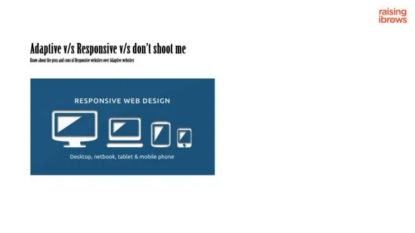
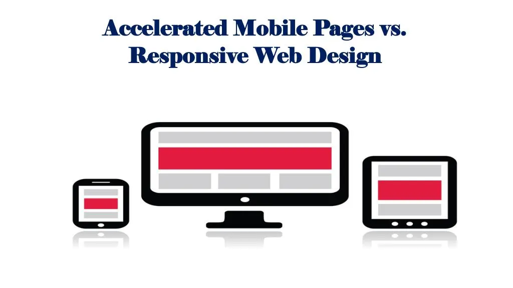
• Responsive web design (RWD) makes a single web page look good on computers, smartphones, tablets, and phablets. • It requires developers to create responsive web pages with HTML5, CSS3 and JavaScript. The programmers have to resize, enlarge, shrink, hide or move website content by using HTML and CSS. • The use of HTML and CSS to customize content will make the website look good on any device.
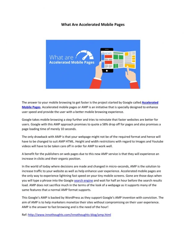
• Accelerated mobile pages (AMP) also help developers to create websites that deliver rich user experience across multiple devices and platforms. • AMP allows developers to optimize web pages for mobile devices by using HTML, CSS and JavaScript. But it increases the loading speed of mobile web pages drastically by using various optimization techniques. • The AMP Project is currently supported by several publishers and tech companies including Google, Twitter and WordPress. Google has already integrated AMP listings into its mobile search results.
• Both RWD and AMP help developers to enhance the mobile experience delivered by their websites. • They further enable programmers to optimize the websites for mobile devices by using popular web technologies like HTML, CSS and JavaScript. • But RWD and AMP differs from each other in terms of objectives, content type, and user experience. That is why; each web developer must know the important differences between AMP and RWD.