Download
1 / 8
80 likes | 198 Views
If you think you need to steer clear off the adaptive v/s responsive conversation currently trending on major design and tech sites, think again!

E N D
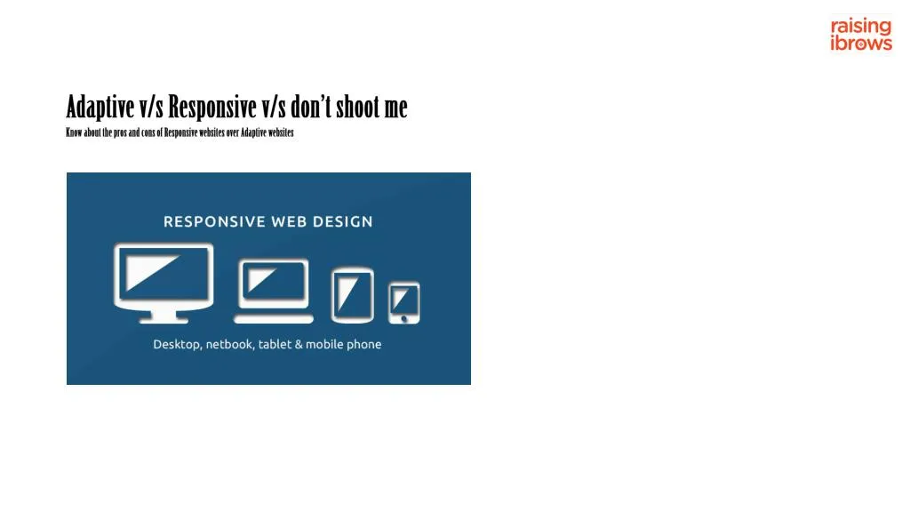
Adaptive v/s Responsive v/s don’t shoot me Know about the pros and cons of Responsive websites over Adaptive websites
Introduction: Calling all you digipeople from Account Management. If you think you need to steer clear off the adaptive v/s responsive conversation currently trending on major design and tech sites, you’ve got the wrong think baby! Here’s a snapshot of your future, should you continue ignoring the preceding para. It’s a verse from a Simon & Garfunkel song called Old Friends, off the Bookends album. Time it was and what a time it was, it was a time of innocence, a time of confidences.Long ago, it must be, I have a photograph.Preserve your memories, they’re all that’s left of you. Let’s cut to the chase and move beyond clichés like ‘we’re living in a post-pc world’, ‘30-50% of website traffic emanates from mobi devices’, ‘m-dot or tdot hacks’ and dive into the what w3c calls the ‘one web approach’. This means the same content is available to me, irrespective of my access device. The 3-column website version, gives way to the 2-column tab version, to the 1-column mobi version. Developers are now getting weird-ed out by the ever changing device specifications of today and the unimagined interfaces of the future. Two popular approaches to addressing the one web paradigm include: responsive and client/server-side adaptive design. Debatable is the one better than the other approach. Having said that let us now put pen to where mouth earlier was.
Responsive • Responsive web design is the most common One Web approach. The approach uses CSS media queries to modify the presentation of a website based on the size of the device display. Responsive designs are created using the CSS3 @media rule. Allowing for the creation of device-specific rules. Using fluid grids and percentages for widths, designers can create interfaces that auto-respond to device sizes. • Advantage Responsive • Use of a single template for all devices and CSS to determine how content is rendered for varying screen sizes. Designers can still work in familiar HTML and CSS, technologies. • Same Experience for Everyone – Mobile users see a slightly different layout than desktop users; by and large everyone viewing the site enjoys the same experience. • Less Maintenance – Multiple designs take longer to update. Using a single responsive design, reduces time spent updating designs. • Everything on one URL – Desktop, tablet and smartphone users all view a page off the same url, which makes this better for social media sharing and search engine ranking optimizing. Also, stats will not be split for different website versions. • Google Friendly – Google went on record stating that they prefer website owners to use responsive designs. “Google can discover your content more efficiently as we wouldn’t need to crawl a page with the different Googlebot user agents to retrieve and index all the content.” • Responsive web design works best in combination with a mobile first approach, where the mobile use case is prioritized during development. Progressive enhancement is then used to address tablet and desktop use cases.
Disadvantage Responsive • Performance – When someone loads a web page with a responsive design, they load the information for all devices, not just the one they are viewing your website on. Images are a concern too. Most designs simply scale down the size of an image. Therefore, smartphone users may download an image of 1000 by 1000 pixels in width, despite it being scaled down to 250 by 250 pixels on their device. • Integrating Ads – It’s more difficult to integrate advertising effectively into a responsive design as ads have to fit nicely into all resolutions. • Sacrificing Functionality – A lot of sacrifices are made when using one single design for all devices. For e.g., one will have to compromise a user’s desktop experience to ensure that the experience for mobile users is not hindered (and vice-versa). From a SEO and consistency perspective, responsive designs seem like the best option.
Client-Side Adaptive • Adaptive builds on the principles of responsive, to deliver user experiences targeted at specific devices and contexts – using JavaScript to enrich websites with advanced functionality and customization. • Two approaches to adaptive design are: • one where the adaptations occur on the client side, in the user’s browser, and the other, • b) where the web server detects and loads the device-specific template. Client-side adaptive entails not rebuilding the site ground up, but building on existing content while still delivering a mobile-responsive layout. Expert developers can now specifically target particular device or screen resolutions. Adaptive designs generally require more work, however they ensure each visitor gets the best experience possible. • Advantage Client-side Adaptive • Best Experience for all – When optimizing the experience for desktop and mobile users individually, you can ensure each gets the best experience. • Fast Loading – Users will only load the version of the website that they are viewing. Smartphone users will really notice the difference in speed as mobile designs tend to be simplified versions of their desktop equivalents with few images and basic navigation. • Advertising Monetization – More designers are working towards optimizing advertising options in responsive designs, such as replacing 728×90 banners with 468×90 banners in smaller resolutions. While this is still very limiting, monetizing a website in the most profitable way requires using adaptive design customized to device it is being viewed on.
Disadvantage Client-side Adaptive • Bad for Search Engines – Two different designs mean that each article/section has two separate URL’s. Search engines are allergic to identical articles hosted on different URL’s, therefore traffic may be reduced. • Cross-Linking – Linking internally becomes difficult when you have more than one version of your website. Do you link to the full version or the mobile version of your article? You may have to set up redirects so that someone who clicks on the full article from the mobile design is redirected to the mobile version of the article. • Stuck in the Middle – Mobile users usually find the mobile optimised version of a design easier to navigate – however tablet users may not. Those with smaller screens may prefer the mobile version of your website whilst others will prefer viewing the full version of the design. This does not stop a user from landing on the wrong version in the first instance. • Server-Side Adaptive – The server-side adaptive approach achieves the advantages of the client-side approach, through server-side plugins and custom user agent detection. What calls for choosing server-side adaptive? Typically this approach offers distinct templates for each device, enabling more customisation. This keeps device-detection logic on the server, enabling smaller mobile pages that load faster. • Numerous server-side plugins are now available for common CMS’ and eCom systems like Magneto. This approach however requires significant changes to back-end systems, which may result in a lengthy (and often times costly) implementation. • Managing multiple templates increases maintenance costs. It can also encounter performance issues when servers are under heavy load. When a mobile user agent detection is performed on the server, common caching mechanisms deployed by CDNs like Akamai, etc. need to be turned off.
Disadvantage Client-side Adaptive • Often times resulting in slower UX for mobile and desktop visitors. Reality byte – the majority of website owners continue to grapple with the basics of responsive; hence confronting the sophistication of adaptive is way down the road. • As competition and mobile traffic increases globally, however, survival will push site owners to pick an approach that works best. • The next time you’re thrown into the responsive v/s adaptive debate, playing the ignorant Account Management dude won’t cut it, ‘cause… well you’ve gotten the point. Or rather, many, many points, to make your point.