Download
1 / 22
230 likes | 415 Views
GUI Layout Managers and Components, Continue. Card Layout Borders More GUI components Menu List Sliders Combo Boxes Scroll Panes Split Panes Special Features of Swing components Further GUI Programming Examples Exercises. Introduction.

E N D
GUI Layout Managers and Components, Continue • Card Layout • Borders • More GUI components • Menu • List • Sliders • Combo Boxes • Scroll Panes • Split Panes • Special Features of Swing components • Further GUI Programming Examples • Exercises Unit 13
Introduction • This is our concluding session on GUIs and event-driven programming. • In our discussion on GUI-based programs so far, we have covered: • GUI design issues, GUI components and containers. • Basic event handling. • Basic layout management. • We are going to cover: • More GUI components. • More layout managers. • Special Features of Swing components • With this coverage the student's knowledge base of the basics would be broadened. Unit 13
Card Layout Manager • A CardLayout object is a layout manager for a container. It treats each component in the container as a card. • Only one card is visible at a time, and the container acts as a stack of cards. • The first component added to a CardLayout object is the visible component when the container is first displayed. • The ordering of cards is determined by the container's own internal ordering of its component objects. • CardLayout defines a set of methods that allow an application to flip through these cards sequentially, or to show a specified card. • Card Layout has two constructors: • CardLayout(): Creates a new card layout with gaps of size zero. • CardLayout(int hgap, int vgap) Creates a new card layout with the specified horizontal and vertical gaps. Unit 13
Card Layout • Use the Card Layout class when you have an area that can contain different components at different times. • Panel cards = new Panel(); • CardLayout cardLayout = new CardLayout(); • cards.setLayout(cardLayout); • cards.add("Ace", new Button("Ace of Hearts")); • cards.add("Deuce", new Button("Two of Hearts")); • cards.add("Three", new Button("Three of Hearts")); Unit 13
Introduction to Borders • A border can be put around any Swing component to define how the edges of the component should be drawn. • The BorderFactory class is useful for creating border objects. • It has methods for creating specific types of borders. • A border is applied to a component using the setBorder method: JPanel myPanel = new JPanel(); Border myBorder = BorderFactory.createEtchedBorder(); myPanel.setBorder(myBorder); Unit 13
Borders • A line border • Surrounds the component with a simple line • The line's color and thickness can be specified • An etched border • Creates the effect of an etched groove around a component • Uses colors for the highlight and shadow • A bevel border • Can be raised or lowered • Uses colors for the outer and inner highlights and shadows Unit 13
Borders • A compound border • Is a combination of two borders • One or both of the borders can be a compound border • A titled border • Places a title on or around the border • The title can be oriented in many ways • A matte border • Specifies the sizes of the top, left, bottom, and right edges of the border separately • Uses either a solid color or an image. Unit 13
The BorderDemo Program Unit 13
MenuBar and Menu • A menu offers options to user. • Menus are not generally added to user interface. • Menu usually appears either in a menubar or as a popupmenu. • A JFrame often has a menu bar containing many menus; and each menu can contain many choices. • Menu bar can be added to a JFrame with the method setJMenuBar. JFrame window = new JFrame("Some Application"); JMenuBar menuBar = new JMenuBar(); window.setJMenuBar(menuBar); Unit 13
Menu • Menus are JMenu instances and added to menu bar: JMenu batter = new JMenu("Batter"); menuBar.add(batter); • Menu choices are JMenuIteminstances, and are added to menu: JMenuItem swing = new JMenuItem("Swing"); JMenuItem take = new JMenuItem("Take"); JMenuItem bunt = new JMenuItem("Bunt"); batter.add(swing); batter.add(take); batter.add(bunt); Unit 13
Lists • The Swing Jlist class represents a list of items from which the user can choose. • The contents of a JList object can be specified using an array of objects. • A JList object generates a list selection event when the current selection changes. • A JList object can be set so that multiple items can be selected at the same time. It can be one of three options: • Single selection – only one item can be selected at a time. • Single interval selection – multiple, contiguous items can be selected at a time. • Multiple interval selection – any combination of items can be selected. • The list selection mode is defined by a ListSelectionModel object. Unit 13
Declaring a JList String[] items = {“A", “B", “C", "D"}; JList list = new JList(items); list.setSelectionMode(DefaultListSelectionModel.SINGLE_SELECTION); // Set the item width int cellWidth = 200; list.setFixedCellWidth(cellWidth); // Set the item height int cellHeight = 18; list.setFixedCellHeight(cellHeight); // Get number of items in the list int size = list.getModel().getSize(); Unit 13
List Example Frame frame = new Frame(); frame.setLayout(new FlowLayout()); Button button1 = new Button("Next"); frame.add(button1); TextField text1 = new TextField(); text1.setColumns(10); frame.add(text1); Label label1 = new Label("First Name:"); frame.add(label1); TextArea textArea1 = new TextArea("This is some text in a text area"); textArea1.setRows(2); textArea1.setColumns(10); frame.add(textArea1); List list1 = new List(); list1.add("FirstItem"); list1.add("SecondItem"); list1.add("ThirdItem"); list1.add("FourthItem"); list1.add("FifthItem"); frame.add(list1); frame.pack(); frame.setVisible(true); Unit 13
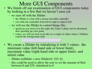
Sliders • A slider is a component that allows the user to specify a numeric value within a bounded range. • The JSlider class has several methods that allow the programmer to tailor the look of a slider. • Major and minor tick marks, and labels on the tick marks, can be explicitly set and displayed. • A slider produces a change event. Unit 13
Sliders Declaration // Create a horizontal slider with min=0, max=100, value=50 JSlider slider = new JSlider(); // Create a horizontal slider with custom min and max; value is set to the middle int minimum = -255; int maximum = 256; slider = new JSlider(minimum, maximum); // Create a horizontal slider with custom min, max, and value int initValue = 0; slider = new JSlider(minimum, maximum, initValue); // Create a vertical slider with min=0, max=100, value=50 slider = new JSlider(JSlider.VERTICAL); // Create a vertical slider with custom min, max, and value slider = new JSlider(JSlider.VERTICAL, minimum, maximum, initValue); Unit 13
Combo Boxes • A combo box provides a menu from which the user can choose one of several options. • The currently selected option is shown in the combo box. • Unlike a JList object, a combo box shows its options only when the user presses it using the mouse. • Options can be established using an array of strings or using the addItem method. • A combo box generates an action event when the user makes a selection from it. // Create a read-only combobox String[] items = {"item1", "item2"}; JComboBox readOnlyCB = new JComboBox(items); // Create an editable combobox items = new String[]{"item1", "item2"}; JComboBox editableCB = new JComboBox(items); editableCB.setEditable(true); Unit 13
Scroll Panes • A scroll pane is useful for images or information too large to fit in a reasonably-sized area. • A scroll pane offers a limited view of the component it contains. • It provides vertical and/or horizontal scroll bars that allow the user to scroll to other areas of the component. • No event listener is needed for a scroll pane. // Create a scrollable text area JTextArea textArea = new JTextArea(); JScrollPane scrollableTextArea = new JScrollPane(textArea); // Create a scrollable list JList list = new JList(); JScrollPane scrollableList = new JScrollPane(list); Unit 13
Top Component Right Component Left Component Bottom Component Split Panes • A split pane (JSplitPane) is a container that displays two components separated by a moveable divider bar • The two components can be displayed side by side, or one on top of the other. Moveable Divider Bar Unit 13
Split Panes • The orientation of the split pane is set using the HORIZONTAL_SPLIT or VERTICAL_SPLIT constants • The divider bar can be set so that it can be fully expanded with one click of the mouse. • The components can be continuously adjusted as the divider bar is moved, or wait until it stops moving. • Split panes can be nested // Create a left-right split pane JSplitPane hpane = new JSplitPane(JSplitPane.HORIZONTAL_SPLIT, leftComponent, rightComponent); // Create a top-bottom split pane JSplitPane vpane = new JSplitPane(JSplitPane.VERTICAL_SPLIT, topComponent, bottomComponent); Unit 13
Special Features • Swing components offer special features to facilitate and enhance their use Unit 13
Tool Tips • Tool tips provide a short pop-up description when the mouse cursor rests momentarily on a component • A tool tip is assigned using the setToolTipText method of a Swing component. JButton button = new JButton ("Compute"); button.setToolTipText ("Calculate size."); Unit 13
Disabled Components • Components can be disabled if they should not be used. • A disabled component is "grayed out" and will not respond to user interaction. • The status is set using the setEnabled method: JButton button = new JButton (“Do It”); button.setEnabled (false); Unit 13