Download
1 / 22
220 likes | 317 Views
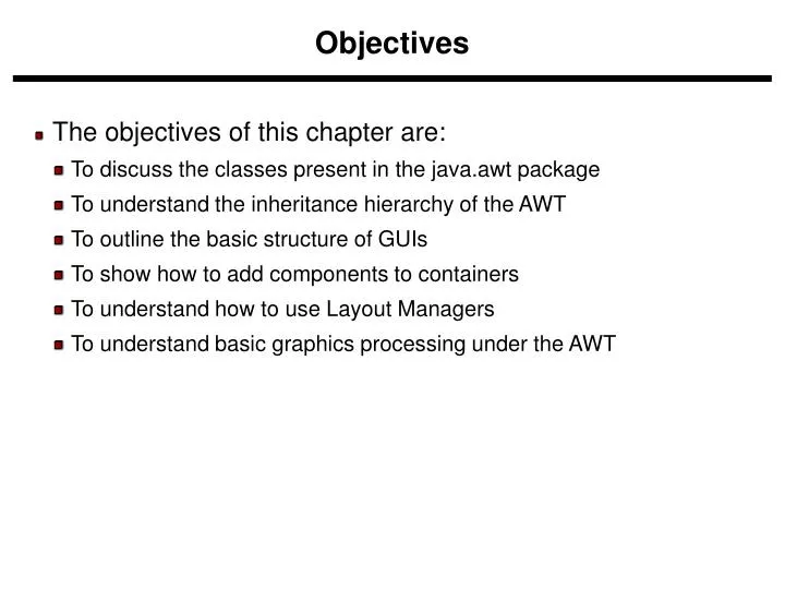
The objectives of this chapter are: To discuss the classes present in the java.awt package To understand the inheritance hierarchy of the AWT To outline the basic structure of GUIs To show how to add components to containers To understand how to use Layout Managers

E N D
The objectives of this chapter are: • To discuss the classes present in the java.awt package • To understand the inheritance hierarchy of the AWT • To outline the basic structure of GUIs • To show how to add components to containers • To understand how to use Layout Managers • To understand basic graphics processing under the AWT Objectives
The AWT is roughly broken into three categories • Components • Layout Managers • Graphics • Many AWT components have been replaced by Swing components • It is generally not considered a good idea to mix Swing components and AWT components. Choose to use one or the other. AWT (Abstract Windowing Toolkit)
Component Container Window Frame Button Panel List Checkbox Choice Label TextComponent TextField TextArea AWT Class Hierarchy Note: There are more classes, however, these are what are covered in this chapter
Component is the superclass of most of the displayable classes defined within the AWT. Note: it is abstract. • MenuComponent is another class which is similar to Component except it is the superclass for all GUI items which can be displayed within a drop-down menu. • The Component class defines data and methods which are relevant to all Components • setBounds • setSize • setLocation • setFont • setEnabled • setVisible • setForeground -- colour • setBackground -- colour Component
Container is a subclass of Component. (ie. All containers are themselves, Components) • Containers contain components • For a component to be placed on the screen, it must be placed within a Container • The Container class defined all the data and methods necessary for managing groups of Components • add • getComponent • getMaximumSize • getMinimumSize • getPreferredSize • remove • removeAll Container
The Window class defines a top-level Window with no Borders or Menu bar. • Usually used for application splash screens • Frame defines a top-level Window with Borders and a Menu Bar • Frames are more commonly used than Windows • Once defined, a Frame is a Container which can contain Components Frame aFrame = new Frame(Hello World); aFrame.setSize(100,100); aFrame.setLocation(10,10); aFrame.setVisible(true); Windows and Frames
When writing a GUI application, the GUI portion can become quite complex. To manage the complexity, GUIs are broken down into groups of components. Each group generally provides a unit of functionality. A Panel is a rectangular Container whose sole purpose is to hold and manage components within a GUI. Panel aPanel = new Panel(); aPanel.add(new Button("Ok")); aPanel.add(new Button("Cancel")); Frame aFrame = new Frame("Button Test"); aFrame.setSize(100,100); aFrame.setLocation(10,10); aFrame.add(aPanel); Panels
This class represents a push-button which displays some specified text. When a button is pressed, it notifies its Listeners. (More about Listeners in the next chapter). To be a Listener for a button, an object must implement the ActionListener Interface. Panel aPanel = new Panel(); Button okButton = new Button("Ok"); Button cancelButton = new Button("Cancel"); aPanel.add(okButton)); aPanel.add(cancelButton)); okButton.addActionListener(controller2); cancelButton.addActionListener(controller1); Buttons
This class is a Component which displays a single line of text. Labels are read-only. That is, the user cannot click on a label to edit the text it displays. Text can be aligned within the label Label aLabel = new Label("Enter password:"); aLabel.setAlignment(Label.RIGHT); aPanel.add(aLabel); Labels
This class is a Component which displays a list of Strings. The list is scrollable, if necessary. Sometimes called Listbox in other languages. Lists can be set up to allow single or multiple selections. The list will return an array indicating which Strings are selected List aList = new List(); aList.add("Calgary"); aList.add("Edmonton"); aList.add("Regina"); aList.add("Vancouver"); aList.setMultipleMode(true); List
This class represents a GUI checkbox with a textual label. The Checkbox maintains a boolean state indicating whether it is checked or not. If a Checkbox is added to a CheckBoxGroup, it will behave like a radio button. Checkbox creamCheckbox = new CheckBox("Cream"); Checkbox sugarCheckbox = new CheckBox("Sugar"); [] if (creamCheckbox.getState()) { coffee.addCream(); } Checkbox
This class represents a dropdown list of Strings. Similar to a list in terms of functionality, but displayed differently. Only one item from the list can be selected at one time and the currently selected element is displayed. Choice aChoice = new Choice(); aChoice.add("Calgary"); aChoice.add("Edmonton"); aChoice.add("Alert Bay"); [] String selectedDestination= aChoice.getSelectedItem(); Choice
This class displays a single line of optionally editable text. This class inherits several methods from TextComponent. This is one of the most commonly used Components in the AWT TextField emailTextField = new TextField(); TextField passwordTextField = new TextField(); passwordTextField.setEchoChar("*"); […] String userEmail = emailTextField.getText(); String userpassword = passwordTextField.getText(); TextField
This class displays multiple lines of optionally editable text. This class inherits several methods from TextComponent. TextArea also provides the methods: appendText(), insertText() and replaceText() // 5 rows, 80 columns TextArea fullAddressTextArea = new TextArea(5, 80); [] String userFullAddress= fullAddressTextArea.getText(); TextArea
Since the Component class defines the setSize() and setLocation() methods, all Components can be sized and positioned with those methods. Problem: the parameters provided to those methods are defined in terms of pixels. Pixel sizes may be different (depending on the platform) so the use of those methods tends to produce GUIs which will not display properly on all platforms. Solution: Layout Managers. Layout managers are assigned to Containers. When a Component is added to a Container, its Layout Manager is consulted in order to determine the size and placement of the Component. NOTE: If you use a Layout Manager, you can no longer change the size and location of a Component through the setSize and setLocation methods. Layout Managers
There are several different LayoutManagers, each of which sizes and positions its Components based on an algorithm: • FlowLayout • BorderLayout • GridLayout • For Windows and Frames, the default LayoutManager is BorderLayout. For Panels, the default LayoutManager is FlowLayout. Layout Managers (cont)
The algorithm used by the FlowLayout is to lay out Components like words on a page: Left to right, top to bottom. It fits as many Components into a given row before moving to the next row. Panel aPanel = new Panel(); aPanel.add(new Button("Ok")); aPanel.add(new Button("Add")); aPanel.add(new Button("Delete")); aPanel.add(new Button("Cancel")); Flow Layout
The BorderLayout Manager breaks the Container up into 5 regions (North, South, East, West, and Center). When Components are added, their region is also specified: Frame aFrame = new Frame(); aFrame.add("North", new Button("Ok")); aFrame.add("South", new Button("Add")); aFrame.add("East", new Button("Delete")); aFrame.add("West", new Button("Cancel")); aFrame.add("Center", new Button("Recalculate")); Border Layout
The regions of the BorderLayout are defined as follows: Center North West East South Border Layout (cont)
The GridLayout class divides the region into a grid of equally sized rows and columns. Components are added left-to-right, top-to-bottom. The number of rows and columns is specified in the constructor for the LayoutManager. Panel aPanel = new Panel(); GridLayout theLayout = new GridLayout(2,2); aPanel.setLayout(theLayout); aPanel.add(new Button("Ok")); aPanel.add(new Button("Add")); aPanel.add(new Button("Delete")); aPanel.add(new Button("Cancel")); Grid Layout
LayoutManagers have proved to be difficult and frustrating to deal with. The LayoutManager can be removed from a Container by invoking its setLayout method with a null parameter. Panel aPanel = new Panel(); aPanel.setLayout(null); What if I dont want a LayoutManager? Ch. VIII - 21
It is possible to draw lines and various shapes within a Panel under the AWT. • Each Component contains a Graphics object which defines a Graphics Context which can be obtained by a call to getGraphics(). • Common methods used in Graphics include: • drawLine • drawOval • drawPolygon • drawPolyLine • drawRect • drawRoundRect • drawString • draw3DRect • fill3DRect • fillArc Graphics • fillOval • fillPolygon • fillRect • fillRoundRect • setColor • setFont • setPaintMode • drawImage