Download
1 / 18
180 likes | 309 Views
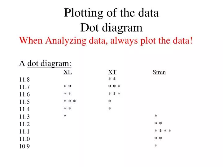
Plotting of the data Dot diagram. When Analyzing data, always plot the data! A dot diagram: XL XT Stren 11.8 * * 11.7 * * * * * 11.6 * * * * * 11.5 * * * * 11.4 * * * 11.3 * * 11.2 * * 11.1 * * * * 11.0 * * 10.9 *. Plotting Original Data.

E N D
Plotting of the dataDot diagram When Analyzing data, always plot the data! A dot diagram: XLXTStren 11.8 * * 11.7 * * * * * 11.6 * * * * * 11.5 * * * * 11.4 * * * 11.3 * * 11.2 * * 11.1 * * * * 11.0 * * 10.9 *
Plotting Original Data • Always plot original data points. • This is the first thing to do when analyzing data • This is very important!
Plotting Cancer Study Results • The following plots are from a study by Dr. Terry Rose-Hellekant in the Medical School Duluth • Treatments • Tamoxifen • Placebo • Some mice develop breast cancer
The data are RT-PCR expressions corresponding to particular genes • In RT-PCR the values are roughly a log base 2 scale of the RNA content. • PUM1 Is a “housekeeping” gene • Account for RNA quality in the sample • For example time since death for a study of schizophrenia on deceased patients’ brains
Two groups can be compared with back to back stem and leaf diagrams E.g. Stopping distances of bikes Treaded tire Smooth tire 34 1 8 9 35 5 5 36 6 4 37 5 38 1 39 1 2 0 40 Or dot diagrams | | | * | ** | | * |** Treaded 340 350 360 370 380 390 400 |*** | * | | * | | * | Smooth
When there are associations between sets of data values, plot the data accordingly. E.g., Snowfall for duluth and White Bear Lake 1972-2000 A not very good way to plot the data WB Lake Duluth 130 * 120 * 110 ** ** 100 *** * 90 ***** 80 ****** ****** 70 ** *** 60 ** ********** 50 **** *** 40 *** *** 30 * *** 20
Duluth White Bear
A study of trace metals in South Indian River 5 3 1 6 2 4 T=top water zinc concentration (mg/L) B=bottom water zinc (mg/L) 1 2 3 4 5 6 Top 0.415 0.238 0.390 0.410 0.605 0.609 Bottom 0.430 0.266 0.567 0.531 0.707 0.716
One of the first things to do when analyzing data is to PLOT the data • This is not a useful way to plot the data. There is not a clear distinction between bottom water and top water zinc • even though Bottom>Top at all 6 locations.
A better way Top Bottom Connect points in the same pair.
A better way Bottom=Top
This following plot would imply a natural ordering of sites from 1 to 6. This would not be the best way to plot the data unless the sites 1-6 correspond to a natural ordering such as distance downstream of a factory.