Download
1 / 9
90 likes | 332 Views
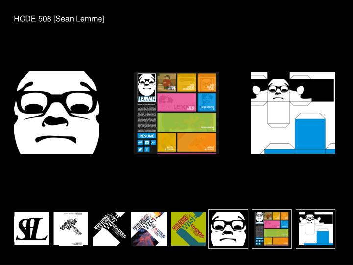
HCDE 508 [Sean Lemme]. Print. Web. Icons. Color. Photo. Layout II. Layout I. Type.

E N D
Print Web Icons Color Photo Layout II Layout I Type For the first assignment of HCDE 508, we had to find a way to combine three letters into a new shape. I chose my initials, SFL. Once I decided what I wanted the shape to be, a sort of fanning effect, I picked a bold serif font to create it. I like how the heavy lettering feels molded by the curves of the text. If I could spend some more time with this piece, I think I would play with font weight more, however. The “S” kind of disappears into the composition, while the “L” really stands out. I think I could have found a better middle ground.
Print Web Icons Color Photo Layout II Layout I Type For our first layout assignment, we had to chose text – in my case an email about a campus event – and establish its hierarchy. We then had to lay out that text, using no more than three fonts, in three different ways; horizontally, vertically, and diagonally. This diagonal version was my favorite, because of the shape I was able to create using the event’s title and keynote speakers. Little did I know I’d be using this composition for the next few weeks.
Print Web Icons Color Photo Layout II Layout I Type The first time I revisited the layout composition, it was to create another two versions of it. One was to show how it could be tweaked using lines, and the other using shapes. I really liked how the shapes one turned out, especially how the “WiSE” looked – I had to make sure that “E” didn’t turn into another letter or disappear. I also tried do an inverted effect (on the “Science” at the top and “Saturday” at the bottom) which at the time seemed pretty cool. If I could keep working on this piece, however, I would probably eliminate that.
Print Web Icons Color Photo Layout II Layout I Type The next revision of the layout assignment was to add a photograph to the composition, and it was a small challenge finding a photograph to go with women in science that was horrid. I ended up going with a photograph of an erupting volcano, and tried to give the piece a sort of 1980s sci fi / science text book feel. Maybe it could also be a metaphor for the power and influence of women in science no longer being dormant. I made a few versions that played more with inversion and transparency, but I think this version, with big white shapes, turned out the best.
Print Web Icons Color Photo Layout II Layout I Type The last time we edited our layout compositions was when we added color. The idea was to use 3-5 colors that not only went well together, but complimented the content of the poster. I made a bunch of new versions, and the one that everyone liked the most was this green one. That bright green seems like a ooze or goo, perhaps the work of some mad scientist. Hopefully it makes the event seem fun and inviting too. I also took this as an opportunity to slightly revise the shapes I was using, as I wanted to emphasize that green.
Print Web Icons Color Photo Layout II Layout I Type Shepard Fairey’s famous “Andre the Giant has a Posse” street art campaign started as a happy accident when he was teaching a friend how to make stencils. Similarly, the idea that I could create roughly the same effect came as a bit of a surprise while I was playing with images of my face for the icon assignment. But once inspiration hit, it was hard to resist. I’m not as big as Andre, but I’m something of a giant myself. And I could swap the ominous, They Live-inspired “OBEY” for my own name, which gives it a friendlier, goofier vibe. Instead of obeying me, let me do that for you – that sort of thing.
Print Web Icons Color Photo Layout II Layout I Type The first webpage I made relied heavily on my experience designing corporate responsive Wordpress blogs. This is my second attempt, and I wanted it to reflect my experiences in this class working with layout and color. The leftmost column is fixed and contains all the boilerplate information on the website. The right column can scroll vertically and features everything in my portfolio laid out in a strong grid, with some flexibility in tile sizing. Unlike my first attempt, on this website I tried to use many colors to make the site seem more fun and less businesslike. Every portfolio image has a mouseover state which reduces the opacity of the color overlay, as demonstrated by the “print media” tile. They all link to individual pages where the work is available in a higher resolution with commentary.
Print Web Icons Color Photo Layout II Layout I Type For the last assignment of this class, we had to create something that was designed to be printed and folded. I decided to make a papercraft version of myself, based on the icon I had already used for the previous couple of assignments. This is a revision of that original design that adds in new arm and neck pieces, as well as additional information on the actual piece of paper, so I could theoretically hand this out and let other people make mini mes.