Download
1 / 18
180 likes | 255 Views
Under standing C O L O R Theory VII. presentation by Pam Coulter. Review. There are two aspects of color that we examined last lesson: Atmospheric (or aerial) perspective Warm colors approach; cool colors recede. Atmospheric perspective.

E N D
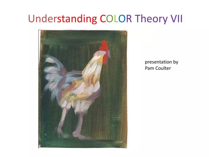
UnderstandingCOLOR Theory VII presentation byPam Coulter
Review There are two aspects of color that we examined last lesson: • Atmospheric (or aerial) perspective • Warm colors approach; cool colors recede
Atmospheric perspective Aerial perspective or atmospheric perspective refers to the effect the atmosphere has on the appearance of an object as it is viewed from a distance. As the distance between an object and a viewer increases, the contrast between the object and its background decreases, and the contrast of any markings or details within the object also decreases. The colours of the object also become less saturated and shift towards the background color, which is usually blue, but under some conditions may be some other color (for example, at sunrise or sunset distant colors may shift towards red). — Wikipedia
An example Carole Marine, High Country Shacks, 5” x 7”
Review: Exercise Using pictures of landscapes, put aerial perspective to use in adding depth to the flat plane of the canvas. Some pictures of mountains follow. A note about photography: Most of us are amateur photographers. As such, we use the default settings in taking photos. What happens is that the “depth of field” setting is the default setting and we see, in the picture that we get back. an infinitely sharp focus. Hold your thumb up and look only at it. notice that, with your attention focused on your thumb, everything around it fades in significance. That thumb becomes your focal point. In creating a painting, we choose what the focal point (or points) will be. In effect, we manipulate the viewer by our use of the basics of art.
Warm colors approach cool colors recede In depth perception, our human vision reads warm colors (red, orange, yellow, yellow-green) as closer to us and cool colors (blue, purple blue-green) as more distant. Notice that, if you stand looking out over distant fields, while you may still see a red roof in the distance, in general, farther objects will be "bluer" and nearer objects, brighter and warmer.
Flattening the plane • You can “flatten” space in a composition by mis-using cues. Doing a still life, for instance, where all the objects are bright and primary brings them into the same plane. (Not saying this is wrong. You can use this if you know what you’re doing.
What’s wrong with this portrait? Doing a portrait where the background is brighter and more warm than the face makes the face recede. Mary Ellison by Mary Cassatt
Warm colors approachCool colors recede exercise: landscape or portrait – using background color properly and “improperly” (Discuss the result) Pause for exercise
Color proximity: colors affect colors they are near. As an exercise to see this, Do a series of small simple figure-on-ground exercises using the same color on the figure and different colors on the ground (the background or area surrounding the figure.) Examples follow: Discuss!
Color Proximity:Using a colored ground Using a colored ground under your painting affects the painting, particularly if the paint is a bit transparent. Also, allowing a contrasting colored ground to show through parts of the painting gives an interesting contrast.
Colored Ground If you are going to start with a dark ground, you will want to ensure that your paints are relatively opaque. The opacity or transparency of your paints affects the finished product.
What’s next? Color opacity and transparency, how it affects your painting in acrylics, oils. How to combat problems. Give examples. Have students demonstrate. Exercise: do a chart of opacity/transparency. color and composition: hard and soft edges (exercise with still life) broken color and why it is used (exercise with impressionist landscape example and mabe student’s own picture. why the “old masters” used dark backgrounds in their pictures (examples) Mood and color (“psychological” aspect of color.) Maybe use Picasso’s blue guitarist and changethe color. Have students mock up own examples. High and low key; high and low contrast