Download
1 / 18
180 likes | 351 Views
presentation by Pam Coulter. Under standing C O L O R Theory IV. Review . Discuss color value scale which should be done by now. Home color / shades and tints / what use?. Review: Tints and Shades. notice that you’ve now used tints and shades

E N D
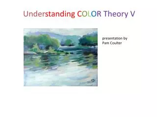
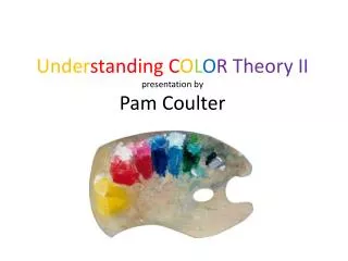
presentation byPam Coulter UnderstandingCOLOR Theory IV
Review Discuss color value scale which should be done by now. Home color / shades and tints / what use?
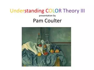
Review: Tints and Shades notice that you’ve now used tints and shades importance of getting away from just the saturated hues in your painting Cezanne Three pears
Review: Tints and Shades Tints, shades and “breaking the rule” Manet, Flowers in a vase Matisse, Window
Review Color lightening and darkening. Local color is the basic color of an area excluding the effects of light and shadow. Light will tend to wash out the color and shadow darkens and dulls it. If you can establish the basic “local” color of an object and then lighten and darken, using analogous or complementary colors rather than white or black, your painting will be richer than if you just “paint what you see” or what your reference photo shows.
Review: Modifying “home” value • Using black and white only to model form dulls the result. • Using complements and analogous colors keeps the result bright.
Above exercises should be done by now. Now we can start to apply to “real” objects Students should have brought one or more simple objects with a single “home” color (preferably high hue, not neutral — gray or brown)
Assignment Each student should have brought an object (can be a piece of fruit, cup, bowl — something with a simple shape and one basic home value.)
“Home” colors/modeling • Using ONLY black and white, lighten and darken the home color and value on these objects. We’ll compare this to the next exercise.
“Home” colors/modeling • Using analogous and complementary colors, lighten and darken the home color. Note: use actual fruit or shapes if available. Do red, yellow, blue and then orange, green, purple. (See next slide). You can put these on separate pages. Color background if you wish.
“Home” colors/modeling And do the same exercise using “secondary colors” shapes.
light: using color to model “When the light is cool, the shadows are warm; when the light is warm, the shadows are cool.” How does this seem to you? We’ll discuss more later. corot-italian-girl elgreco-Portrait-of-Jorge-Manuel-Theotocopoulos
light corot-bridge ingres-marcotte-dargenteuil-1810
warm and cool shadows practice warm and cool shadows if you finish previous exercise.
What’s next? “When the light is cool, the shadows are warm; when the light is warm, the shadows are cool.” NEXT: exercises using portrait and landscape. Atmospheric (aerial) perspective: tinting colors to get perspective (exercise: receding landscape.) Warm colors approach; cool colors recede. (exercise: landscape, portrait – using background color that is cooler than face.) Color proximity: colors affect colors they are near. (lemon exercise) Color proximity: using a colored ground. (Exercise: doing a primarily green landscape over a sienna ground) Color opacity and transparency, how it affects your painting in acrylics, oils. How to combat problems. Give examples. Have students demonstrate. Exercise: do a chart of opacity/transparency. color and composition: hard and soft edges (exercise with still life) broken color and why it is used (exercise with impressionist landscape example and mabe student’s own picture. why the “old masters” used dark backgrounds in their pictures (examples) Mood and color (“psychological” aspect of color.) Maybe use Picasso’s blue guitarist and changethe color. Have students mock up own examples. High and low key; high and low contrast