Download
1 / 17
170 likes | 400 Views
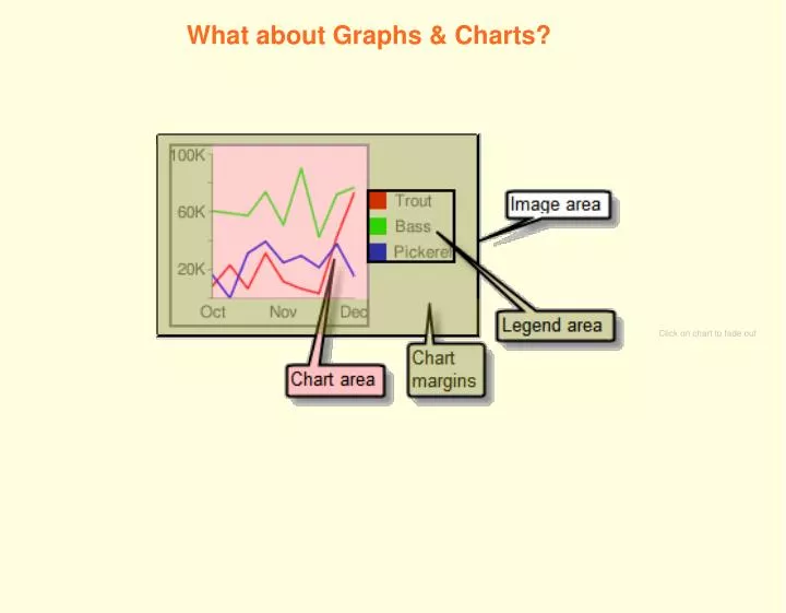
What about Graphs & Charts?. Click on chart to fade out. Not sure about which graph to use? Confused between bar charts, line graphs, and pie charts? Let's explore Charts. A Line Graph. Line graphs are used to track changes over short and long periods of time.

E N D
What about Graphs & Charts? Click on chart to fade out
Not sure about which graph to use? Confused between bar charts, line graphs, and pie charts? Let's explore Charts.
A Line Graph Line graphs are used to track changes over short and long periods of time. When smaller changes exist, line graphs are better to use than bar graphs.
Let's analyze the data on this chart. Let's make a line graph.
A Bar Chart Bar charts are used to compare things between different groups or to track changes over time. However, when trying to measure change over time, bar charts are best when the changes are larger.
Let's analyze the data on this chart. Let's make a bar chart.
A Pie Chart Pie charts are best to use when you are trying to compare parts of a whole. They do not show changes over time.
Let's analyze the data on this chart. Let's make a Pie Chart.
Venn Diagram The Venn Diagram is made up of two or more overlapping circles. It is often used in mathematics to show relationships between sets. Venn Diagrams are useful for examining similarities and differences. This activity enables students to organize similarities and differences visually .
Let's analyze the data on this chart. Yellow Marbles Red Marbles Let's make a venn diagram. = 1 student Green Marbles
Pictograph A pictograph uses pictures or symbols to represent an assigned amount of data. A pictograph takes the form of a bar graph. The key for a pictograph tells the number that each picture or symbol represents.
Let's analyze the data on this chart. Let's make a pictograph.
Nick, an analyst at a shipping company, reviewed historic postal rates in order to predict future rate increases.
The students in Mr. Smith's class recorded the number of siblings that each student has. How many students have at least 2 siblings? 3 7 12 23
Electoral Votes by States Use the Data in the tally chart to complete the missing row in the pictograph. Each = 2 votes Click on Star for answer.
Which shape is at (3, 2)? 5 4 3 2 1 0 1 2 3 4 Push Button for answer.