Download
1 / 28
300 likes | 473 Views
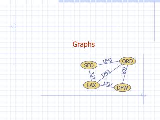
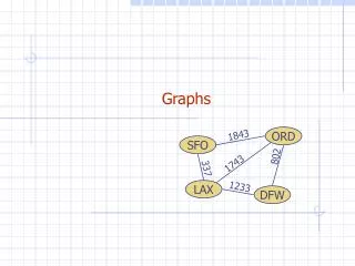
Graphs & Charts. Graphic communication. Name: ………………………………………………………… Class:……………… Teacher:…………………………………………. Introduction to Graphs and Charts.

E N D
Graphs & Charts Graphic communication Name: ………………………………………………………… Class:……………… Teacher:…………………………………………..
Introduction to Graphs and Charts Statistics are part of our everyday lives; from stocks and shares to government spending and sports league tables. Such information, when written, would be complex and difficult to understand. By representing statistics in a graph or chart makes the information much quicker and easier to understand and interpret. This makes it the most efficient way to display statistical analysis. • There are many ways in which we can record statistical information, for example: • Bar Charts • Pie Charts • Line Graphs • Pictograms • Tables
Types of Graphs and Charts Bar Charts (or Histograms) A Bar Chart uses either horizontal or vertical bars to show comparisons among categories. One axis of the chart shows the specific categories being compared, and the other axis represents the units. The "bars" should be of the same width and for clarity and where possible, should be kept separate. Pie Charts These charts are used to compare relative values of the statistic as a percentage. Pie charts show a circle cut into wedges, each wedge being proportionate to the relevant percentage value.
Task 1 – Reading Graphs and Charts • This pie chart shows the results of a survey that was carried out • to find out how students travel to school. • What is the most common method of travel? ………………….. • What fraction of the students travel to school by car? ………………….. • If 6 students travel by car, how many people took part in the survey? ………………….. (3) Leon conducts a survey to find the number of people in each of the cars arriving at his school gate between 8.30am and 9.00am. His results are shown in the bar chart on the left: How many cars contained 1 person? ……………………… How many cars contained more than 3 people? ………………………. Why are there only a small number of cars containing 1 person? ………………………. (3)
Types of Graphs and Charts Line Graphs A line graph is a useful way to displaying data or information that changes continuously over a period of time. Different scales are added to the X axis and the Y axis and a series of points are plotted (and joined with a line) to show a change in trends. Pictograms These are special kinds of bar charts (or graphs). Values or sizes are represented by symbols, figures or pictures related to the information being conveyed. These symbols, figures or pictures should be uniform in size and evenly spaced on the graph.
Task 2 – Reading Graphs and Charts 3. This line graph shows the midday temperature over a period of 7 days. a) What was the lowest temperature and on what day did it occur? ……………………………………………… On what day was the midday temperature 26°C? ……………………………………………… (2) 4. This pictogram shows the number of pizzas eaten by four friends in the past month: Who ate the most pizzas? …………………………………………. How many pizzas did Bob eat? …………………………………………. c) What was the total number of pizzas eaten by the four friends? …………………………………………. (3)
Types of Graphs and Charts Gantt Charts Gantt charts show the different tasks involved in making a product. They are used for complex planning where different tasks can be done at the same time, or where two or more people are working on the same project. Task 3 – Creating a Gantt Chart Using the Gantt chart above, answer the following questions; What process takes place during week 2 and week 3? …………………………… (1) What process are Hina and James doing during week 4? ……………………………(1) Who is responsible for printing the final version? ……………………………(1) What 3 tasks are they all involved in? …………………………………………………….. …………………………………………………….. …………………………………………………….. (3)
Task 4 – Creating a Graphs and Charts A group of 60 S4 pupils were asked what there favourite colour was. The results are shown below: Using the results above and the grid provided opposite, complete the following tasks: Label the X and Y axis (2) Input the data on the grid to create a bar graph(6)
Task 5 – Creating a Graphs and Charts A Craft, Design and Technology department at a local school decides to analyse their pupils exam results during a 10 year period. The results, shown below, show the number of pupils who achieved a grade A, B, C or D in Graphic communication: No. of pupils achieving grades A-D Year Group No. of pupils Using the results above and the grid provided opposite, complete the following tasks: Label the X and Y axis (2) Input the data on the grid to create a line graph (you may require colour pencils to show the different grades) (4) Year Group
Designing your Display Step 1: You must decide which topic you want to research and present. Some ideas are shown below to help you choose an idea. Favourite Soft Drinks Favourite Fresh Fruits Favourite Mobile Phone Favourite Karaoke Songs Favourite Breakfast Cereals Favourite Soap Opera Eg, A class of 20 Third year pupils were asked the question “What is your favourite action film?” The results are shown opposite Step 3: Create a ‘Survey Statement’ describing what research has been carried out, how many people have taken part etc. This information should appear somewhere on the finished presentation. Step 2: Decide which type of graph or chart would best suit the information you want to display. You could create some thumbnail sketches to help you decide. Also, consider what information could be represented on the X-axis and the Y-axis.
Designing your Display • Step 4: • After carrying out your research, you should produce a range of thumbnail sketches to help you create the perfect layout to display your statistical information. • Remember to include the following information on your presentation: • A heading/title eg, Favourite • Movies • A sub heading eg, Action films • A survey statement • Your graph/chart • Units should be included to show • how the information is being • measured in eg, number of people • or sales figures in £’s • To help create a good display, consider how you could use or include the following aspects: • Colour selections • Backgrounds and flashbars • Selection of fonts and size of text • Balance of the page • Additional images
Assignment • Brief: • The clients who asked you to design the Table Talker have asked you to create a statistical display for their new advertising campaign. This display will be published in local newspapers and online via their website and social networking pages. Your display must be clear, relevant and have good visual impact. • Things to consider: • What type of café/restaurant are you commissioned by? • - this may have an influence on your display. • What is your target audience? • - are you designing this display for teenagers or pensioners etc • What information are you displaying? • - what is the best way to display the information, ie, bar chart, line graph etc • What units will you use? • - time, number of people etc Comparisons between local competitors Most popular day of the week to eat out Most popular Dish Most popular drink You will be completing your display on Serif Draw Plus
Evaluation • Complete the table below by rating your work in terms of the criteria listed in the original brief; clarity, relevance and visual impact. Circle the mark you think best suits each heading using the grading system below. • 1: Unsatisfactory 2: Poor 3:Satisfactory 4:Good 5: Excellent • Answer the following question: • In which areas of this task were you successful? ……………………………………………………………………………………………………….. • ……………………………………………………………………………………………………….. • Which areas of the task could you improve on? ……………………………………………………………………………………………………….. • ………………………………………………………………………………………………………..
Homework Booklet Graphs and Charts Graphic Communication Name: ……………………………………………………………….……………… Class:……………………… Teacher:………………………………………………………………
Homework Ex1 – Interpreting data • A super market chain sold 3600 packets of sausages last month. • The pie chart shows the different flavors. • How many packets of vegetarian sausages were sold? • Answer: ………………………………………………… (1) • How many packets of beef sausages were sold? • Answer: ………………………………………………… (1) • This bar chart shows the heights of 200 people. • How many people were between 140-150cm? • Answer: ………………………………………………… (1) • How many people were over 150cm tall? • Answer: ………………………………………………… (1) • How many people were below 130cm tall? • Answer: ………………………………………………… (1)
Homework Ex2 – Interpreting data • The S4 pupils at a school were asked to state what their favorite fruit smoothie was, the results are shown in the pictogram below. • What was the most popular type of smoothie? Answer: ………………………………………………… (1) • How many pupils preferred the pineapple smoothies? Answer: ………………………………………………… (1) • Were bananas or apples more popular? Answer: ………………………………………………… (1) • What fruit was voted for by 10 pupils? Answer: ………………………………………………… (1) • e) How many pupils took part in the survey? Answer: ………………………………………………… (1) Apple Strawberry Each full piece of fruit represents 4 pupils choosing their favourite smoothie. Pineapple Banana Kiwi