Download
1 / 62
630 likes | 772 Views
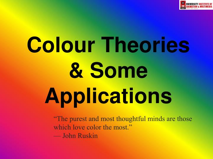
Colour Theories & Some Applications. “The purest and most thoughtful minds are those which love color the most.” — John Ruskin. Interpretations of Colour Theory by artists. Goethe’s Theory of Colours (1810) Built on wavelength theory of light (after Newton) Methods interesting

E N D
Colour Theories & Some Applications “The purest and most thoughtful minds are those which love color the most.” — John Ruskin
Interpretations of Colour Theory by artists • Goethe’s Theory of Colours (1810) • Built on wavelength theory of light (after Newton) • Methods interesting • Conclusion refuted • Influential on artists • Ex. Turner • Colour theory weblink Goethe’s Colour Wheel
Research on Colour Theory & Nomenclature (names) by scientists for aesthetic ‘products’ • Michel Eugène Chevreul--Chemist working in Gobelins carpet factory • Noticed optical mixing of two adjacent colours • De la loi du contrast simultané des couleurs 1839 • Influential on artists
Complementary Colours in art & design • 19th c. theories of “Simultaneous Contrast” and optical mixing Ex. Eugène Delacroix Women of Algiers
Complementary Colours in art & design • optical mixing • Ex. Pointillism (neo-expressionism)--Seurat
optical effects of adjacent tonal valuesor colourslink to stroboscopic effects (complementary colors seen as grey)http://www.michaelbach.de/ot/mot_strob/index.html
Colour Theory & Practical Applications in Design • Video Clip from The Devil Wears Prada Part of Pantone color swatch set with samples of color trends for designers (fall 2008) www.pantone.com
Types of Colour Theories • Subtractive Theory • The subtractive, or pigment theory deals with how white light is absorbed and reflected off of coloured surfaces. • Additive Theory • The Additive, or light theory deals with radiated and filtered light.
Subtractive Theory • Black absorbs most light • White reflects most light • Coloured Pigments absorb light and reflect only the frequency of the pigment colour. • All colours other than the pigment colours are absorbed so this is called subtractive colour theory. • The primary colours in Subtractive Theory are: • Cyan ( C ) • Magenta ( M ) • Yellow ( Y ) • Black ( K ) • Subtractive or Pigment Theory is used in printing and painting.
Additive Theory • Black radiates no light • White (sun) radiates all light • Video is the process of capturing and radiating light, therefore it uses Additive (Light) Theory not Subtractive (Pigment) Theory. • The primary colours in Additive Theory are: • Red ( R ) • Green ( G ) • Blue ( B ) • The primary colours add together to make white • Light Theory is also called Additive Theory. • Light Theory is used in Television, theater lighting, computer monitors, and video production.
The Colour Wheel If the ends of the spectrum are bent around a colour wheel is formed:
The Colour Wheel • Colours on the wheel can be described using three parameters: • Hue: degrees from 0˚ to 360˚ • Saturation: brightness or dullness • Value: lightness or darkness (As suggested by Henry Albert Munsell in A Colour Notation, 1905)
The Colour Wheel: Hue • Hue or Spectral Colour is represented as an angle. • Primary Colours: • 0˚ = Red • 120˚ = Green • 240˚ = Blue • Secondary Colours: • 60˚ = Yellow • 180˚ = Cyan • 300˚ = Magenta
The Colour Wheel: Saturation • Saturation or Chroma is the intensity of a colour. • A highly saturated colour is bright and appears closer to the edge of the wheel. • A more unsaturated colour is dull. • A colour with no saturation is achromatic or in the grey scale.
The Colour Wheel: Value "the quality by which we distinguish a light colour from a dark one." • Albert Henry Munsell A Colour Notation 1905 Value represents the luminescent contrast value between black and white
The Colour Wheel 3d Three parameters to describe a colour: Hue Chroma Value
Using Color-- • blue in large regions, not thin lines • red and green in the center of thefield of view (edges of retina not sensitive to these) • black, white, yellow in periphery • Color Brewer • Pantone
Colour SchemesSystematic ways of selecting colours • Monochromatic • Complimentary • Analogous • Warm • Cool • Achromatic • Chromatic Grays
Colour Schemes: Monochromatic • Monochromatic: One Hue many values of Tint and Shade Artist: Marc Chagall Title: Les Amants Sur Le Toit
Colour Schemes: Complementary (note spelling--NOT complimentary) • Complimentary: Colours that are opposite on the wheel. High Contrast Artist: Paul Cezanne Title: La Montage Saint Victoire Year: 1886-88
Colour Schemes: Analogous • Analogous: A selection of colours that are adjacent. Minimal contrast Artist: Vincent van Gogh Title: The Iris Year: 1889
Colour Schemes: Warm Warm: First half of the wheel give warmer colours. The colours of fire. Artist: Jan Vermeer Title: Girl Asleep at a Table Year: 1657
Colour Schemes: Cool Cool: Second half of the wheel gives cooler colours Artist: Pablo Picasso Title: Femme Allongée Lisant Year: 1939
Colour Schemes:Achromatic, Chromatic Grays Achromatic: Black and white with all the grays in-between. Chromatic Grays: Also called neutral relief. Dull colours, low contrast.
Colour Pickers & Choice of Media • HSB, HLS, HSV • RGB • CMYK • Others • Lab • PANTONE Munsell’s notation wheel
Colour Pickers: HSB, HLS, HSV • HSV • Hue • Saturation • Value • HSB (Same as HSV) • Hue • Saturation • Brightness • HLS • Hue • Lightness • Saturation
Colour Pickers: RGB, CMYK • RGB • Red • Green • Blue • Used in Video and Computer graphics • 3 Values in % or between • 0-255 • CMYK • Cyan • Magenta • Yellow • K = Black • Used for printing
Photoshop CS3 Picker • Combines HSB,RGB, CMYK,Lab (Luminance, Red/Green, Yellow/Blue) • Adobe http://kuler.adobe.com/
Colour Pickers: PANTONE • Standard for printing/fastion industry
Using the Wheel Complementary Colors Colors opposite from one another on the wheel. These colors will provide the most visual contrast. Contrast is the noticeable level of difference between two colors.
Contrast with Text But be careful, even though colors may contrast they may not always work well for text and background pairing. “Simultaneous Contrast” occurs when a color like red is fore grounded on blue. Note how the text appears to slightly vibrate. This would get annoying real quick. But simultaneously be aware of extreme lack of contrast in your text and background choices. Honestly, this is just painful. Do not make your readers struggle with this!
Practical Example Neither of these flyers is completely ineffective and both provide shape contrast with the text box. But the orange box above provides a nice contrast with the blues and grays of the clothes rack. The blue box here, however, is too similar to the clothes’ color palette.
Analogous Colors in Nature Nature offers an excellent look at analogous colors in action. Question: what color of flower could be added to this photo to provide a strong and attention drawing contrast?
Color and Cultural Association Color’s often come with feelings, moods, and associations that you can draw from in your work. For example, the color Red is largely associated with danger, aggression, stimulation, and excitement. Red stop signs signify danger if you don’t stop, and stimulates the senses with excitement less you don’t see one coming up!
Color and Cultural Association It’s an important to remember that these color associations do not come from the color itself. Without us to interpret it, red is simply light and doesn’t need an interpretive characteristic. Because these associations depend on us, they can differ from culture to culture, and they can also change over time. For example, purple use to be associated with solely belonging to royalty. This PowerPoint could now be beheaded if it weren’t made by the King or Queen!