Download
1 / 25
250 likes | 372 Views
Histograms. Kevin Zhou, Joshua Zhong , and Daniel Falvo. What is a histogram?. Does this sound boring?. Is it like 1000 times less than a milligram?.

E N D
Histograms Kevin Zhou, Joshua Zhong, and Daniel Falvo
What is a histogram? Does this sound boring? Is it like 1000 times less than a milligram? No. It is a diagram that displays the frequency of a continuous independent variable, or a series of intervals. It displays how many data points lay in each interval. 1 mg
Well... if so... you have 5 seconds to fall asleep. 5 4 3 1 2
How do you interpret histograms? Number of events in a given interval Frequency, Y-Axis Title Intervals, X-Axis
But when? But when should you use histograms instead of these?
When to appropriately use histograms When you have only one independent variable, you should use histograms. If you have very large data sets, use histograms to summarize them graphically.
What do histograms look like? (For real) Unless there are outliers. ??? Are you my kind? Symmetrical histograms are shaped like mounds.
Example of outliers Am I an outlier? I think.
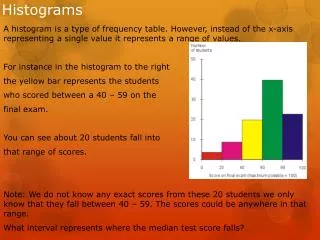
How can histograms be used in real life? What type of data is necessary to make a histogram? Example: How many people arrive at a certain time at the car loop on a two hour delay schedule? Independent variable: When people arrive Dependent variable: How many people arrived Notice how the data is NOT categorical, even though each interval seems like one! They have numbers, and thus, they are numerical. NUMERICAL!!!
THE HISTOGRAM Amount of students When kids arrive when there's a two hour delay
How is this histogram meaningful? This histogram is meaningful because it shows that most people arrive at the car loop early in the case of a two hour delay, so the teachers should pay the most attention from 10:00 to 10:03.
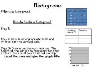
What have we seen so far? All of the histograms that we’ve seen so far are called frequency histograms. To create a histogram, first make a data table; then, just make the histogram as you would make a bar graph. Remember, the difference between them is very slight. Histograms have the rectangles next to each other; the other has them separated. Histograms have numerical independent variables. Bar graphs have categorical independent variables.
How do you create a histogram? • Decide on an example. • Collect data and put it in a data table. • As if making a bar graph, make a rectangle above each interval to the dependent variable. • There is no step 4. • Label the X-axis and Y-axis. • Give your graph a title. • Format it however you want, and in the meantime, set the gaps of the bars to 0%. • Stare at your masterpiece. • DONE!
Relative frequency histogram How can we make a relative frequency histogram using the information from the frequency histogram? Both histograms look the samebecause the relative frequency histogram shows the proportion of data in each interval.
How do you create a relative frequency histogram? • Decide on an example. • Collect data. • Add up each independent variable. • Divide each data point by the number you got from step 3. Record all of those numbers into a data table. • As if making a bar graph, make a rectangle above each interval to the dependent variable. • Label the axes and give your graph a title. • Do all of your pretty formatting techniques. • Stare at your masterpiece. • DONE! AGAIN! NOTICED HOW BOTH ARE 9 SIMPLE STEPS? Rounded to the nearest hundredth due to space issues
Interpreting relative frequency histograms (AKA Probability histogram) “0.4” means that there is a 40% chance, that someone would arrive between 10:00-10:01. Probability, Y-Axis
How does this relate to statistics? What is probability? Probability is the relative frequency of an event in the long run. This means that in the long run, the relative frequency histogram should look the same as a probability histogram! (Probability histograms are where all of the bar heights add up to 1)
Summing up relative frequency! Relative frequency is an event’s probability, or the proportion of times the event occurs in the long run.
Advantages and Disadvantages Disadvantages • The original data cannot be derived from the graph. That is because the graph only shows the frequencies. The intervals can combine several data points together, so you can’t retrieve the original data. • It is hard to read when there are outliers. Advantages • They are very easy to read, and are thus great for comparing data. • They can show the shape of distribution for a larger set of data. • They show trends in the data clearly.
Order For example: The X-axis is arranged in arrival time. When used in histograms, order just means how the graph is arranged in sequence.
Interval size The interval size is a mini-range. Anything that is between the minimum and maximum of two adjacent intervals will all be summed up into one bar. To select an interval size, it is suggested to find the range of the whole data set (maximum – minimum) and divide this number by 10.
Decreasing interval size When you decrease interval size, the histogram will look different. The bars will have lower frequency. Interval size 5 Interval size 1
Problem based off the graph Also known as: A pop quiz! Some people would arrive right on the spot, while others would arrive 15 minutes early. If you imagine that there was more data to the left, wouldn’t it be like a regular bell-curve? Where is the outlier on this histogram? The answer is “After”. Notice the jump between 10:10 and After. The reason why “10:00-10:01” is not the correct answer is because if we extended the histogram like so...
Works Cited or Consulted • The Cartoon Guide to Statistics • http://www.shodor.org/interactivate/activities/Histogram/ • Howto_histogram.pdf • http://www.studyzone.org/mtestprep/math8/k/histograms5l.cfm • http://www.psychstat.missouristate.edu/introbook/sbk09m.htm • David, H. A.; Nagaraja, H. N. (2003). Order Statistics. Wiley Series in Probability and Statistics.