Download
1 / 24
240 likes | 243 Views
This article explores the alarming decline in life expectancy in the United Kingdom since 2010, highlighting the impact of cuts to healthcare and social care services. It discusses the rise in mortality rates, particularly among older adults, and the need for political intervention to address this health crisis.

E N D
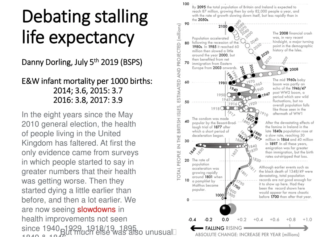
Debating stalling life expectancyDanny Dorling, July 5th 2019 (BSPS)E&W infant mortality per 1000 births: 2014; 3.6, 2015: 3.7 2016: 3.8, 2017: 3.9 In the eight years since the May 2010 general election, the health of people living in the United Kingdom has faltered. At first the only evidence came from surveys in which people started to say in greater numbers that their health was getting worse. Then they started dying a little earlier than before, and then a lot earlier. We are now seeing slowdowns in health improvements not seen since 1940, 1929, 1918/19, 1895, 1849 & 1846. But much else was also unusual
Between 2008 and 2013, cuts led to some 483,000 old and disabled people in the UK either losing their care support or becoming no longer eligible to claim it. “reductions … are particularly acute for older people”. There are now millions fewer social care visits a year to the elderly than took place five years ago. The biggest cuts to visits came after the general election of May 2010.
In the year to June 2013, some 23 400 more deaths than expected occurred (5% more). Post retirement life expectancy dropped by 2%. Influenza and pneumonia can have contributed only 5.8% and 3.5% (unless there was mass misdiagnosis).
Peaks tend to be multi-causal July 2011: UK’s largest private care home provider about to go bankrupt and might need to close all 752 homes – no effect? …Women deaths rate rose much faster than men’s. The BBC posted this story as a piece of ‘business news’. The coalition did not intervene early on. The underlying issue was landlords’ rents.
The Vote Partly Reflects a Health Crisis On the day of the EU referendum data from the ONS revealed there had been 52,400 more deaths in the year to June 2015 as compared to the same period a year before. Death rates in England and Wales rose overall by 9% and by 12% for those aged 90+; by 10% for those aged 85-89; 7% for those aged 80-84; 5% for those aged 75-70; and by 3% for those aged 55-74. These rate rises were unprecedented. They were attributed to dementia and Alzheimer’s, with influenza being suggested as a contributory factor. Austerity “almost certainly” played a major role. It was those with long term care needs who were dying earlier.The health and social services crises will worsen further as national finances worsen and as it becomes harder to recruit and retain staff from the European mainland (death rates only fell for adults aged 25-29).
From a talk given in Bristol, October 2016 This is what a flu epidemic looks like when you have a severe epidemic in England and Wales
24% 1918 1. Influenza (pandemic) 16% 1940 2. War 15% 1929 3. VeryColdwinter 13% 1895 4. The Great Frost 10% 1846 5. Cholera 9% 1849 6. Cholera 9% 2015 7. What? (7% rise calender year) 8% 1911 8% 1915 7% 1931 7% 1890 7% 1863 7% 1847 7% 1951 6% 1878 6% 1927 6% 1857 6% 1858 6% 1851 (Flu) 6% 1943 6% 1904 6% 1924 6% 1968 23. Flu The largest single year rises in mortality in England and Wales 1840-2015 (relative increase in mortality rate on the year before The rise in the overall death rate between the calendar years 2014 and 2015 was 7% - the last time a calendar year rise was a big as that was 1951 (When more people died of Flu in Liverpool than in the 1918 pandemic).Source of that claim: http://wwwnc.cdc.gov/eid/article/12/4/05-0695_article
Before the great rise in deaths we had some warnings – dismissed as artifact….
Male life expectancy from age 85 Source: https://www.ons.gov.uk/peoplepopulationandcommunity/birthsdeathsandmarriages/lifeexpectancies/bulletins/nationallifetablesunitedkingdom/20132015
Female life expectancy from age 85 Source: https://www.ons.gov.uk/peoplepopulationandcommunity/birthsdeathsandmarriages/lifeexpectancies/bulletins/nationallifetablesunitedkingdom/20132015
Relative declines for over 30 years have turned into absolute decline in health since 2010 or 2014 https://www.ons.gov.uk/peoplepopulationandcommunity/healthandsocialcare/childhealth/articles/ukdropsineuropeanchildmortalityrankings/2017-10-13
Lucinda Hiam and Martin McKee: The deepening health crisis in the UK requires society wide, political intervention, March 8, 2019: “These are not just numbers, these are lives” https://blogs.bmj.com/bmj/2019/03/08/lucinda-hiam-and-martin-mckee-the-deepening-health-crisis-in-the-uk-requires-society-wide-political-intervention/
What did the June 2019 ONS ‘MYE’ data release tells us about life expectancy? • On 26 June 2019 the annual midyear estimates of the population of the UK were released. The headline figure on mortality was that there had been 623,000 deaths, 20,000 more than the previous year, a 3% increase. However, the UK is also ageing so to what extent did the rise in mortality matter? • The BBC ran the story with the headline: “UK population growth rate stalls, official estimates show” and then quoted the spokesperson of the lobby group “Population Matters” (which used to be called “The Optimum Population Trust”) who said: “our already unsustainable population is continuing to rise and that will continue until a positive strategy is put in place to address it”. (https://www.bbc.co.uk/news/uk-48769175)
The Guardian newspaper lead with a story about migration saying that: “At 275,000, this net number of immigrants was 6,000 higher than the average for the past five years and 45,000 higher than last year.” And the Express newspaper reported that: “The surge is the equivalent of adding a city the size of Coventry to the country.” • The data released by ONS was very detailed. For instance in Coventry the number of men aged 86, 87, 88, 89 and 90+ who died in the most recent year was revealed to be 49, 45, 33, 49 and 254 respectably. The numbers of those ages who had died the year before was, in turn: 46, 42, 27, 39, and 216. In each case more had died, but of course that could just be down to chance (and it partly was). https://www.theguardian.com/world/2019/jun/26/uk-population-rises-to-664-million-but-rate-of-growth-slows https://www.express.co.uk/news/uk/1145955/uk-population-office-for-national-statistics-ons
Change in mortality in England for men by age (most recent data) • Source: analysis of ONS mid-year estimates as released on June 26 2019. • [Note: colouredred if number or rates of death are rising for age group]
Change in mortality in England for women by age (most recent data)
Some very basic mistakes are being made in ONS press releases “There were also fewer live births in England and Wales in 2017 and this meant the infant mortality rate increased to 3.9 deaths per 1,000 live births compared with 3.8 in 2016.” ‘This’ did not ‘mean’ that. [26 June 2019 release] https://www.ons.gov.uk/peoplepopulationandcommunity/birthsdeathsandmarriages/deaths/bulletins/childhoodinfantandperinatalmortalityinenglandandwales/2017
Other key data is hard to find (countries with data up to 2016: female life expectancy change, 2 year) https://www.ons.gov.uk/peoplepopulationandcommunity/birthsdeathsandmarriages/lifeexpectancies/articles/changingtrendsinmortalityaninternationalcomparison/2000to2016 See: https://www.ons.gov.uk/visualisations/dvc521/international/chart12/datadownload.xlsx
For men the worse effects come later (countries with data up to 2016: male life expectancy change, 2 year ) https://www.ons.gov.uk/peoplepopulationandcommunity/birthsdeathsandmarriages/lifeexpectancies/articles/changingtrendsinmortalityaninternationalcomparison/2000to2016 See: https://www.ons.gov.uk/visualisations/dvc521/international/chart12/datadownload.xlsx