Download
1 / 32
320 likes | 392 Views
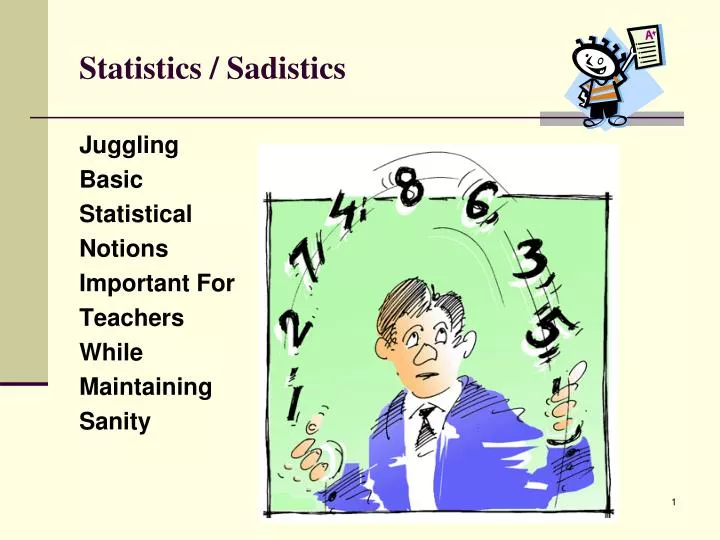
Statistics / Sadistics. Juggling Basic Statistical Notions Important For Teachers While Maintaining Sanity. Remember . . . There are three kinds of people in the world. Those who are good at math, and Those who aren’t.

E N D
Statistics / Sadistics Juggling Basic Statistical Notions Important For Teachers While Maintaining Sanity
Remember . . . There are three kinds of people in the world. Those who are good at math, and Those who aren’t.
Raw Scores: without organization or context, scores by themselves are meaningless • George Carlin’s famous line: “Here’s a partial football score just in, Green Bay 6.” • Ohio State 35; Michigan 32 • Annika Sorenstam 35; Lorena Ochoa 32 • John and Charley are taking a trip together. Charley has lived for 7 years; John has lived for 27. Who is the older of the two? • Charley • John • Charley is a dog. In human years he is 46; e.g., (7-1) x 5 +16 = 46. John is a man. In human years he is 27.
Edward L. Thorndike (1874-1949). . . his pioneer investigations in the fields of human and animal learning are among the most influential in the history of Psychology. “Whatever exists, exists in some quantity. If it exists in quantity, it can be measured.” – E. L. Thorndike (quote paraphrased)
The McNamara Fallacy . . . attributed to economist Charles Handy • The first step is to measure whatever can be easily measured. • This is okay as far as it goes. • The second step is to disregard that which can’t be easily measured, or to give it an arbitrary value. • This is artificial and misleading. • The third step is to presume that what can’t be measured easily isn’t important. • This is blindness. • The fourth step is to say that what can’t be easily measured doesn’t exist. • This is suicide. • Bottom Line of the Robert McNamara fallacy: • “What does not get counted does not count.”
Yet, the word ‘assess’ . . . comes from the Latin verb ‘assidere’ meaning ‘to sit with’. Thus, in assessment one is supposed to sit with the learner. This implies it is something we do withandforstudents and not to students. (Green, J. M. 1998, February. Constructing the way forward for all students. A speech delivered at “Innovations for Effective Schools” OECD/New Zealand joint follow-up conference, Christchurch, New Zealand.)
Statistics Topic List • Descriptive vs. Inferential Statistics • Concepts of Data, Variables, Scales • Frequency Tables • Bar Graphs and Histograms • Measures of Central Tendency • Measures of Variability • Shapes of Distributions • z-scores • Correlation
Two Main Areas of Statistics:Descriptive vs. Inferential • Descriptive Statistics is used to organize, consolidate or summarize data we have in front of us. Typically in descriptive statistics we describe: • a set of data elements by graphically displaying the information; or • its central tendencies and how it is distributed in relation to this center; or • the relationship between two data elements. • Inferential Statistics is a leap into the unknown. We use samples (a selected portion of the data set) to draw inferences about populations (the complete set of data elements).
Variables A good place to begin is with the concept of “variables”. Our students “vary” with regard to many characteristics related to aptitude and achievement. We can think of these variable characteristics using three levels of generality.
English Lesson – When Speaking of Data As a teacher, you will see lots of data. • The dictionary defines “data” as facts or figures. Notice the word “data” is plural and when speaking of data you need to use plural verb forms. It is an unfortunate giveaway that you might NOT know what you are talking about if you use the phrase “this data is” instead of “these data are” in professional conversation. • “Datum” is the singular form for data. No one ever uses this term.
Scales of Measurement – Organizing and Comparing Data; the use of Zero • The first is Nominal. It is data that is categorized and can't be arranged in an order from low to high; e.g. answer a question yes or no, colors of cars in a parking lot, race and gender. • The second is Ordinal. It is data that is categorized and can be arranged in an order from low to high, but differences between the scores can not be determined, or are meaningless; e.g. grades A, B, C, D, E or grade levels 9th, 10th, 11th, 12th, or survey type questions such as do not like, somewhat like, like, love; or another is movie ratings. • The third is Interval. It is the ordinal scale, but with the additional property that the difference between the data (i.e. the interval size) is equal, but the scale does not have a natural zero starting point; e.g. the years (2009, 2000, 1610, etc), the temperature scale (50, 68, 90, etc degrees F). • The fourth is Ratio. It is the interval scale, but with the additional property that it does have a natural zero starting point. Money and weight are examples; 0 money means you have none, and $4.00 is 2 X $2. Likewise with weight; no weight means there is none and 4 pounds is 2 x 2 pounds. • Note: Despite evidence that grading as punishment (such as the use of zero for missing work) does not work (Guskey, 2000) and the mathematical flaw in the use of the zero on a 100-point scale (Reeves, 2004), some teachers persist. Will you? • Guskey, T. R. (2000). Grading policies that work against standards … and how to fix them. NASSP Bulletin, 84(620), 20–29. • Reeves, D. B. (2004). The case against zero. Phi Delta Kappan, 86(4), 324–325.
Making and Reading Frequency Tables Part 1:Frequency Distributions - with special focus on bins (also known as intervals, categories and class intervals) Purpose of Creating these Tables – To organize data in ways to make our inspection of those data much more manageable. • Frequency Distribution • We construct or read a table of counts per score. • BUT, when we have many scores, we create intervals (I like the term “bins”) and place the individual scores in the bins. When making bins: • Determine your score range • Determine an appropriate number of bins. Rule of thumb: no fewer than 5 or more than 20 class intervals work best for a frequency table. • Make sure no overlap exists so that no data fall into more than one bin. • Count each score in its one and only appropriate bin. • Notice that in the resulting table, individual scores are lost.
Making and Reading Frequency Tables Part 2:Cumulative Distributions • Cumulative frequency distribution: A distribution that indicates cumulative frequency counts (cum f) in each bin, and/or percentage of the total number of cases at and below the upper limit of the associated bin. Sometimes this is referred to simply as cumulative distribution or cumulative frequency. • Note: Educators are using the description statistics of cumulative distributions when speaking of students’ relative standing. • Percentile: The point on the original measurement scale at and below which a specified percentage of scores falls. Also called a percentile point. • Percentile rank: The percentile rank of a score is the point on the percentile scale that gives the percentage of scores falling at and below a student’s specified score.
Tables are Nice, but Pictures are Nicer • Frequency distributions are often converted into graphic form. • Bar Graph – Individual counts. The count bins are separated on the horizontal line. • Histogram – Grouped counts. The bins touch each other on the horizontal line. • Pie Graph – Either individual or grouped counts. The media likes to display data using these graphs. • Explore the CSERD (Computational Science Education Reference Desk) Interactive Website. This is a Pathways project of the National Science Digital Library and funded by the National Science Foundation.
Ideas of Data “Centers”; How Does Data Cluster?. . . . starting with a concept from Garrison Keillor. Keillor’s hometown is Lake Wobegon, located near the geographic center of Minnesota. Keillor reports that in Lake Wobegon "all the women are strong, all the men are good looking, and all the children are above average."
Central Tendency • While graphs and charts are useful to visually represent data, they are inconvenient; they are difficult to display and can not be easily remembered apart from the visual. It is frequently useful to reduce data to a number (sometimes called an index number) that is easy to remember, is easy to communicate, yet captures the essence of the complete data set it represents. • One such index is called Measures of Central Tendency (i.e., how do the raw data tend to cluster) • Mean – the arithmetical average • Median – the middle score • Mode – the most occurring score • So, these are measures of “center” regarding the data, but we are also concerned about how the raw data are spread out around the center.
Consider the two graphs below. These graphs represent the scores on two quizzes. The mean score for each quiz is 7.0. Despite the equality of means, you can see that the distributions are quite different. Specifically, the scores on Quiz 1 (top graph) are more densely packed while those on Quiz 2 (bottom graph) are more spread out. The differences among students was much greater on Quiz 2 than on Quiz 1.
Variability • Our second index is called Measures of Variability (i.e., how do the raw data tend to spread out or scatter) • Range – list the lowest and highest scores, then take the difference (aka subtract) between them • Standard Deviation (S, SD, σ) – this is an interesting concept; it is akin to finding the average distance that scores are from the center • Variance (SD2) – mathematically the standard deviation squared; we more often use the standard deviation in educational assessment.
Shape of Normal Distributions • The frequency histograms for test score data often approximate what is called the “normal distribution” (aka bell curve, normal curve). • The normal curve has three characteristics: • unimodal – one hump • asymptotic – tails never touch the base • symmetrical – mirror image about the center axis
Shape of Other Distributions • Kurtosis – • platykurtic looks more flat • leptokurtic looks more peaked • Skewness – • positive skew means that the tail is to the right • negative skew means that the tail is to the left. -------------------------------------------------------------------- • Back to the normal distribution, let’s look at transforming a data score to a score that will tell us where that score is in relationship to the mean. This score is called a “z-score”.
z-scores • Formula: z = X - M SD • Definition: A measure of how many standard deviations a raw score is from the mean. • If the z score is negative, we say the score is below the mean • If the z score is positive, we say the score is above the mean
z-scores in normal curve This Graph Leads In To Percentile Rank
Comparing Two Variables So far we have only dealt with one variable (aka univariate statistics). Sometimes (I would say many times) we are curious as to the relationship between two variables (aka bivariate statistics). We call this curiosity an interest in co-relationships or correlation.
Some History . . . Francis Galton (1822-1911)and “Co-relations” • Cousin of Charles Darwin • Interested in the mathematical treatment of heredity • Used statistical analysis to study human variation • noted that arranging measures of a physical trait in a population (height, e.g.) displays a bell-shaped distribution • Coined term "eugenics"—science of improving the stock • variations (deviations) viewed as flaws as well as assets • artificial and natural selection will shift median of distribution
The Eugenics Movement • Scientific “evidence” was used to argue that social ills like feeble-mindedness, alcoholism, pauperism and criminal behavior are hereditary traits. • Aim - "to give the more suitable races or strains of blood a better chance of prevailing speedily over the less suitable" • Can no longer rely on natural selection: • unfit survive to childbearing years due to • advances in medicine • comforts of civilization • social welfare • unfit reproduce at higher rate than fit, • Must design society by controlling human reproduction: encourage fit to have children • prohibit unfit from having children
Scattergram – Can you “eye ball” the one line you could draw through the data points that best describes the graphic display? .
Correlation Coefficient – the calculated number that best describes the relationship between two variables • Correlation coefficient – symbol is “r” – linear relationships • Range -1.00 through .00 to +1.00 • Sign indicates direction • + indicates that as one variable increases, the other variable increases • - indicates that as one variable increases, the other variable decreases • Number indicates strength • Although the following table is somewhat arbitrary, the following thinking might be useful in interpretation: • -1.0 to -0.7 strong converse association. • -0.7 to -0.3 weak converse association. • -0.3 to +0.3 little or no association. • +0.3 to +0.7 weak direct association. • +0.7 to +1.0 strong direct association.
Important Notes about “r”: • Not a percentage (decimal makes it look like one) • Linear assumption, not curvilinear • Equal scatter assumption – no bunching • Variability affects “r” • Greater the variability, greater the “r” • Less the variability, lower the “r” • “r” does not imply causation
Depth Chart • During your YSU field work, you will be asked to organize data through the creation of frequency tables or histograms. Thus, we discussed constructing them as well as understanding them. • Throughout your professional practice, you will be asked to utilize measures of central tendency and variability. Thus, we emphasized understanding them, basic computations, and their relationship to z-scores. These concepts are key to understanding standard scores. • In professional publications you will see correlation coefficients. We discussed (and you were asked to compute) correlation. Correlation is a key tool in exploring our next topic – reliability (and later, validity) . • Hopefully you will see value in computing measures based on your own classroom data. It is actually fun to learn to do these basic descriptive stats with a software package. Commonly used packages include SPSS, SAS, Minitab, and SYSTAT. Any system would be OK. Start simple.