Download
1 / 35
350 likes | 492 Views
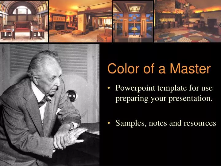
Color of a Master. Powerpoint template for use preparing your presentation. Samples, notes and resources. Why this Powerpoint File?.

E N D
Color of a Master • Powerpoint template for use preparing your presentation. • Samples, notes and resources
Why this Powerpoint File? • This file includes an outline, notes, ideas and graphic resources that might be helpful in planning and preparing your presentation. Feel free to use any portion of this file — or to use none of it. • While researching your presentation, be sure to keep the main goal in mind: introduce us to the distinctive color traits and tactics used by your artist/designer.Help us learn how they used color.
Artist/Designer • “SAVE-AS” THIS FILE with your own file name!
A suggested general outline for your presentation: • 5-8 minutes presentation • Introduce the artist/designer/firm briefly (1-2 minutes) • Present the artwork/designs and your analysis/comments on the works. (5-6 minutes) • Summarize color traits/strategies. (1 minute)
Introduce the artist/designer: Introduce the artist/designer/firm briefly (1-2 min) • Note that this presentation is not primarily a biography on an artist/designer. However, introduce us to the general background and influences on the artist —give us the context in which the designer worked. • Your presentation should answer some of these questions: • Where was he/she raised and where did he/she study? • When did he/she work? Where? • What kind of projects did he/she complete? • What influenced his/her work?? • What aspirations or goals motivated him/her?
Present a selection of representative works(6-12 works or a few major projects)5-6 minutes • Present/describe color use • Dominant hues • Typical hue schemes (complementary, split-comp, analogous, monochromatic, etc.) • Characteristic use of contrast (very bold, very soft/subtle?) • Prominent accents? • What traits recur? • Are there any ‘signature’ aspects of color use that this artist/designer often exploits?
Summary portion of presentation(about 1 minute) • Key points/conclusions — especially, what features are common in this artist/designer’s use of color?
Suggestion: make sure we can see your images! Scale images UP!Fill the screen so that we can see from a distance! Select the image…with arrow/cursor tool, drag control handles (at the corners of the selected image) Note that you can also crop/trim images within Powerpoint.
Suggestion: make sure the background of your slides complements rather than competing with your images and text. • Powerpoint allows you virtually unlimited control over the appearance of your content. • AVOID backgrounds that are busy/cluttered (they will distract) • AVOID backgrounds that are high in chroma (they will overwhelm most foreground imagery) • Generally avoid backgrounds that are light or white — since Ppt projects light in a darkened room, the broad bright surface can wash out smaller, darker images and text.
Suggestion: maintain value contrast. • Contrast, contrast, contrast…. • When selecting type, images and backgrounds, pay special attention to contrast — does the foreground stand out clearly from the background? • VALUE CONTRAST! • VALUE CONTRAST! • VALUE CONTRAST! • VALUE CONTRAST! • VALUE CONTRAST! • VALUE CONTRAST!
Suggestion: Use common fonts • Powerpoint files use fonts that are stored/installed on the computer that displays the presentation (not those stored on the computer used to create the presentation.) • Thus, if you use a really neat, nifty Art Deco font for your presentation, but our classroom computer does not have it installed, your presentation will end up looking very different. Often type placement/spacing will be very, very odd. • Arial, Times Roman, Helvetica are standard faces — readable and available.
Suggestion: Stick with Powerpoint • There are other presentation programs out there — good ones like Keynote. However, we don’t have those programs installed on our classroom computer. Thus, we can’t show those presentations. • Powerpoint is available on virtually every computer on Harding’s campus. Unless you have a very compelling reason to do otherwise, use it. • If you create your presentation in ANY program other than Powerpoint, it is your obligation to test the presentation during the class period before you are scheduled to present. (the presentation does not have to be finalized, but you must try out the file type that you plan to use.)
Importing/Placing Images • NOTE: these steps assume you are in Ppt editing mode [View:Normal] • [via Menu command] Insert:Picture:From File… (then use standard file dialog to locate your image file.) • Copy from Web browser or Photoshop (or any image-capable application) and Paste into Powerpoint • Drag-n-Drop: You can drag files directly from directory listings onto a Ppt slide.
Color Use Show us samples of the colors used in your designs/images.Help us see quickly what you’ve been looking at for a long time. To fill a swatch with a color from your photo:a) select the swatch/square From the fill-color palette, select the eyedropper tool (“Pick Fill Color”) Then click on the photo/image at exactly the spot with the color you want to sample. [note: copy/duplicate the squares above if you like.]
Schemes • Show us general/simplified color charts so we can quickly see the structure of the color relationships. • Feel free to coyp/paste/duplicate these charts and use Powerpoint’s draw/shape tools to chart color use.
W B Schemes
FRANK LLOYD WRIGHT May House, 1908
Transferring your presentation to the classroom • To show PPt files in classroom • A) copy your file to transportable media (CD-R, or USB memory key (best)) • B) store on your M-Drive (Not advised: This can be tricky as classroom access to M-Drives does not always connect as expected.) • Have your CD or memory key in class 5-10 minutes before class starts so we can transfer your file.
Artist/Designer • Contact me if you have questions/problem. • Gclayton@hardiing.edu • Phone: HU 4433