Download
1 / 52
520 likes | 670 Views
Screen. Cabinet. Cabinet. Lecturer’s desk. Table. Computer Storage Cabinet. Row A. 3. 4. 5. 19. 6. 18. 7. 17. 16. 8. 15. 9. 10. 11. 14. 13. 12. Row B. 1. 2. 3. 4. 23. 5. 6. 22. 21. 7. 20. 8. 9. 10. 19. 11. 18. 16. 15. 13. 12. 17. 14. Row C. 1. 2.

E N D
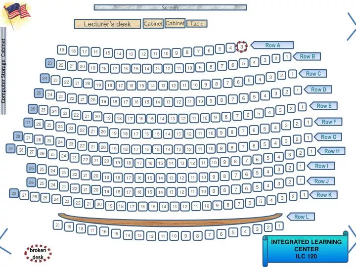
Screen Cabinet Cabinet Lecturer’s desk Table Computer Storage Cabinet Row A 3 4 5 19 6 18 7 17 16 8 15 9 10 11 14 13 12 Row B 1 2 3 4 23 5 6 22 21 7 20 8 9 10 19 11 18 16 15 13 12 17 14 Row C 1 2 3 24 4 23 5 6 22 21 7 20 8 9 10 19 11 18 16 15 13 12 17 14 Row D 1 2 25 3 24 4 23 5 6 22 21 7 20 8 9 10 19 11 18 16 15 13 12 17 14 Row E 1 26 2 25 3 24 4 23 5 6 22 21 7 20 8 9 10 19 11 18 16 15 13 12 17 14 Row F 27 1 26 2 25 3 24 4 23 5 6 22 21 7 20 8 9 10 19 11 18 16 15 13 12 17 14 28 Row G 27 1 26 2 25 3 24 4 23 5 6 22 21 7 20 8 9 29 10 19 11 18 16 15 13 12 17 14 28 Row H 27 1 26 2 25 3 24 4 23 5 6 22 21 7 20 8 9 10 19 11 18 16 15 13 12 17 14 Row I 1 26 2 25 3 24 4 23 5 6 22 21 7 20 8 9 10 19 11 18 16 15 13 12 17 14 1 Row J 26 2 25 3 24 4 23 5 6 22 21 7 20 8 9 10 19 11 18 16 15 13 12 17 14 28 27 1 Row K 26 2 25 3 24 4 23 5 6 22 21 7 20 8 9 10 19 11 18 16 15 13 12 17 14 Row L 20 1 19 2 18 3 17 4 16 5 15 6 7 14 13 INTEGRATED LEARNING CENTER ILC 120 9 8 10 12 11 broken desk
MGMT 276: Statistical Inference in ManagementRoom 120 Integrated Learning Center (ILC)Fall, 2012 Welcome
Use this as your study guide By the end of lecture today9/6/12 Surveys and questionnaire design – Prep for Tuesday Dot Plots Frequency Distributions - Frequency Histograms Frequency, cumulative frequency Relative frequency, cumulative relative frequency Guidelines for constructing frequency distributions Simple versus systematic random sampling Sample frame and randomization Stratified sampling, cluster sampling, judgment sampling Snowball sampling, convenience sampling Correlational methodology
Homework due - (September 11th) On class website: please print and complete homeworks 2 & 3 Please double check – Allcell phones other electronic devices are turned off and stowed away
Review of Homework Worksheet On Tuesday Homework Reports must be complete, stapled, and polished
Schedule of readings Before next exam: Please read chapters 1 - 4 & Appendix D & E in Lind Please read Chapters 1, 5, 6 and 13 in Plous Chapter 1: Selective Perception Chapter 5: Plasticity Chapter 6: Effects of Question Wording and Framing Chapter 13: Anchoring and Adjustment
Time series versus cross-sectional comparisons: Trends over time versus a snapshot comparison Time series design: Each observation represents a measurement at some point in time. Repeated measurements allow us to see trends. Cross-sectional design: Each observation represents a measurement at some point in time. Comparing across groups allows us to see differences. Unemployment rate Is there an increase in workers calling in sick as the summer months approach? Do more young workers call in sick than older workers? Grade point average (GPA) Does GPA tend to go up or down as students move from freshman to sophomores to juniors to seniors? Does GPA tend to go up or down when you compare Mr. Chen’s class with Mr. Frank’s Freshman English classes?
Sample versus census How is a census different from a sample? Census measures each person in the specific population Sample measures a subset of the population and infers about the population – representative sample is good What’s better? Use of existing survey data U.S. Census Family size, fertility, occupation The General Social Survey Surveys sample of US citizens over 1,000 items Same questions asked each year
Population (census) versus sampleParameter versus statistic Parameter – Measurement or characteristic of the population Usually unknown (only estimated) Usually represented by Greek letters (µ) pronounced “mu” pronounced “mew” Statistic – Numerical value calculated from a sample Usually represented by Roman letters (x) pronounced “x bar”
Simple random sampling: each person from the population has an equal probability of being included Sample frame = how you define population Let’s take a sample …a random sample Question: Average weight of U of A football player Sample frame population of the U of A football team Pick 24th name on the list Random number table – List of random numbers Or, you can use excel to provide number for random sample =RANDBETWEEN(1,110) Pick 64th name on the list(64 is just an example here) 64
Systematic random sampling: A probability sampling technique that involves selecting every kth person from a sampling frame You pick the number Other examples of systematic random sampling 1) check every 2000th light bulb 2) survey every 10th voter
Stratified sampling: sampling technique that involves dividing a sample into subgroups (or strata) and then selecting samples from each of these groups - sampling technique can maintain ratios for the different groups Average number of speeding tickets 12% of sample is from California 7% of sample is from Texas 6% of sample is from Florida 6% from New York 4% from Illinois 4% from Ohio 4% from Pennsylvania 3% from Michigan etc Average cost for text books for a semester 17.7% of sample are Pre-business majors 4.6% of sample are Psychology majors 2.8% of sample are Biology majors 2.4% of sample are Architecture majors etc
Cluster sampling: sampling technique divides a population sample into subgroups (or clusters) by region or physical space. Can either measure everyone or select samples for each cluster Textbook prices Southwest schools Midwest schools Northwest schools etc Average student income, survey by Old main area Near McClelland Around Main Gate etc Patient satisfaction for hospital 7th floor (near maternity ward) 5th floor (near physical rehab) 2nd floor (near trauma center) etc
Convenience sampling: sampling technique that involves sampling people nearby. A non-random sample and vulnerable to bias Snowball sampling: a non-random technique in which one or more members of a population are located and used to lead the researcher to other members of the population Used when we don’t have any other way of finding them Also vulnerable to biases
Judgment sampling: sampling technique that involves sampling people who an expert says would be useful. A non-random sample and vulnerable to bias Focus group: members can be randomly or not randomly selected. Mediator gathers opinion and information from group. Information can be qualitative or quantitative
So far, Measurement: observable actions Theoretical constructs: concepts (like “humor” or “satisfaction”) Operational definitions Validity and reliability Independent and dependent variable Random assignment and Random sampling Within-participant and between-participant design Single blind (placebo) and double blind procedures Continuous versus discrete Categorical versus Numerical data
Let’s try one A study explored whether eating carrots really improves vision. Half of the subjects ate a package of carrots everyday for 3 months while the other group did not. Then, they tested the vision for all of the subjects. The independent variable in this study was a. the performance of the subjects on the vision exam b. the subjects who ate the carrots c. whether or not the subjects ate the carrots d. whether or not the subjects had their vision tested
Let’s try one A study explored whether eating carrots really improves vision. Half of the subjects ate a package of carrots everyday for 3 months while the other group did not. Then, they tested the vision for all of the subjects. The dependent variable in this study was a. the performance of the subjects on the vision exam b. the subjects who ate the carrots c. whether or not the subjects ate the carrots d. whether or not the subjects had their vision tested
Let’s try one A study explored whether eating carrots really improves vision. Half of the subjects ate a package of carrots everyday for 3 months while the other group did not. Then, they tested the vision for all of the subjects. This experiment was a a. within participant experiment b. between participant experiment c. mixed participant experiment d. non-participant experiment
Let’s try one When Martiza was preparing her experiment, she knew it was important that the participants not know which condition they were in, to avoid bias from the subjects. This is called a _____ study. She also was careful that the experimenters who were interacting with the participants did not know which condition those participants were in. This is called a ____ study. a. between participant; within participant b. within participant; between participant c. double blind design; single blind d. single blind; double blind design
Let’s try one A measurement that has high validity is one that a. measures what it intends to measure b. will give you similar results with each replication c. will compare the performance of the same subjects in each experimental condition d. will compare the performance of different subjects in each experimental condition
Let’s try one A study explored whether conservatives or liberals had more bumper stickers on their cars. The researchers ask 100 activists to complete a conservative/liberal values test, then used those results to categorize them as liberal or conservative. Then they identified the 30 most conservative activists and the 30 most liberal activists and measured how many bumper stickers each activist had on their car. The independent variable in this study was a. the performance of the activists b. the number of bumper stickers found on their car c. political status of participant (liberal versus conservative) as determined by their performance on the liberal/conservative test d. whether or not the subjects had bumper stickers on their car
Let’s try one A study explored whether conservatives or liberals had more bumper stickers on their cars. The researchers asked 100 activists to complete a conservative/liberal values test, then used those results to categorize them as liberal or conservative. Then they identified the 30 most conservative activists and the 30 most liberal activists and measured how many bumper stickers each activist had on their car. The dependent variable in this study was a. the performance of the activists b. the number of bumper stickers found on their car c. political status of participant (liberal versus conservative) as determined by their performance on the liberal/conservative test d. whether or not the subjects had bumper stickers on their car
Let’s try one A study explored whether conservatives or liberals had more bumper stickers on their cars. The researchers 100 activists to complete a conservative/liberal values test, then used those results to categorize them as liberal or conservative. Then they identified the 30 most conservative activists and the 30 most liberal activists and measured how many bumper stickers each activist had on their car. This study was a a. within participant experiment b. between participant experiment c. mixed participant experiment d. non-participant experiment
Let’s try one A study explored whether conservatives or liberals had more bumper stickers on their cars. They had 100 activists complete liberal/conservative test. Then, they split the 100 activists into 2 groups (conservatives and liberals). They then measured how many bumper stickers each activist had on their car. This study used a a. true experimental design b. quasi-experiment design c. correlational design d. mixed design
Describing Data Visually Lists of numbers too hard to see patterns 14 17 20 25 21 29 16 25 27 18 16 13 11 21 19 24 20 11 20 28 16 13 17 14 14 16 8 17 17 11 11 14 17 19 24 8 16 12 25 9 20 17 11 14 16 18 22 14 18 23 12 15 10 13 15 11 11 8 11 14 17 19 24 8 12 14 17 20 25 9 12 15 17 20 25 10 13 15 17 20 25 11 13 16 17 20 27 11 13 16 17 21 28 11 14 16 18 21 29 11 14 16 18 22 11 14 16 18 23 11 14 16 19 24 Organizing numbers helps Graphical representation even more clear This is a dot plot
Describing Data Visually 8 12 14 17 19 24 8 12 14 17 20 25 9 13 15 17 20 25 10 13 15 17 20 25 11 13 16 17 20 27 11 13 16 17 21 28 11 14 16 18 21 29 11 14 16 18 22 11 14 16 18 23 11 14 16 19 24 Measuring the “frequency of occurrence” Then figure “frequency of occurrence” for the bins We’ve got to put these data into groups (“bins”)
Frequency distributions Frequency distributions an organized list of observations and their frequency of occurrence How many kids are in your family? What is the most common family size?
Another example: How many kids in your family? Number of kids in family 1 3 1 4 2 4 2 8 2 14 14 4 2 1 4 2 3 2 1 8
Frequency distributions Number of kids in family 1 3 1 4 2 4 2 8 2 14 How many kids are in your family? What is the most common family size? Crucial guidelines for constructing frequency distributions: 1. Classes should be mutually exclusive: Each observation should be represented only once (no overlap between classes) Wrong 0 - 5 5 - 10 10 - 15 Correct 0 - 4 5 - 9 10 - 14 Correct 0 - under 5 5 - under 10 10 - under 15 2. Set of classes should be exhaustive: Should include all possible data values (no data points should fall outside range) Correct 0 - 3 4 - 7 8 - 11 12 - 15 Wrong 0 - 3 4 - 7 8 - 11 No place for our family of 14!
Frequency distributions Number of kids in family 1 3 1 4 2 4 2 8 2 14 How many kids are in your family? What is the most common family size? Crucial guidelines for constructing frequency distributions: 3. All classes should have equal intervals (even if the frequency for that class is zero) Correct 0 - 4 5 - 9 10 - 14 Wrong 0 - 4 8 - 12 14 - 19 Correct 0 - under 5 5 - under 10 10 - under 15 missing space for families of 5, 6, or 7
8 12 14 17 19 24 8 12 14 17 20 25 9 13 15 17 20 25 10 13 15 17 20 25 11 13 16 17 20 27 11 13 16 17 21 28 11 14 16 18 21 29 11 14 16 18 22 11 14 16 18 23 11 14 16 19 24 4. Selecting number of classes is subjective Generally 5 -15 will often work How about 6 classes? (“bins”) How about 16 classes? (“bins”) How about 8 classes? (“bins”)
8 12 14 17 19 24 8 12 14 17 20 25 9 13 15 17 20 25 10 13 15 17 20 25 11 13 16 17 20 27 11 13 16 17 21 28 11 14 16 18 21 29 11 14 16 18 22 11 14 16 18 23 11 14 16 19 24 5. Class width should be round (easy) numbers Lower boundary can be multiple of interval size Remember: This is all about helping readers understand quickly and clearly. Clear & Easy 8 - 11 12 - 15 16 - 19 20 - 23 24 - 27 28 - 31 Round numbers: 5, 10, 15, 20 etc or 3, 6, 9, 12 etc • 6. Try to avoid open ended classes • For example • 10 and above • Greater than 100 • Less than 50
Let’s do one Scores on an exam 82 58 64 80 75 72 87 73 88 94 84 78 93 69 70 60 53 84 76 87 84 61 89 95 87 91 75 99 53 58 60 61 64 69 70 72 73 75 75 76 78 80 82 84 84 84 87 87 87 88 89 91 93 94 95 99 Step 1: List scores Step 2: List scores in order Step 3: Decide whether grouped or ungrouped If less than 10 groups, “ungrouped” is fine If more than 10 groups, “grouped” might be better How to figure how many values Largest number - smallest number + 1 99 - 53 + 1 = 47 Step 4: Generate number and size of intervals (or size of bins) If we have 6 bins – we’d have intervals of 8 Sample size (n) 10 – 16 17 – 32 33 – 64 65 – 128 129 - 255 256 – 511 512 – 1,024 Number of classes 5 6 7 8 9 10 11 Let’s just try it and see which we prefer… Whaddya think? Would intervals of 5 be easier to read?
Scores on an exam 82 58 64 80 75 72 87 73 88 94 84 78 93 69 70 60 53 84 76 87 84 61 89 95 87 91 75 99 Scores on an exam Score Frequency 93 - 100 4 85 - 92 6 77- 84 6 69 - 76 7 61- 68 2 53 - 60 3 Scores on an exam Score Frequency 95 - 99 2 90 - 94 3 85 - 89 5 80 – 84 5 75 - 79 4 70 - 74 3 65 - 69 1 60 - 64 3 55 - 59 1 50 - 54 1 53 58 60 61 64 69 70 72 73 75 75 76 78 80 82 84 84 84 87 87 87 88 89 91 93 94 95 99 Let’s just try it and see which we prefer… 6 bins Interval of 8 10 bins Interval of 5 Scores on an exam Score Frequency 95 - 99 2 90 - 94 3 85 - 89 5 80 – 84 5 75 - 79 4 70 - 74 3 65 - 69 1 60 - 64 3 55 - 59 1 50 - 54 1 Remember: This is all about helping readers understand quickly and clearly.
Scores on an exam 82 58 64 80 75 72 87 73 88 94 84 78 93 69 70 60 53 84 76 87 84 61 89 95 87 91 75 99 Scores on an exam Score Frequency 95 - 99 2 90 - 94 3 85 - 89 5 80 – 84 5 75 - 79 4 70 - 74 3 65 - 69 1 60 - 64 3 55 - 59 1 50 - 54 1 Let’s make a frequency histogram using 10 bins and bin width of 5!!
Scores on an exam 82 58 64 80 75 72 87 73 88 94 84 78 93 69 70 60 53 84 76 87 84 61 89 95 87 91 75 99 Step 6: Complete the Frequency Table Scores on an exam Score Frequency 95 - 99 2 90 - 94 3 85 - 89 5 80 – 84 5 75 - 79 4 70 - 74 3 65 - 69 1 60 - 64 3 55 - 59 1 50 - 54 1 RelativeCumulative Frequency 1.0000 .9285 .8214 .6428 .4642 .3213 .2142 .1785 .0714 .0357 Relative Frequency .0715 .1071 .1786 .1786 .1429 .1071 .0357 .1071 .0357 .0357 Cumulative Frequency 28 26 23 18 13 9 6 5 2 1 Just adding up the relative frequency data from the smallest to largest numbers Please note: Also just dividing cumulative frequency by total number 1/28 = .0357 2/28 = .0714 5/28 = .1786 6 bins Interval of 8 Just adding up the frequency data from the smallest to largest numbers Just dividing each frequency by total number to get a ratio (like a percent) Please note: 1 /28 = .0357 3/ 28 = .1071 4/28 = .1429
Scores on an exam 82 58 64 80 75 72 87 73 88 94 84 78 93 69 70 60 53 84 76 87 84 61 89 95 87 91 75 99 Step 6: Complete the Frequency Table Scores on an exam Score Frequency 95 - 99 2 90 - 94 3 85 - 89 5 80 – 84 5 75 - 79 4 70 - 74 3 65 - 69 1 60 - 64 3 55 - 59 1 50 - 54 1 RelativeCumulative Frequency 1.0000 .9285 .8214 .6428 .4642 .3213 .2142 .1785 .0714 .0357 Relative Frequency .0715 .1071 .1786 .1786 .1429 .1071 .0357 .1071 .0357 .0357 Cumulative Frequency 28 26 23 18 13 9 6 5 2 1 Just adding up the relative frequency data from the smallest to largest numbers Please note: Also just dividing cumulative frequency by total number 1/28 = .0357 2/28 = .0714 5/28 = .1786 6 bins Interval of 8 Just adding up the frequency data from the smallest to largest numbers Just dividing each frequency by total number to get a ratio (like a percent) Please note: 1 /28 = .0357 3/ 28 = .1071 4/28 = .1429
Step 6: Complete the Frequency Table Scores on an exam Score Frequency 95 - 99 2 90 - 94 3 85 - 89 5 80 – 84 5 75 - 79 4 70 - 74 3 65 - 69 1 60 - 64 3 55 - 59 1 50 - 54 1 RelativeCumulative Frequency 1.0000 .9285 .8214 .6428 .4642 .3213 .2142 .1785 .0714 .0357 Expected number in each group 7.15 10.71 17.86 17.86 14.29 10.71 3.57 10.71 3.57 3.57 Relative Frequency .0715 .1071 .1786 .1786 .1429 .1071 .0357 .1071 .0357 .0357 Cumulative Frequency 28 26 23 18 13 9 6 5 2 1 (.0715 x 100) = 7.15 people Question: What if we want to give the test to 100 students and we want to predict how many people would score in each category? Use the “relative frequency” to figure the percentage of 100 for each range of scores (relative frequency x 100)
Simple Frequency Table – Qualitative Data We asked 100 Republicans “Who is your favorite candidate?” Number expected to vote 6,380,000 3,740,000 2,860,000 2,200,000 880,000 880,000 5,060,000 Who is your favorite candidate Candidate Frequency Rick Perry 29 Mitt Romney 17 Ron Paul 13 Michelle Bachman 10 Herman Cain 4 Newt Gingrich 4 No preference 23 Relative Frequency .2900 .1700 .1300 .1000 .0400 .0400 .2300 Percent 29% 17% 13% 10% 4% 4% 23% If 22 million Republicans voted today how many would vote for each candidate? Just divide each frequency by total number Just multiply each relative frequency by 22 million Just multiply each relative frequency by 100 Please note: 29 /100 = .2900 17 /100 = .1700 13 /100 = .1300 4 /100 = .0400 Please note: .2900 x 22m = 6,667k .1700 x 22m = 3,740k .1300 x 22m = 2,860k .0400 x 22m= 880k Please note: .2900 x 100 = 29% .1700 x 100 = 17% .1300 x 100 = 13% .0400 x 100 = 4% Data based on Gallup poll on 8/24/11
Pie Charts: General idea of data that must sum to a total(these are problematic and overly used – use with much caution) Exploded 3-D pie charts look cool but a simple 2-D chart may be more clear Exploded 3-D pie charts look cool but a simple 2-D chart may be more clear Bar Charts can often be more effective
Scores on an exam 82 58 64 80 75 72 87 73 88 94 84 78 93 69 70 60 53 84 76 87 84 61 89 95 87 91 75 99 Graphing options Scores on an exam Score Frequency 95 - 99 2 90 - 94 3 85 - 89 5 80 – 84 5 75 - 79 4 70 - 74 3 65 - 69 1 60 - 64 3 55 - 59 1 50 - 54 1 Relative Frequency .0715 .1071 .1786 .1786 .1429 .1071 .0357 .1071 .0357 .0357 Cumulative Rel. Freq. 1.0000 .9285 .8214 .6428 .4642 .3213 .2142 .1785 .0714 .0357 Cumulative Frequency 28 26 23 18 13 9 6 5 2 1 Cumulative Frequency Data Cumulative Frequency Histogram
55 - 59 75 - 79 50 - 54 60 - 64 80 - 84 95 - 99 70 - 74 85 - 89 65 - 69 90 - 94 Score on exam Scores on an exam 82 58 64 80 75 72 87 73 88 94 84 78 93 69 70 60 53 84 76 87 84 61 89 95 87 91 75 99 Step 1: List scores Step 2: List scores in order Step 3: Decide grouped Step 4: Decide 10 for # bins (classes) 5 for bin width (interval size) Step 5: Generate frequency histogram Scores on an exam Score Frequency 95 - 99 2 90 - 94 3 85 - 89 5 80 – 84 5 75 - 79 4 70 - 74 3 65 - 69 1 60 - 64 3 55 - 59 1 50 - 54 1 6 5 4 3 2 1
55 - 59 75 - 79 50 - 54 60 - 64 80 - 84 95 - 99 70 - 74 85 - 89 65 - 69 90 - 94 Score on exam Scores on an exam 82 58 64 80 75 72 87 73 88 94 84 78 93 69 70 60 53 84 76 87 84 61 89 95 87 91 75 99 Generate frequency polygon Plot midpoint of histogram intervals Connect the midpoints Scores on an exam Score Frequency 95 - 99 2 90 - 94 3 85 - 89 5 80 – 84 5 75 - 79 4 70 - 74 3 65 - 69 1 60 - 64 3 55 - 59 1 50 - 54 1 6 5 4 3 2 1
55 - 59 75 - 79 50 - 54 60 - 64 80 - 84 95 - 99 70 - 74 85 - 89 65 - 69 90 - 94 Score on exam Scores on an exam 82 58 64 80 75 72 87 73 88 94 84 78 93 69 70 60 53 84 76 87 84 61 89 95 87 91 75 99 Generate frequency ogive (“oh-jive”) Frequency ogive is used for cumulative data Plot midpoint of histogram intervals Connect the midpoints Scores on an exam Score 95 – 99 90 - 94 85 - 89 80 – 84 75 - 79 70 - 74 65 - 69 60 - 64 55 - 59 50 - 54 30 Cumulative Frequency 28 26 23 18 13 9 6 5 2 1 25 20 15 10 5
Pareto Chart: Categories are displayed in descending order of frequency
Stacked Bar Chart: Bar Height is the sum of several subtotals