Download
1 / 16
160 likes | 303 Views
Scatter Diagram & Line of Best Fit. Prepared by Lee Kok Ming Li Po Chun United World College of Hong Kong For the Statistical Section of Mathematics at International Baccalaureate Diploma Level (equivalent to grade 11 and 12). Objectives:.

E N D
Scatter Diagram &Line of Best Fit. Prepared by Lee Kok Ming Li Po Chun United World College of Hong Kong For the Statistical Section of Mathematics at International Baccalaureate Diploma Level (equivalent to grade 11 and 12).
Objectives: At the end of this presentation you should be able to: • plota scatter diagram, • find out the direction, form, and the qualitative strength of the relationship, and • to draw a line of best fit by inspection.
Introduction: • Scatter Diagram is often used as the initial visualization aid for two sets of data. • Ideally, these data should be continuous. • The purpose: to find out whether or not these data are related.
Concept Map. Direction, form & strength of relationship Plotting a scatter diagram Drawing the line of best fit Data Data
An example: • Each dot on the diagram represents a pair of the data on the left. Map
No matter how you draw it, height and weight in this sample has a positive association (relationship or correlation). • That is, as height increases there is also a tendency for weight to increase.
Caution: • Scatter diagram cannot show causality. • It only shows how these data are related to each other. Map
Questions: • What is the relationship between x and y? Negative association. • What is the form of this relationship? Linear (negative association)
There are non-linear associations. How would you describe the association between • Radioactivity & time ? Exponential decay. • Level of pollution & economic development? Quadratic function.
Describe the relationship between x and y. Exponential growth. Another Question:
A Challenge: • Describe the relationship between height of tide and time. Sine or Cosine.
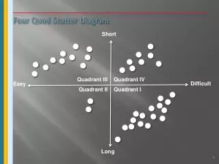
Correlation coefficient (r) measures the strength of a linear association. Please match the “qualitative” tags below to diagrams A, B, C & D above: No association Perfect positive association Strong positive association Weak positive association Qualitative Strength: D A B C Map
Which is the Line of Best Fit?Revisiting our first example. • The line of best fit should pass through most points in such a way that data points are distributed as evenly as possible above and below the line.
Line of Best Fit: • The line of best fit always passes through the point that has both means as its coordinates (red point) • The line of best fit: • Gives us an algebraic function. • Gives us “power” to predict.
Summary: • Scatter Diagram: • Visualization • Direction, form & strength of relationship • Line of Best Fit gives us an algebraic relationship • Line of Best Fit always passes through the point (mean of x, mean of y).
Links for Correlation & Regression. • A good start to more correlation and regression with examples. Also uses Excel for calculation. Click here. • To try a hand-on calculation with Excel. Click here. (Please enable Macro to activate the spreadsheet.) • Return to Statistical Method website.