Download
1 / 10
110 likes | 227 Views
Composition Elements. Com Tech 1 WJ. Veldhoen. Visual Composition. Visual composition delivers interesting messages with text and artwork…. How do we See and Understand?. Photography, Video and all Graphic Arts are a based on our seeking understanding through our visual senses.

E N D
Composition Elements Com Tech 1 WJ. Veldhoen
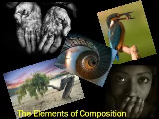
Visual Composition Visual composition delivers interesting messages with text and artwork…
How do we See and Understand? • Photography, Video and all Graphic Arts are a based on our seeking understanding through our visual senses. • What we see is a major part of our decision if we believe what we hear. • 80% of a message is visual • Visual composition are tools and techniques used create clear messages in the visual space of a page, computer screen, billboard etc.
Visual Composition focuses on a clear message. For the Graphic Artist • Focus on how people search images for meaning. • Provide choices as you design • Link all parts of a design for unified message.
THE ELEMENTS OF DESIGN • LINELine can be considered in two ways. • the linear marks made with a pen or brush • the edge created when two shapes meet. • Lines can also be seen as continuous or as broken • DIRECTIONAll lines have direction - Horizontal, Vertical or Diagonal and can encourage a sense of direction when we explore an image. They can also suggest feeling that become part of the message we receive. • Horizontal suggests calmness, stability and tranquility. • Vertical gives a feeling of balance, formality and alertness. • Diagonal suggests movement and action • Curves connect or add flow in images or layouts. The line is a set of points we assume are connected as we look for meaning. Text are lines we connect and attach meaning to including sounds and ideas. Fonts in text can add to, or distract from the idea.
Lines can direct your attention or be the story of your image. • How do the lines in these images add to the stories? • Which image uses the lines to suggest the world has 3 dimensions in a 2 dimensional image? • Which image uses outlines to bring emphasis.
SHAPE • Lines can work together to create a sense of a shape. • A shape is a self contained defined area of geometric or organic form. • Open Shapes can be entered and exited easily. • Closed shapes contain or separate ideas or groups • A positive shape in a painting automatically creates a negative shape. • Silhouette focuses on shape around the outside of an object with little or no detail inside. • This rope by Britney shows lines becoming a shape with an inside and outside • The lines in the background do not become shape but give a texture in the image • Subtle variation in the light also suggest the rope has height while the background lines do not. • When you sense that third dimension we say you are working with form while shapes are flat or 2 dimensional.
Elements cont. • SIZESize is simply the relationship of the area occupied by one shape to that of another. • TEXTURETexture is the surface quality of a shape - rough, smooth, soft hard glossy etc. Texture can be physical (tactile) or visual. • COLOURAlso called Hue Colour can evoke emotional responses that should be a considered as part of your unified message. • VALUEValue is the lightness or darkness of a colour. Value is also called Tone. • Black and white images shift focus from hue to value. • This image by Colleen B shows how a story can shift in editing from the original shot above to the edited below. • The size of the cropped section being increased focuses attention on the different textures of the glass and metal work. • The colour and values shifting give a different sense of mood. • This shot could have been cropped less if shot in portrait mode and colour filters on the camera could be used for effect as well.
Discuss 1. • What was the dominant shape in each image? • Is there a message in the way the shape is used? 2.
DOMINANCE Dominance gives an image interest, counteracting confusion and monotony. Dominance can be applied to one or more of the elements to give emphasis • Placement in an image can add or reduce dominance. • Centering vertically or horizontally can be calming and discourage the viewer from looking at the rest of the scene. • Placement off center can add tension and encourage exploration of the whole space. • Different rules such as the golden Mean, Rule of Thirds and Symmetry are choices to work with dominance and creating a clear message. Your self evaluation of work will be graded of the clarity of a message and how you use different ideas to focus or create dominance an image or graphic design.