Download
1 / 12
120 likes | 209 Views
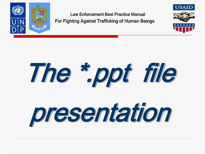
For Fighting Against Trafficking of Human Beings. The *.ppt file presentation. Use a Template. Use a set font and color scheme. Different styles are disconcerting to the audience. You want the audience to focus on what you present, not the way you present.

E N D
For Fighting Against Trafficking of Human Beings The *.ppt file presentation
Use a Template • Use a set font and color scheme. • Different styles are disconcerting to the audience. • You want the audience to focus on what you present, not the way you present. • See Presentation Templates in Microsoft Office
Fonts • Choose a clean font that is easy to read. • Roman and Gothic typefaces are easier to read than Script or Old English. • Stick with one or two types of fonts. • Bulleted items should be no smaller than 22 points. • The title should be no smaller than 28 points.
Bullets • Keep each bullet to one line, two at the most. • Limit the number of bullets in a screen to six, four if there is a large title, logo, picture, etc. • This is known as “cueing” • You want to “cue” the audience in on what you are going to say. • Cues can be thought of as a brief “preview.” • This gives the audience a “framework” to build upon.
Bullets (2) • If you crowd too much text, the audience will not read it. • Too much text makes it look busy and is hard to read. • Why should they spend the energy reading it, when you are going to tell them what it says? • Our reading speed does not match our listening speed; hence, they confuse instead of reinforcing each other.
Caps and Italics • Do not use all capital letters • Makes text hard to read • Conceals acronyms • Denies their use for EMPHASIS • Italics • Used for “quotes” • Used to highlight thoughts or ideas • Used for book, journal, or magazine titles
Colors • Reds and oranges are high-energy but can be difficult to stay focused on. • Greens, blues, and browns are mellower, but not as attention grabbing. • White on dark background should not be used if the audience is more than 20 feet away. • This set of slides is a good example. • You can easily read the slides up close. • It is harder to read the further away you get.
Backgrounds • A white on a dark background was used for this set of slides as: • The author assumes most users will view the presentation on their own computer. • Having a dark background on a computer screen reduces glare.
The Color Wheel • Colors separated by another color are contrasting colors (also known as complementary) • Adjacent colors (next to each other) harmonize with one another. e.g. Green and Yellow • The color wheel below is simplified for easy use
Clashing Colors • Colors that are directly opposite from one another are said to clash. • These provide readability - e.g. yellow on blue.
Attention Grabber To make a slide stand out, change the font or background
Illustrations • Use only when needed, otherwise they become distracters instead of communicators • They should relate to the message and help make a point • Ask yourself if it makes the message clearer • Simple diagrams are great communicators