Download
1 / 36
370 likes | 560 Views
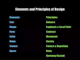
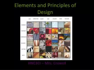
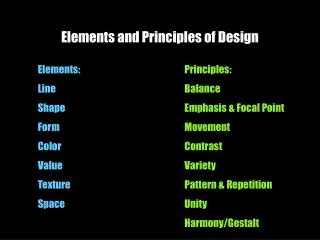
Elements and Principles of Design. AVI 3M0. Elements of Design. The basic ingredients and tools to create a visual image. Line.

E N D
Elements and Principlesof Design AVI 3M0
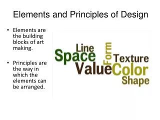
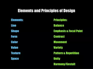
Elements of Design The basic ingredients and tools to create a visual image.
Line An element of art that is used to define shape, contours, and outlines, also to suggest mass and volume. It may be a continuous mark made on a surface with a pointed tool or implied by the edges of shapes and forms.
Characteristics of Line are: • Width- thick, thin, tapering, uneven Length - long, short, continuous, broken
Direction- horizontal, vertical, diagonal, curving, perpendicular, oblique, parallel, radial, zigzag Focus- sharp, blurry, fuzzy, choppy
Shape Shape: When a line crosses itself or intersects with other lines to enclose a space it creates a shape. Shape is two-dimensional; it has height and width but no depth.
Categories of Shapes • Geometric Shapes-Circles, Squares, rectangles and triangles. We see them in architecture and manufactured items. • Organic Shapes-Leaf, seashells, flowers. We see them in nature and with characteristics that are free flowing, informal and irregular.
Texture Texture is the surface quality of an object. A rock may be rough and jagged. A piece of silk may be soft and smooth and your desk may feel hard and smooth.
Categories of Texture • Real Textureis the actual texture of an object. Artist may create real texture in art to give it visual interest or evoke a feeling. A piece of pottery may have a rough texture so that it will look like it came from nature or a smooth texture to make it look like it is machine made. • Implied Textureis the where a two-dimensional piece of art is made to look like a certain texture but in fact is just a smooth piece of paper. • Mechanical textureis when a three dimensional texture is transferred onto a two-dimensional surface. An example is placing a piece of paper over a coin and rubbing the paper with a pencil
Space Space in a two-dimensional drawing or painting refers to the arrangement of objects on the picture plane. The picture plane is the surface of your drawing paper or canvas. The illusion of depth can be achieved by using perspective. This is the technique used to have your picture look likes it is moving to the distance like a landscape or cityscape.
Categories of Space • Positive Space – is the main shapes in the work of art • Negative space – is the background or empty space
Techniques • Spaciousness – a lot of negative space • Uniform – negative space evenly controlled • Tension – very little negative space • Overlapping – creates three dimensional depth and distance
Colour Colour is the effect of white light reflecting off of objects with pigment. Colour can have expressive, informative, and psychological effects in works of art.
Colour • A Colour Wheel is a tool used to organize colour. It is made up of: • Primary Colours-Red, Yellow, Blue (colours that cannot be mixed). • Secondary Colours-Orange, Violet, Green, (colours are created by mixing two primaries). • Tertiary Colors- Red-Orange, Yellow-Green, Blue- Violet, etc. (mixing a primary with a secondary creates these colors). • Complementary Colors-are colors that are opposite each other on the color wheel. When placed next to each other they look bright and when mixed together they neutralize each other.
We call the side of the colour wheel that reminds us of fire warm colours. • We call the side of the colour wheel that reminds us of ice and water cool colours • A hue is the proper name for colours on the colour wheel • A tint is a colour mixed with white. A shade is a colour mixed with black. • A monochromaticcolour scheme is a colour mixed with black, white, and shades of grey. • An analogous colour scheme is two or more neighbouring colours on a colour wheel.
Value Value is the range of lightness and darkness within a picture. Value is created by a light source that shines on an object creating highlights and shadows. It also illuminates the local or actual colour of the subject. Value creates depth within a picture making an object look three dimensional with highlights and cast shadows, or in a landscape where it gets lighter in value as it recedes to the background giving the illusion of depth.
Shaded Sphere LIGHT SOURCE FULL LIGHT SHADOW EDGE HALF TONE REFLECTED LIGHT CAST SHADOW
Sfumato is the blurring or softening of sharp outlines in painting by subtle and gradual blending of one tone into another. • Chiaroscuro is a technique of painting or drawing using light and shade to achieve a three-dimensional quality
When creating a value on an object (for example, shading), consider: • Source of light: angle, distance, shape of light, wattage, and casing of light • Object: material, positioning in relation to other shapes, size, texture, colour, and reflected light • Surface for cast shadow: texture, colour, material of which it is made, size and shape, and reflected light.
Cast shadows of more than one object come together to create an organic shape • If the light source is closer to the object, cast shadow is shorter and darker and it has a sharp edge • Highlight is very light and small • If the light source is further from the object, the highlight is lighter, softer, larger, faded, or less intense.
Principles of Design The principles of art are used to control and order the elements of art and create organization in the art form. The unification of these elements and principles produces a successful design.
Balance Balance is overall visual weight of a composition. 3 Types of Balance Symmetric:achieved when the objects on either side of a central axis is similar or the same. Asymmetric:achieved when aspects of the object are not distributed equally on each side but their total weight is balanced. Radial:achieved when axis point originates from the centre of the composition and objects fan out from that point. Symmetrical Balance
Rhythm/ Movement Movement in a composition guides a viewers eye through the work, usually to the focal point. By using lines, shapes, forms, colours, etc. the artist can produce the look of action. Rhythm is the regular repetition of elements of art to produce a look and feel of movement
Types of Movement • vertical: up and down movement will produce a feeling of stability (tall buildings, telephone poles) • horizontal: side to side movement can show quiet, rest and calm (land and seascapes) • diagonal: will provide a feeling of uneasiness, imbalance, and action (a running figure) • colour: warm coloursadvance, cool coloursrecede, bright colours seem closer to us than faded or muted colours
Other Ways to Create Movement • overlap objects to produce movement from one to the other • create a path between objects in which movement seems to flow • emphasize or exaggerate certain lines or colours to draw attention to the pattern of movement. • place the horizon line higher up on the picture plane to emphasize movement to the centre of interest. • use lines of perspective to draw your eyes further into the picture plane
Scale/ Proportion Change in scale or proportion of an object is made to help otherobjects stand out or make the viewer question thejuxtaposition.
Changing the proportions of a face or object can result in humorous caricatures or cartoons
Unity occurs when everything in the composition looks like it belongs together. Similar colours, textures, line, brushwork, etc. are used to create the composition. Unity
Dominance/Emphasis This occurs when certain elements are stressed more than others. This may be done by contrasting colour, size, texture, and shape. Typically, this area is the focal point.
Contrast/ Variety Contrast is an abrupt, unexpected change in an element. When there are many changes and multiple qualities occur, variety is created. E.g. A variety of fruits in a composition with a wide range of colours and textures contrast and variety is achieved.