Download
1 / 45
500 likes | 682 Views
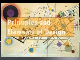
Elements and Principles of Design. How Do We Make Art?. We mark on the page to create lines, shapes, objects, and spaces. We color parts in to call attention to them and make everything aesthetically pleasing (pretty). Elements of Design – “The How”.

E N D
How Do We Make Art? We mark on the page to create lines, shapes, objects, and spaces. We color parts in to call attention to them and make everything aesthetically pleasing (pretty).
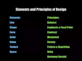
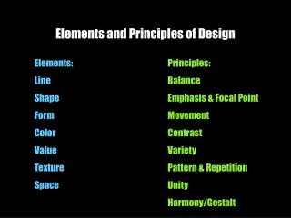
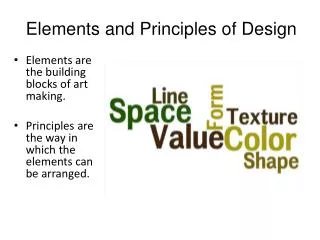
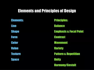
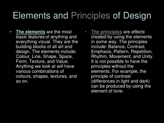
Elements of Design – “The How” These are the things that make up any work of art. Think of them as the ‘tools’ or ‘ingredients’ artists use to create their work. Shape Line Form Space Color Value Texture
Line • Line is the most basic of the elements. • ALL ARTWORK CONTAINS LINE. • What are some different kinds of line?
Lines are Created by: • Line of vision • Patterns • Edges of art • Edges of colors • objects
Shapes • Shapes are 2-DIMENSIONAL enclosed spaces. • There are two different kinds of shapes: • Geometric • Organic
Form • Form is a 3-DIMENSIONAL enclosed space. • They are the same as shapes expect that they are/or appear to be 3D.
Space • The feeling of depth or that you could move/interact with an artwork. • It can be real (like a sculpture) or visual (like a painting).
Color • We reproduce color through pigments. • Pigments are the chemicals that create colors. • They work a bit differently than visible light but produce similar effects.
Three Properties of Colors • Hue – The name of a color • Value – The lightness or darkness of a color • Intensity – The brightness or dullness of a color
Color Ranking • Colors are broken down • into three main rankings. • Primary (Circles) • Secondary (Squares) • Tertiary (Triangle)
The Primary Colors Red Yellow Blue • The primary colors are the main colors. • They CANNOT be made through mixing. • ALL other colors can be made by mixing primaries (and white and black).
The Secondary Colors OrangeGreenViolet • These colors are created by mixing two primary colors together.
The Tertiary Colors • These colors are made • by combining a primary • and a secondary color. • They typically have • combination names such • as Red-Orange. • Remember 1+2=3.
Warm vs. Cool The color wheel can be spilt on the diagonal to divide it into warm and cool colors. What are some differences between warm and cool colors? Warm Cool
Warm Colors Warm colors are reds, oranges, and yellows – some greens and violets can be warm too. What are some things that we associate with warm colors?
Cool Colors Cool colors are greens, blues, and violets. What are some things that we associate with cool colors?
Analogous Colors These are colors that are similar. They share colors. They are NEXT to each other on the color wheel.
Complimentary Colors These colors are opposites. They do not share colors. They are ACROSS the color wheel from each other. Blue - Orange Red - Green Yellow - Violet
Intensity • If you mix a color with its compliment, you will loose intensity. • Mixing compliments will make blacks and browns.
Color and Mood • Color very much changes the mood or feeling of an artwork. • What happens if you use bright/warm colors? • What happens if you use dark/cool colors?
Value • The lightness or darkness of a color/area/object. • Value takes a shape and makes it a form.
Texture • Texture can either be visual or actual • Visual – things look like you could touch them • Actual – real texture, such as a sculpture
Principles of Design – “The Why” These are the rules or goals that artists follow to create a successful artwork. • Balance • Unity • Variety • Emphasis • Proportion • Movement • Rhythm and Pattern
Balance • How parts of an artwork are arranged to create a sense of equalweight or interest Symmetrical Balance: similar elements on each side of the work; like a mirror Oriental Poppies 1928 Georgia O’Keefe
Balance Asymmetrical balance: balance created while using different sizes, colors, or shapes Sunday Afternoon on the Island of La Grande Jatte 1884 Georges Seurat
Asymmetrical Balance • Asymmetrical is still balanced! • One side has 1 or 2 larger, more important object(s) • Other side many smaller, less important objects • Think of it like this: • One dollar = four quarters • Which would you pick up first?
Balance Radial balance: all elements radiate from a center point in a circular fashion Rose Window Notre Dame Cathedral Paris, France
Unity • All parts of a design work together to create a feeling of wholeness. Think of the elements working as a ‘team’. Paris Street, Rainy Day 1877 Gustave Caillebotte
Variety • The use of different lines, shapes, colors, and textures to create interest in an artwork Composition VIII 1923 Wassily Kandinsky
Emphasis • Some visual elements are given more importance than others to catch and hold a viewer’s attention • What your eye is drawn to first Untitled (I Shop, therefore I Am) 1987 Barbara Kruger
Emphasis • Emphasis is created through: • Variety – The things that are different • Color – The brighter the more it draws attention • Placement – Things closer to the center are deemed more important • Size – Larger things are considered more important
Rhythm or Pattern • Repeating elements create visual or actual movement in an artwork. Okazaki. Tenshin-no Hashi 1834 Ando Hiroshige
Movement • Visual elements are combined to create a sense of action. Horse Fair 1853-1855 Rosa Bonheur
Proportion • The relation of an object to another in size, amount, or number. Clothespin 1976 Claes Oldenburg
Resources • Piet Mondrian, Composition with Yellow, Blue, and Red, 1921, oil on canvas, 72.5 x 69 cm, Tate Gallery. London • Stuart Davis, Colonial Cubism1954 (90 Kb); Oil on canvas, 44 7/8 x 60 1/8 in; Walker Art Center, Minneapolis, Minnesota • AnishKapoor, Cloud Gate, Millennium Park, Chicago, 2002-2004 • Alexander Calder, Big Sail, MIT campus, 40 feet high,1966 • Wassily Kandinsky, Composition VII, 1913 • M. C. Escher, Drawing Hands, 1948 • Ursula von Rydingsvard, Plate with Dots Detail, 2006