Download
1 / 5

E N D
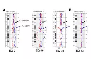
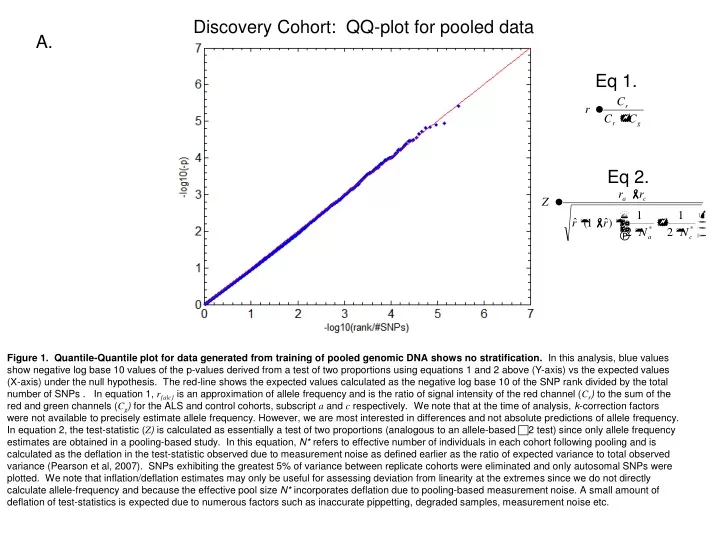
Discovery Cohort: QQ-plot for pooled data A. Eq 1. Eq 2. Figure 1. Quantile-Quantile plot for data generated from training of pooled genomic DNA shows no stratification. In this analysis, blue values show negative log base 10 values of the p-values derived from a test of two proportions using equations 1 and 2 above (Y-axis) vs the expected values (X-axis) under the null hypothesis. The red-line shows the expected values calculated as the negative log base 10 of the SNP rank divided by the total number of SNPs . In equation 1, r{a|c} is an approximation of allele frequency and is the ratio of signal intensity of the red channel (Cr) to the sum of the red and green channels (Cg) for the ALS and control cohorts, subscript a and c respectively. We note that at the time of analysis, k-correction factors were not available to precisely estimate allele frequency. However, we are most interested in differences and not absolute predictions of allele frequency. In equation 2, the test-statistic (Z) is calculated as essentially a test of two proportions (analogous to an allele-based 2 test) since only allele frequency estimates are obtained in a pooling-based study. In this equation, N* refers to effective number of individuals in each cohort following pooling and is calculated as the deflation in the test-statistic observed due to measurement noise as defined earlier as the ratio of expected variance to total observed variance (Pearson et al, 2007). SNPs exhibiting the greatest 5% of variance between replicate cohorts were eliminated and only autosomal SNPs were plotted. We note that inflation/deflation estimates may only be useful for assessing deviation from linearity at the extremes since we do not directly calculate allele-frequency and because the effective pool size N* incorporates deflation due to pooling-based measurement noise. A small amount of deflation of test-statistics is expected due to numerous factors such as inaccurate pippetting, degraded samples, measurement noise etc.
Replication Series 1: QQ-plot for Caucasian ALS vs. Caucasian control (2 test). B. Figure 2.Quantile-Quantile plot for replication series 1 shows expected deviation due to a priori selection of significant SNP from Discovery series. Blue dots show negative log base 10 of p-values calculated using an allele-based 2 test in Plink 0.99p of Caucasian ALS population vs. Caucasian controls for 348 SNPs selected from pooling-based genome-wide association data. The Y-axis are the observed values and the X-axis are the expected values under the null hypothesis. The red-line shows the expected values calculated as the negative log base 10 of the SNP rank divided by the total number of SNPs. As expected, we selected SNPs with imbalanced alleles from the pooling cohort and this difference is recapitulated in this first replication cohort.
Replication Series 1: QQ-plot for replication cohortmulti-ethnic ALS vs. Caucasian control (2 test). C. Figure 3.Quantile-Quantile plot for replication series 1 shows expected deviation due to a priori selection of significant SNPs from the Discovery series. Blue dots show negative log base 10 of p-values calculated using an allele-based 2 test in Plink 0.99p of multi-ethnic ALS population vs. Caucasian controls for 348 SNPs selected from pooling-based genome-wide association data. The Y-axis are the observed values and the X-axis are the expected values under the null hypothesis. The red-line shows the expected values calculated as the negative log base 10 of the SNP rank divided by the total number of SNPs. As expected, we selected SNPs with imbalanced alleles from the pooling cohort and this difference is recapitulated in this first replication series. While this data is stratified, it is possible that enhancement of signals at certain loci could truly be caused by increased power. We present this genotype data to the community for meta-analysis.
Replication Series 2: QQ-plot for Shymick et al datalocus-max p-value D. Figure 4.Quantile-Quantile plot for locus-max p-value for ALS data by Shymick et al shows deviation due to a priori selection of significant SNPs from Discovery series. Blue dots show negative log base 10 of locus max p-values. Locus-max p-values are lowest p-value observed within a 25kb window using an allele-based 2 test in Plink 0.99p. The Y-axis are the observed values and the X-axis are the expected values under the null hypothesis. The red-line shows the expected values calculated as the negative log base 10 of the SNP rank divided by the total number of SNPs. SNPs with a minor allele frequency (MAF) less than 5% were removed prior to plotting. As expected, we selected SNPs with imbalanced alleles from the pooling cohort and this difference is recapitulated in this second replication cohort.
Replication Series 2: QQ-plot for Shymick et al data(2 test) E. Figure 5.Quantile-Quantile plot for all original ALS data by Shymick et al (Single Marker statistics). Blue dots show negative log base 10 of p-values calculated using an allele-based 2 test in Plink 0.99p. The Y-axis are the observed values and the X-axis are the expected values under the null hypothesis. The red-line shows the expected values calculated as the negative log base 10 of the SNP rank divided by the total number of SNPs. SNPs with a minor allele frequency (MAF) less than 5% were removed prior to plotting. As determined by STRUSTURE there is no stratification in this case-control series.