Download
1 / 70
700 likes | 906 Views
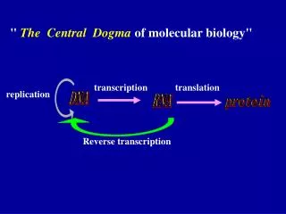
GeneExpression II: 1. Transcription Factor Binding Sites 2. Microarrays 26 th May, 2010 Karsten Hokamp Genetics Department. TFBS prediction - Overview. Introduction Methods Implementations Analyse 2kb upstream of eve. TFBS prediction - Introduction. TFBS = DNA motifs

E N D
GeneExpression II: 1. Transcription Factor Binding Sites 2. Microarrays 26th May, 2010 Karsten Hokamp Genetics Department BI2010
TFBS prediction - Overview • Introduction • Methods • Implementations • Analyse 2kb upstream of eve BI2010
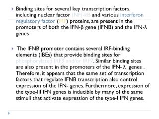
TFBS prediction - Introduction • TFBS = DNA motifs = 5 – 20 bp long = variable = multiple occurrences/sites per gene = combination of activators and repressors • cis-regulatory regions = clusters of TFBS -20kb – first intron BI2010
TFBS prediction - Introduction Example: MSE2 strip for eve (D. melanogaster): (Janssens et al., 2006) • understand transcriptional regulation • infer regulatory networks BI2010
TFBS prediction - Methods • De novo motif prediction (overrepresentation) • Searching for known motifs • Phylogenetic Footprinting/Shadowing • Clustering of TFBSs • Integration of external data sources (co-expression, structure) BI2010
TFBS prediction - Overview BI2010 Hannenhalli (2008, Bioinformatics)
De novo motif prediction • Search for over-represented motifs • Frequency count • Works well for yeast and prokaryotes • Not so successful in higher organisms BI2010
Using motif databases • Search for known motifs • Position specific scoring matrix (PSSM) or Position weight matrix (PWM) • Databases: • Transfac • Jasper BI2010
Phylogenetic-based methods • Search for islands of highly conserved regions • Footprinting: elements conserved across distant species • Shadowing: elements conserved between closely related species • Pros: increases specificity • Cons: conservation is not sufficient nor necessary BI2010
Practical: • Try some tools on 2kp upstream sequence of D. melanogaster eve and compare with published results. • Alibaba (de novo) • Match (Tranfac) • Meme (de novo) • Promo (Tranfac) • WeederH (phylogenetic footprinting) BI2010
Other tools: • Many more tools available for download: • Sombrero • FootPrinter • PhyloGibbs • Other Web-tools for groups of co-regulated genes: • RSAT • NestedMICA • WebMOTIFS BI2010
TFBS prediction - Conclusion: • No single tool gives accurate results • Combination of predictions from multiple tools might increase specificity • Incorporate additional information for greater precision BI2010
Microarrays - Overview • Introduction • Data Generation • Data Characteristics • Diagnostic Plots • Preprocessing • Statistical Analysis BI2010
What is a microarray? • A solid support onto which the sequences • from thousands of different genes are • immobilized • Different array supports • glass slide • nylon membrane • silicon chip • Different probe types • short oligonucleotides • long oligonucleotides • cDNA • Each probe measures the expression of a single transcript BI2010
Microarrays – How do they work? Affymetrix Arrays : single colour + uninfected cells infected cells RNA Reverse transcription Label with dye cDNA Hybridize Slide A Slide B BI2010
Microarrays – How do they work? Spotted Arrays : two colour Prepare Sample + Prepare Microarray uninfected cells infected cells Hybridize target to microarray BI2010
Microarray: Subgrids • One pin per subgrid (printTip group, stratus) BI2010
Microarrays – Data Extraction • How to get data from the slides into the computer? BI2010
PRMS02-001-S100 CF010 Data Extraction – Scanning Slide Images (TIFF) Scanner channel 1 (green) channel 2 (red) composite (green, yellow, red) settings: - laser power - sensitivity - focus BI2010
Data Extraction – Quantification Data File align grid, tag unreliable spots Software: -ImaGene -GenePix -ScanAlyze ... program assigns numbers representing intensity of spot foreground (FG) background (BG) BI2010
Quantification: Intensity Range • area composed of pixel • value range: 0 – 216 - 1 • value range: 0 – 65535 • saturation possible • low intensities = noise BI2010
Data Generation – Summary • RNA labelling and hybridization • Array Scanning • One image per channel • Load into quantification software • Flag flawed spots • Extract values • Text file with FG and BG intensities (per probe) BI2010
Microarrays – Sources of Variation Cy3 Cy3-cDNA Cy5 Cy5-cDNA systematic experimental error uneven hybridization gel print-tip variations background variations wavelength dependent intensity dependent image processing algorithm-dependent .tiff Image Files Raw Data File Sample1 mRNA Cy3 intensity RT RT cDNA array Sample2 mRNA Cy5 intensity source: www.tigr.org BI2010
Microarrays – Sources of Variation • Technical: • labelling • hybridization • slide quality • scanning • print-tip effect • quantification • experimenter • Biological: • individual/strain/sample • environment • time point BI2010
Microarrays – Data Characteristics • Intensities vs. ratios • Natural scale vs. log scale BI2010
Intensities vs. Ratios • Intensities: ratio = ch2 / ch1 BI2010
Intensities vs. Ratios • Ratios: ratio = ch2 / ch1 > 0 ratio = 1 if ch1 = ch2 BI2010
Intensities vs. Ratios • Ratios • convey expression changes • hide base level differences • But: absolute changes can be important, too! BI2010
ratio = 1 18000 Y CH2: Cy5 3000 3000 18000 X CH1: Cy3 Graphical Representation: Signal Scatter Plot BI2010
~ 10x Graphical Representation: Signal Scatter Plot CH2: Cy5 ratio = 1 CH1: Cy3 BI2010
Graphical Representation: Histogram Frequency ratios 1 Ratios BI2010
Raw vs. Log ratios x = 2y • Log transformation ratios x = basey 8 = 23 0.125 = 2-3 y undefined for x <= 0 BI2010
Log ratios: scatter plot log-ratio = 0 ratio = 1 CH2: Cy5 CH2: log2(Cy5) CH1: log2(Cy3) CH1: Cy3 BI2010
Log ratios: histogram Frequency ratios 1 Log-ratios Ratios BI2010
Microarrays – Data Characteristics • ratios vs. intensities • convey expression changes • hide base level differences • log ratios vs. raw ratios • reduce spread • provide symmetry BI2010
Diagnostic plots • histogram • scatter plot • box plot • MA plot • chip visualization BI2010
Diagnostic plots – Histogram good bad frequency log(CH1) log(CH2) BI2010
bad Diagnostic plots – Scatter plot o.k. BI2010
Diagnostic plots – MA plot • Rotate scatter plot by ~ 45 degree: BI2010
Diagnostic plots – MA plot • Rotate scatter plot by ~ 45 degree: BI2010
Minus Addition Diagnostic plots – MA plot • Mathematically: = log2(R) – log2(G) = 0.5 * ( log2(R) + log2(G) ) BI2010
M A Diagnostic plots – MA plot BI2010
2-fold cut-off BI2010
2-fold cut-off BI2010
2-fold cut-off BI2010
Dye Swap Unequal labeling efficiency Cy5 Cy3 Cy3-cDNA Cy3 Cy5 Cy5-cDNA Strong bias towards Cy3! M = log(R/G) A = ½ log(RG) BI2010
Dye Swap Cy5 vs Cy3 Cy3 vs Cy5 + + uninfected cells infected cells uninfected cells infected cells cDNA cDNA Merged Data set BI2010
Dye Swap A = ½ log(RG) Unequal labeling efficiency Cy3 M = log(R/G) Cy3-cDNA A = ½ log(RG) Cy5 Cy5-cDNA BI2010
Diagnostic plots – Box plot outliers whiskers [ 1.5 times inter-quartile range upper quartile [ Inter-quartile range median lower quartile BI2010
bad Diagnostic plots – Box plot o.k. BI2010