Download
1 / 31
310 likes | 312 Views
This lecture covers the fundamentals of regression, including correlation, model generation, and the dangers of extrapolation. It also explores linear regression and the development of precise models.

E N D
Learning Objectives By the end of this lecture, you should be able to: • Describe what is meant by regression. Be able to describe correlation and the relationship between the two. • Generate a regression model both by using a calculator to calculate b0 and b1, and by using statistical software such as SPSS. • Describe why extrapolation can lead to misleading conclusions. • Working with categorical variables – selecting the best tool for the job when comparing categories.
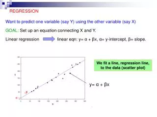
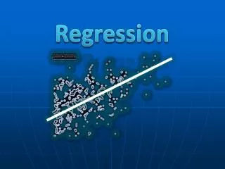
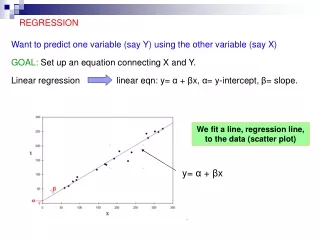
Linear Regression - Overview • Once we have convinced ourselves that a linear relationship does in fact exist between two variables, and that the relationship is causal (more on this later), we have a terrific tool for making predictions. • For example, we can predict the blood alcohol level based on the number of beers consumed, • We can predict by using the graph line itself, but it can be difficult to estimate exactly where on the axis a line falls. An even more useful way would be to take that line and turn it into a formula. This technique is called ‘regression’. • For example: Once we have a formula, we can simply plug in the value for number of beers and the formula would tells us the predicted BAC level.
Developing a more precise model • If you were asked for the blood alcohol level (BAC) for 2.5 beers, you would have to estimate both the location of 2.5 on the x-axis and the quantity of BAC on the y-axis. Your prediction would be imprecise. • Answer = 0.028 ???? • So the next step is to generate a formula from our line which will give us more precise predictions . This formula is what we refer to as our “model”: BAC = -0.013 + 0.018 * num_beers
Is regression the appropriate tool for the job? • Important Reminder: A key point of this course is to recognize when you can and can NOT use a statistical tool. • This is one of those times: It is VERY important that you recognize when a regression model is NOT an appropriate tool. • Before doing a regression analysis, the following must ALL be true: • The relationship is linear • ‘r’ is not too weak (I.e. is not too close to 0) • The relationship is ‘causal’ (VERY important – will discuss later…)
Summary on using correlation to build a model • The purpose of all of this (taking data, graphing it, and looking for correlation, generating a regression line) is to generate a model (a formula) that allows us to infer information about the population and/or to make predictions. • E.g.: If we give someone 6.5 beers, what do we think their BAC is likely to be? Steps: • Obtain data • e.g. Do a study where you take a group of people, record how many beers they drank, and then measure their BAC. • Graph that data on a scatterplot. • If you believe there is a correlation, draw a regression line (we’ll use software for this step). • From that regression line, generate the regression formula (a model)
The Regression Model When dealing with “simple linear regression” (the only regression model we will deal with in this course), the formula generated from the model will be in the form ‘y = mx + b’ that many of you probably encountered in high school. The only difference is that we will use more “statistically appropriate” letters and symbols. You will need to know these (sorry)! Different people use different symbols. Perhaps the most commonly seen are: • b0to refer to the intercept (what you probably called ‘b’). • b1to refer to the slope (what you probably called ‘m’).
The Regression Model • b0refers to the intercept. The intercept is where the regression line crosses the y-axis. • On this graph it is about -0.013 • b1to refer to the slope. The slope refers to the ‘angle’ of the line.
# Beers vs BAC – The regression model Let’s take the generic model and apply it to our # beers v.s. BAC study: BAC^ = b0 + b1 * # of beers The trick is to find out what the values for ‘b0’ and ‘b1’ are. The ^ symbol means “predicted”. We will discuss in more detail shortly.
How to calculate b0 and b1(Good news: It’s actually pretty easy!) First we calculate the slope of the line, b1: • r is the correlation coefficient • sy is the standard deviation of the response variable y • sx is the standard deviation of the explanatory variable x Once we know the slope (b1), we can easily calculate the y-intercept (b0): where x and y are the sample means of the x and y variables You WILL be asked to do these calculations. And I hope you agree the calculations themselves are quite easy. In addition, I will give you the formulas on a cheat-sheet during your exams. HOWEVER: The key, as always, is for you to recognize when they can (and can NOT!) be used.
Variable names FYI, not all calculators and software use the same variables! For example, some use: And some use: Just something to be aware of if / when you use different software or statistical calculators.
What’s up with the hat?? Gas Consumption^ = b0 + b1 * Heating The hat (^) is a symbol that tells us that this result is a predicted value as calculated using the regression line model, as opposed to a value that comes from the original data (observed data). For example, look at the (tiny) purple dot for x=24. This dot was one of our original datapoints that says that on a 24 degree day, the average gas consumption was about 6.4. So 6.4 is the observed result from our data. However, the regression model is somewhere around 5.6. Similarly, for x=26, y=5.3 but y^=6.0. Again, these are symbols I want you to be comfortable with.
^ ^ Nice Hat! Gas Consumption^ = b0 + b1 * Heating Suppose that for a heating value of 24, I look at the regression plot (not the model) and write: "Gas Consumption = 6.4“ (note the absence of a hat!) then I am saying that this particular value (6.4) came from some observed data. If, however, for a heating value of 24, I say: "Gas Consumption^ = 5.6" then I am saying that this particular result is predicted from a regression model. (I.e. As opposed to a value that was actually observed / noted at some point). In other words, the “hat” is our way of saying that the value that has just been reported is a prediction that has come from a statistical model.
Example using SPSS • Let’s use the software to generate a regression model for the beer blood alcohol level discussed earlier. • In SPSS, open beer_bac.sav (you can find this file from the datasets on the class webpage). • To generate the graph: Graph >> Legacy Dialogs >> Scatter Dot >> Simple Scatter. Click ‘Define’ • Remember to always place your explanatory variable (in this case the number of beers variable) on the x-axis and your response variable (in this case, the bac variable) on the y-axis. You can click on the variable and click the arrow to move it into the appropriate field. Click ‘OK’. • Also remember that it is very important that you do not confuse the explanatory vs response variables!
Example using SPSS cont. • A new window will open showing your scatterplot and some additional information. • Generate Regression line: use chart editor (double click on plot) choose the icon for ‘Add Fit Line’ , • You will see a ‘Properties’ window open up. Choose ‘Linear’. Then close the Properties window. • To calculate Parameters: SPSS will also calculate bo and b1 for you. • Close the ‘Chart Editor’ window and return to the output window. • Click: Analyze >> Regression >> Linear. • Recall: “Dependent” refers to the Response variable. "Independent" refers to the explanatory variable. (Recall that these terms are still sometimes used). Click ok. • Under ‘Coefficients’: the first value under the ‘B’ column is b0 (the intercept). The value below b0 is b1 (slope). • We will talk about the ‘model summary’ table later.
The graph generated by SPSS: Note the R2 value of 0.8 that SPSS provides with the graph. As you might expect, if you take the square root of this value, you will have your value for ‘r’. This gives us an r of about 0.89. From this we can say that we have a pretty strong, positive correlation between # of beers and BAC level.
SPSS’ Coefficients Table tells us b0 and b1 b0 (y-intercept) b1 (slope) Regression Model: BAC = -0.013 + 0.018 * num_beers ^ Pop Quiz: Is anything missing?..... Answer: “Don’t forget your hat!”
Example of Minitab output intercept slope R2
Example of Excel output r R2 intercept slope
Correlation and Regression It is important to be clear on the definition of each. I will probably have a question on your exam(s) that asks you to define correlation and regression. Or I may ask you to explain the difference between the two. The definitions are below: Correlation quantifies the strength and direction of a relationship between two (quantitative) variables. Regression describes the variation in the response variable (y) given change in the explanatory variable (x).
Correlation v.s. Regression restated • Correlation is a single number that quantifies the strength of the relationship. • It in no way helps you predict a specific value for ‘y’ give an ‘x’. • We use correlation to come up with a regression formula. • As we have discussed, this regression formula , which we call a model, allows us to do things like make predictions.
Making predictions The equation that we have derived using our regression formula allows us to predict y for a given value of x. Regression Model: BAC = -0.013 + 0.018 * num_beers What would you predict is the BAC level for someone who drinks 6.5 beers? Answer: Nobody in the study actually drank 6.5 beers. However, now that we have a model, by calculating BAC from our regression model for x = 6.5 we can predict a blood alcohol content of 0.104 mg/ml.
= - ˆ y 0 . 125 x 41 . 4 = - ˆ y 0 . 125 x 41 . 4 (in 1000’s) There is a positive linear relationship between the number of powerboats registered and the number of manatee deaths. From the regression line, we generate the equation: Thus if we were to limit the number of powerboat registrations to 500,000, what could we expect for the number of manatee deaths? Roughly 21 manatees.
!!! !!! Extrapolation Height in Inches Extrapolation is the use of a regression line for predictions outside the range of x values used to generate the line. This can be a very bad idea! You should always be extremely wary of extrapolation either in your own analyses, or when looking at “reports” that people give you. Height in Inches
Another example of extrapolation • In this example, there is a strong linear relationship between the time and the temperature. As the time progresses, the temperature keeps dropping. The extrapolation, of course, results from the fact that while the time observations IN THIS RANGE are linear, the graph does level off at a later point and then begins sloping upwards. So, you could do a regression analysis on this particular period, but you could not extrapolate the results to a date before 11/21 or beyond 1/23.
The y intercept FYI: Taken by itself, the y-intercept is often meaningless. In fact, it is sometimes not even a possible value. For example, the y-intercept in our beer / BAC model tells us that at 0 beers, we have a negative blood alcohol content, which makes no sense… y-intercept shows negative blood alcohol But the intercept isnecessary for determining the regression model. -0.013
Categorical variables in scatterplots In certain situations, even data that is purely quantitative should be separated into multiple categories. If we neglect to do, we risk drawing entirely false conclusions. Example: What may look like a positive linear relationship is in fact a series of unrelatedseparate associations. Plotting different habitats in different colors allows us to make that important distinction. Had we neglected to do so, we would have likely drawn the straight line (shown) and incorrectly concluded that there is a positive linear relationship.
Key Point • If one of your variables can be divided into categories, you should strongly consider plotting each datapoint using a different symbol or color depending on its category. • Statistical software will allow you to do this fairly easily. • Another option is simply to use a separate graph for each category. • If you do so, it is often more helpful to keep the two plots on the same chart if doing so allows you to observe differences between the categories.
Comparison of men and women racing records over time. Each group shows a very strong negative linear relationship that would not be apparent without the gender categorization. Relationship between lean body mass and metabolic rate in men and women. Both men and women follow the same positive linear trend, but women show a stronger association. As a group, males typically have larger values for both variables.
Categorical explanatory variables So far, we’ve drawn our scatterplots using quantitative variables (even when we broke them up into different categories). However, when the explanatory variable is categorical, a scatterplot might not be your best choice. Yet there are very effective ways of comparing compare different categories side by side. Level of Education (categorical) vs Income (quantitative response). Comparing 5 different categories on a single graph. Boxplots are a great choice for this kind of comparison.