Download
1 / 29
300 likes | 377 Views
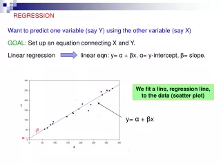
Regression. Normal Curve. Paranormal Curve. Correlation – again. Correlation provides an estimate of how well change in ‘ x ’ causes change in ‘ y ’. The relationship has a magnitude (the r value) and a direction (the sign on the r value).

E N D
Normal Curve Paranormal Curve
Correlation – again Correlation provides an estimate of how well change in ‘x’ causes change in ‘y’. The relationship has a magnitude (the r value) and a direction (the sign on the r value). The r value measures how close the untransformed data points are to a straight line. Therefore, the r value is a very important statistic for regression analysis because it tells you how accurate your predicted values will be. That is why we tested the correlation value.
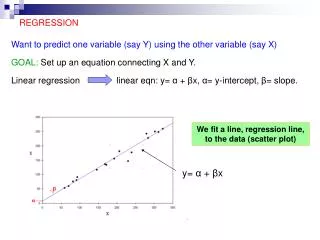
Regression Regression analysis is another method by which the relationship between dependent and independent variables can be estimated. Unlike correlation, which just tells you the strength and direction of a relationship, regression tells you much more about each point and its place in the relationship. Regression also tells you how you can use an ‘x’ value to predicta ‘y’ value using the mathematical expression of a trend line.
Trend Lines A trend line is a line drawn through a frequency distribution of paired values called a scatterplot. The scatterplot shows the overall pattern of the points around the trend line. The data values are the finest degree of resolution in your data. The trend line is the coarsest degree.
Trend Lines Trend lines can be straight and have their ‘straightness’ defined by their different angles: are they steep or shallow? Or trend lines can be curvilinear and have their ‘curviness’ defined by polynomial, logistic, or exponential (log) functions.
Types of Trend Lines Are the simplest linear expressions of the form: Also called exponential functions and defined by the exponent on y=xx Takes many variants of the form: Are labeled by their ‘degree’: Quadratic = 2 Cubic = 3 Quartic = 4 Quintic = 5
Linear Trend Lines The other aspect of trend lines, apart from their form, is whether they have one or more than one independent variable - are they bivariate or multivariate. We have seen only bivariate trend lines so far: that is, lines having a y and onex. For our discussion on regression we will stick with these bivariate linear trend lines.
How are linear trend lines created? First, the line always passes through the arithmetic meansof the x and the y variables. Second, the trend line is always as close as it can be to every data point. Third, the difference between each data point and the line is as small as it can be when all points are considered. This is done by minimising the sum of the squared differences. This is why the Pearson formulation is called the “least squares” method.
Data for the following example: 42 pairs of grades. Mean of x= 75.48 Mean of y= 69.76 n = 42 pairs
Means of the Regression Line The sum of the squared distances from each point to the line is as small as it can be when all points are considered. That is, the line cannot get any closer overallto the points. The regression line passes through the mean of y(75.48) and the mean of x(69.96) Mean of x Mean of y
Prediction - Regression A high school grade of 80% will predict a first year university grade of almost 75% But can we get a more accurate prediction that “almost”? Yes, using this linear equation.
Regression for Real Regression is a mathematical method which uses a linear equation by which one value (y) can be predicted by another value (x). Furthermore, the predicted value can be given ‘margins of error’ - that is, x will predict ywithin ±whatever units y is in. The accuracy of the predicted value of yand the size of the margins of error will depend on how well the data points match a straight line. AND THAT DEPENDS ON HOW HIGH YOUR r VALUE IS. It also depends on how many pairs of data points you have – your ‘n’.
Linear Regression – Equating the Line Where: is the predicted value of y for a given x b is the intercept value m is the slope of the line x1 is the given value in the x (independent) dataset from which you want to predict y. This is the formula that Excel uses. You sometimes also see: y = a + bx CALLED ‘WHY’ HAT
Prediction - Regression This is the linear regression equation used to predict the value in Excel, where =mx+b, with ‘m’ as the slope and ‘b’ as the intercept
Prediction Reprise - “Almost” Regression Using The Line A high school grade of 80% will predict a first year university grade of almost 75% But can we get a more accurate prediction that “almost”? Yes, using this linear equation.
Predicting an 80% Incoming HS Grade from the Linear Regression Equation = 1.0862x - 12.22 = 1.0862 * 80% - 12.22 = 74.7% This is our “almost” 75%.
Standard Error of the Estimate (SEE) of The predicted is not exact even if we have an exact x to start with because… There is likely more than one y for every x, and… The line is based on the correlation coefficient which was not a perfect 1.0 but an imperfect 0.617, and… Our ‘n’ is only 42 pairs and not everyone in the population from which the 42 pairs came.
These two students have the same HS grade but widely differing first year grades. This variability between the predicted grades and the actual grades is called the error of estimate and it can be calculated as a statistic called the standard error of estimate (SEE). If you plug 72.83 into the equation you get a predicted first year value of 66.89, which is not very close to actual grades. These two students have the same HS grade and very close first year grades. If you plug 70.17 into the equation you get a predicted first year value of 63.99, which is very close to actual grades.
These lines represent the idea of variability of the data points from the line. The SEE is the average of all the squared differences from the data points to the line.
Standard Error of Estimate of Note the squared differences of x ’s and y ’s from the mean of all x ’s and y ’s. Note the ‘2’. That’s because we have a pair of values and not just one value. And remember that n-1 is the sample n. Luckily we don’t have to calculate this by hand. Excel calculates it for you. The result is the ± value on in whatever values y was in (e.g. in this case, student CGPA in %). Again the SEE is similar to saying the standard deviation.
Standard Error of Estimate of Now look again, … … and compare it to this: Which you should all recognize as the standard deviation formula.
Interpreting the SEE The SEE for the data is 8.03%. The result is the ±value on in whatever values y was in (e.g. student GPA %). Again the SEE is similar to saying the standard deviation, so saying 1.96*SEE is the same as saying 1.96*s. Thus you can say that the population value of y will, with 95% certainty, fall between ± 1.96*SEE.
These lines represent the average variability of the data points from the line This average variability is calculated as the SEE and represents the average margin of error of any data point from the trend line
Predicting from the Linear Regression EquationPredicting the Value = 1.0862x - 12.22 = 1.0862 * 80% - 12.22 = 74.7%
Predicting from the Linear Regression EquationMargins of Error Predicted value = 74.7% Predicted margin (the SEE) = 1.96 * 8.03% Predicted margin = ±15.78% Range within which real value falls with 95% certainty 58.9% to 90.5% The large range of the margin is a function of the relatively modest ‘r ‘ value (.617) and the small ‘n ’ (42 pairs). How might you reduce these margins?
Reducing Margins of Error The bad news is that they likely cannot be reduced by very much, if at all. If your sample were to have caught only the red circled students, then your r would be small and hence your SEE high. But the larger the sample, the more likely you’ll approximate the distribution seen on the graph, but not much better. The good news is that theoretically they can be reduced by increasing the number of pairs or ‘n’. Remember what happens when you increase sample size using √n.
Sample versus population – n-1 versus N ∑ √(500/10)= √(500/(10-1))= 5.0% 0.4% 0.056% √(500/(100-1))= √(500/100)= √(500/(1000-1))= √(500/1000)= Note: 1. With n-1 the standard deviation is higher. 2. The larger the sample, the smaller the effect of n-1 N
Relationships Summary Relationships measure the effect of one variable (the independent or x) on another (the dependent or y). The direction and strength of the effect is given by the correlation coefficient(r) and its reliability by the SerandSer0 . The degree (in % terms) to which x causes change in y is given by the coefficient of determination (r2). Using line equations, regression allows us to use the relationship measured by correlation to forecast values of y for given values of x. Using the standard error (called SEE) allows us to put margins of error on the predicted values.