Download
1 / 12
120 likes | 213 Views
Welcome. Hello, This library file contains iPhone UI elements you’ll want to copy and paste into your MockApp Template file. Vector format: Most UI elements you’ll find here have been recreated in vector format so you can edit their text and even modify their shape, color, gradient, etc.

E N D
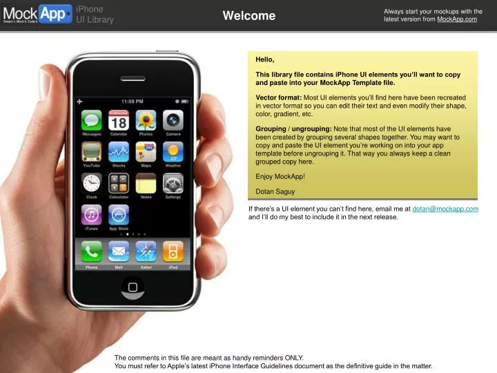
Welcome Hello, This library file contains iPhone UI elements you’ll want to copy and paste into your MockApp Template file. Vector format: Most UI elements you’ll find here have been recreated in vector format so you can edit their text and even modify their shape, color, gradient, etc. Grouping / ungrouping: Note that most of the UI elements have been created by grouping several shapes together. You may want to copy and paste the UI element you’re working on into your app template before ungrouping it. That way you always keep a clean grouped copy here. Enjoy MockApp! Dotan Saguy If there’s a UI element you can’t find here, email me at dotan@mockapp.com and I’ll do my best to include it in the next release. The comments in this file are meant as handy reminders ONLY. You must refer to Apple’s latest iPhone Interface Guidelines document as the definitive guide in the matter.
Carrier Carrier Carrier Network activity 10:32 AM 10:32 AM 10:32 AM Optional instructions for this pane 6 3G + Navigation bar Activity Indicator on grey background... Status bar Tab bar All Contacts Pane Label Pane Label 2 of 50 Groups Inbox (20) Back Button Button Activity indicator for nav bar Disabled Pane Label Cancel Save Search Music Videos Podcasts More Status Bar, Navigation Bar, etc. Status bar Navigation bar Appears at the very top of the screen. Shows important information about their device, including signal strength, the current network connection, and battery charge. You can hide the status bar in an full-screen app (i.e. a game), but be aware that users like seeing this important information. Very popular and useful UI element. Appears at the top of the screen immediately under the status bar. Usually displays the title of the current view and can contain buttons that either do things to the view (Save, etc.), and/or navigate (Back, etc.) Tab bar and badges Recommended for apps that present the same type of information in different views (think iPod app, phone app, etc). Appears at the very bottom of the screen. Gives users the ability to switch among different modes or views in an application. Should be present on all screens to allow the user to switch quickly between the modes/views. A collection of tab bar icons is located on the next slide Badges are superimposed to icons in the tab bar to inform the user of new items not yet acted upon in the corresponding tab 9 99 999 Page Indicator Activity Indicators An activity indicator should be displayed if the app will take more than a couple of seconds to perform the current task
Tab Bar Icon Library Youtube, App Store and Phone additional tab controller + icons (including “table view” black on white versions) More tab bar icons coming soon! iTunes store and iPod tab controllers + icons (including “table view” black on white versions) 6 Featured Favorites Most Recent More Search Top Rated Music Videos Podcasts More Top Rated More Featured Favorites Most Recent More Music Videos Podcasts Search My Videos Subscriptions Playlists Updates Categories iTunes U Downloads Ringtones Genres Artists Categories My Videos Subscriptions Playlists Updates iTunes U Downloads Ringtones Genres Artists Audiobooks Compilations Composers Albums Playlist Contacts Keypad Voicemail Audiobooks Compilations Composers Albums Playlists Contacts Keypad Voicemail Clock App tab bar controller. iDisk App tab bar controller. iDisk Recents Shared Files Public Folders World Clock Alarm Stopwatch Timer World Clock Alarm Stopwatch Timer iDisk Recents Shared Files Public Folders
MockApp 5 Progress Indicator 24 of 39 Cancel Cancel Type a company name or stock ID. Directions MockApp MockApp Toolbar Sample search text Browser bar Cancel Clear Search Primary Secondary Search Cancel Google mockapp.com/ Cancel http://mockapp.com/ Current Location Start: End: Toolbar, Browser Bar, Search Bar Search Bar Toolbar • When the user taps a search bar, a keyboard appears. • By default, a search bar displays the search (magnifier) icon on the left side. In addition, a search bar can display a few optional elements: • Placeholder text (for example, “Search”) • The Bookmarks button to provide a shortcut to previously bookmarked searches/items. • The Clear button to erase the contents of the search bar. • A descriptive title, called a prompt, that appears above the search bar (for example, “Directions”) Use a toolbar where the user can take various actions in the current context (for example browser screen, email reader screen). Appears at the very bottom of the screen. A toolbar should not be used to toggle among the different modes of an app; if you need to do this, use a tab bar instead. Keep in mind that the hit-region is recommended to be 44 x 44 pixels, so providing five or fewer toolbar icons is preferable. Browser bar Google
2 Toolbar Icons and other icons (vector) Page Delete locked Previous Need to re-color an icon? Most of these icons have been created by grouping several shapes together so you may have trouble coloring them. If so try this: 1) Copy the icon to your MockApp template file 2) Ungroup the icon into all of its parts 3) Color each part (color the fill or the stroke depending on the case). 4) Regroup the shapes that form the icons so you can move it around Add Delete unlocked Next Bookmark Grab and move Previous disabled Low volume Next disabled High volume Back Detail Disclosure Forward Back Disabled Add contact Forward disabled Bookmarks Fast forward Street view Move backward Unread Pause Info Reply Camera Refresh Search Action Erase Route Stop Organize Single digit badge 9 Trash 99 Double digit badge Compose 999 Triple digit badge Any toolbar icons missing? email me at dotan@mockapp,com and I will add them in the next version.
Cancel Cancel Action sheet Delete OK Select All MockApp Select Paste Record 0:00 0:28 Primary action Delete Play you can also do this or maybe this or why not that Action sheets, Bubbles Action sheets An action sheet the user a set of choices for a task he/she just selected. It appears at the bottom of the screen by sliding upwards and over the current view. Action sheets can be used either to provide a selection of ways a task can be completed or to get confirmation before completing a potentially destructive task (i.e. delete or cancel). The most important or common action should appear as the top button. If the action is destructive (i.e. Delete), a red button might be called for. Bubbles I’m hoping this one will help put MockApp on the map ;-)
From: Twitter Hide Alert Cancel OK Dotan Sent from iPhone Main Message Optional explanation of what a user needs to do Confirmation Message Optional explanation of what the system is asking Confirmation Message Optional explanation of what the system is asking Please enter your password john@doe.com To: Dotan Saguy Password Everybody is now following you on Twitter! Primary Button Secondary Primary April 1, 2035 1:33 PM Mark Unread Primary Alerts, Text Views, Web Views Alerts Text Views Alerts should be used ONLY for situations that require immediate user attention, typically from processes running in the background. Alerts pops up in the middle of the screen and contrarily to action sheets, alerts are not necessarily due to the user’s most recent action. To help guide inattentive users towards a safe choice, make the light-colored, right-hand button the default choice (for example, Cancel). A text view is a region of the screen with multiple lines of text. It supports scrolling when the content is too large to fit inside its bounds. Text views can be used to display text and/or enable the user to edit that text (in which case a keyboard appears). Web / Email Views A web view is a region of the screen that can display rich, HTML content (including navigation) inside your app. For example, Mail uses a web view to display message content:
, + - _ . . _ - + * | 5 0 8 2 6 4 3 9 1 7 % W M O Q G H N D C U K R B A Y P X S E Z V T ^ L F 1 ? 9 8 7 J 3 4 2 0 6 5 / { } I ` $ = & ~ # ! ~ $ ! = & # @ @ @ ABC ABC #+= #+= #+= ABC return return return . . . space space space WXYZ PQRS MNO ABC TUV JKL DEF GHI + Keyboards Keyboards Keyboards slide in from the bottom when an edit mode is activated. These are all in vector format in case you need to change the letters.
29 G N Delete it highlights Unread This is a regular table view A B C D E F G H I J K L M N O P Q R S T U V W A B C D E F G H I J K L M N O P Q R S T U This is a regular table Pete Gardener First Last name With icons like in view mobile M Tess Grady The “more” tab Item to delete or move Divided into sections M.J. Grey (the letters are the sections) of the iPod app Ready to be deleted Each row is an item Jenn Guggenheim Podcasts of the list Not pressed yet Current status H and can contain several When pressed Sara Hashimoto data elements (image, text, etc.) O Em Hirsch Regular Table Views Regular Table Views Regular table views (as opposed to grouped table views - next slide) are most useful to display long lists of items such as messages, contacts, etc. which users must easily scroll. Each row is an item. The lists can be divided into sections (i.e. alphabetical) separated by grey headers as below. Hierarchical items let the user “drill down” and are indicated by a ‘>’ icon to the right of the item.
ON ON OFF Tab Three Tab One Tab Two Tab Two Tab Two Tab Three Tab Three Tab One Tab One Grouped Table Views Grouped Table Views Grouped tables views list items by group on striped “pajama” background. This view is handy for lists of settings. Hierarchical items let the user “drill down” and are indicated by a ‘>’ icon to the right of the item. Mike Avatar (111) 222-3333 home This group has 3 items (111) 222-3333 mobile This item has been selected (111) 222-3333 work Items highlight briefly when hit (111) 222-3333 whatever This group has only 1 item Text Message Share Contact You can insert headers too You can even insert instructions like these as well if they’re helpful in this context. This one lets you drill down This one shows Current status Silent Segmented controls This item is turned Ring This item is turned
0 hours 1 2 7 8 9 10 11 28 29 30 mins 31 32 Sat Oct 3 Sun Oct 4 Today Tue Oct 6 Wed Oct 7 First & default value Second value Third value 45 46 47 48 49 7 8 9 10 11 03 04 05 06 07 50 55 00 05 10 2007 2008 2009 2010 2011 August September October November December AM PM AM PM Date, Time and other Pickers Date and Time Pickers Value Picker Analogous to “pull-downs” frequently used on websites and desktop applications.
touch and hold 2x tap 2x tap swipe close pinch drag tap pinch open Finger Motions and Backgrounds Animated iPhone Gestures Hit presentation mode to see the animations. Top press or select a control or item (like a single mouse click) In a table-view row, to reveal the delete button Top scroll or pan To zoom-in/out and center a block of content or an image. In editable text, to display a magnified view (moving cursor + copy/paste functions) To zoom-in To zoom out No fingers were harmed in the making of these graphics.