Download
1 / 20
200 likes | 281 Views
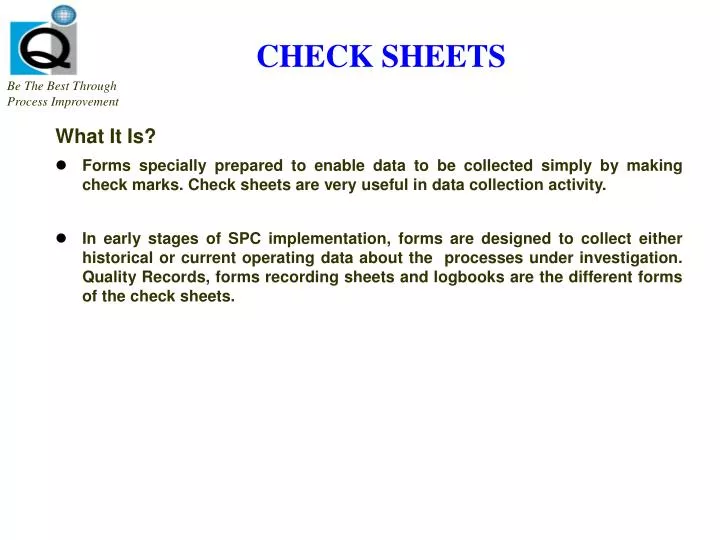
CHECK SHEETS. Be The Best Through Process Improvement. What It Is? Forms specially prepared to enable data to be collected simply by making check marks. Check sheets are very useful in data collection activity.

E N D
CHECK SHEETS Be The BestThrough ProcessImprovement What It Is? • Forms specially prepared to enable data to be collected simply by making check marks. Check sheets are very useful in data collection activity. • In early stages of SPC implementation, forms are designed to collect either historical or current operating data about the processes under investigation. Quality Records, forms recording sheets and logbooks are the different forms of the check sheets.
CHECK SHEETS Be The BestThrough ProcessImprovement Procedure 1 Identify the purpose of selecting data. 2 Select the data required for the purpose. 3 Determine how data will be further analyzed or processed. 4 Develop a form suitable to the requirements. 5 Include a header in the form to include basic information about the product lot, inspector, dates, operation etc. 6 Use the form initially for trial run. 7 Review and revise the form, if necessary.
RECORDING DATA Check sheet Example Be The BestThrough ProcessImprovement Travel Expense Report Errors CAUSE COUNT TOTALS Missing Receipts 3 /// Calculation Error 6 //// / Wrong Information 22 //// //// //// //// // No Signature 11 //// //// / Late Report 7 //// // Other 1 / 50 TOTAL ERRORS
HISTOGRAM Be The BestThrough ProcessImprovement What It Is? • To display the variation and capability of a process. • It is vertical bar chart of frequency distribution. It depicts two things, center and amount of variation in the sample of data. • When the frequency distribution is of continuous nature, it is advisable to construct histogram by using a frequency table. It is multiple bar diagram ( bar linked with each other) • The histogram presents a visual display if the data in which one may see three properties. A) Shape of Histogram B) Location, or average or centering of Histogram C) Scatter or spread or width of Histogram
HISTOGRAM Be The BestThrough ProcessImprovement Procedure • Collect the data values. • Determine the range (R) of the data by subtracting the smallest data value from the largest. • Determine the number of intervals (bars) in your histogram (often between 6 and 12 and divide the range (R) by the number of intervals. • Mark the horizontal axis with the scale of the data values. • Mark the vertical axis with the frequency scale (number or percent of observations). • Draw the height of each interval equal to the number of data values that fall within that interval. • Vertically draw the specification limits and mark them with Su (Upper limit) and SL (Lower limit).
HISTOGRAM Be The BestThrough ProcessImprovement Formula 1. X = X1 + X2 + X3 + ….. Xn N 2. S = (X – X n)2 n - 1 Central Process one value is zero 3. Cp = Su - SL 6s Process range 4. Cpk = Su - X or X - SL 3s 3s Whichever is lowest out of the two.
PARETO CHART Be The BestThrough ProcessImprovement What It Is? • The Pareto chart is simply a frequency distribution (or histogram) of attribute data arranged by category. • The cumulative curve is called the Pareto Chart or Pareto Curve. • The Pareto analysis consists of identifying quality costs by category, or by product or by type of defect or nonconformity. The name Pareto chart is derived from Italian economist Vilfredo Pareto (1848-1923), who theorized that in certain economies the majority of the wealth was held by a disproportionately small segment of the population. Quality engineers have observed that defects usually follow a similar Pareto distribution. • To graphically represent quality problems or their associated cost in order of their significance. • It is a method of identifying the vital few.
PARETO CHARTS Be The BestThrough ProcessImprovement • Procedure • Select the item to be analyzed. • Select the unit of measurement for analysis, such as number of occurrences or cost. • Select the time period for the data to be analyzed. • Arrange the data in descending ( ) order. • Construct two vertical axes, one at each end of the horizontal axes. • The left scale should be calibrated in the unit of measurement, and its height must be equal to the sum of the magnitude of all items. • The right scale must have the same height and is calibrated from 0-100.
PARETO CHARTS Be The BestThrough ProcessImprovement • Procedure • Plot bar graphs representing the magnitude of each item in descending order. • Construct a cumulative frequency line by summing the magnitudes of each item from left to right. • Analyze the chart and make comparative analysis of the same quality characteristic with other time periods and identify items for improvement.
SCATTER DIAGRAM Be The BestThrough ProcessImprovement What It Is? • It shows the relationship between paired data and can provide more useful information about the production process. • It is useful tool for identifying a potential relationship between two variables. Data are collected in pairs: the two variables. The shape of scatter diagram often indicates what type of relationship may be occurring between two variables. Keep in mind, the correlation does not necessarily imply causality. Typical Applications • It is used to study and evaluate the effect of one characteristic on the other like moisture content and elongation of fiber, Bulk and board stiffness, Thickness and board stiffness, Bulk and board density.
SCATTER DIAGRAM Be The BestThrough ProcessImprovement Procedure • Collect the pair data of two associated characteristics believed to be related. • Label x and y axes with their measurement units. • Find max and min values of (x, y) • Decide scale on both horizontal and vertical axes, approximately equal. (3 to 10 graduations) with the scale of the data values. The variable that is being investigated on the x-axis and the “ effect” variable on the y-axis. • Plot the data on paper. Encircle the concentric ( repeat ) points. • Examine the shape of the cloud of points to discover the types of correlation of strengths from the slopes. . • Enter necessary items.
CAUSE AND EFFECT DIAGRAM Be The BestThrough ProcessImprovement What It Is? • Once a defect, error or problem has been isolated for further study, Fishbone diagram as a formal tool must be used in un-layering potential causes. • The construction of Cause & Effect Diagram as a team experiences teams to get people involved in attacking a problem rather than in affixing blame. • If is used to illustrate the various sources of non-conformities in products & their inter relationships. • It is the diagram which shows the relationship between a quality characteristic and factors. (JIS). We can call it a CE-Diagram, or Tree Diagram or River Diagram or Ishikawa Diagram or Fishbone Diagram or Cause and Effect Diagram. • A graphical tool to find out the reasons for problems and to carry out their root cause analysis.
CAUSE & EFFECT ANALYSIS Characteristics Be The BestThrough ProcessImprovement • A graphical representation of cause and effect relationships. “Fishbone Diagram” Major Cause Categories Cause Cause Cause Cause Cause Cause CAUSES EFFECT Cause Cause Brainstormed List Effect Statement Cause Cause Cause Cause Major Cause Categories • Identification of the most probable cause (s) leads to development of theory for solution.
CAUSE AND EFFECT DIAGRAM Be The BestThrough ProcessImprovement Procedure 1 Determine quality characteristic and write it on the right-hand side of a sheet of paper. 2 Find as many causes/factors which are considered to affect the quality characteristic and write primary causes as big bones enclosed by squares. 3 Write the causes (secondary causes) which affect the big bones (primary causes) as medium-sized bones and write the causes (tertiary causes) which affect the medium sized bone as small bones. Go for brain storming sessions. 4 Assign an importance to each factor, and mark particularly important factors which seem to have a significant effect on quality characteristic. 5 Record any necessary information. Use this diagram as a checklist of probable causes of any problems and take corrective action accordingly.
FISHBONE DIAGRAM Be The BestThrough ProcessImprovement METHOD MACHINE PRESSURE SETTING WATER ROLLER PROBLEM INK FORM ROLLERSETTING GAUGE PROBLEM INK ON NON-IMAGE AREA MEASUREMENT ` PLATE PROBLEM IN-EXPERIENCEDPERSONS NEGLIGENCE INK PROBLEM FOUNTAIN SOLUTION MATERIAL MAN
CONTROL CHARTS Be The BestThrough ProcessImprovement What It Is? • To display variation by a line graph in a time-ordered fashion. A centerline an control limits (based on + 3 standard deviations.) are placed on the graph to help analyze the patterns in the data. • Control Chart is a tool to monitor and control process variation on an on-going basis. • A graph or chart with limit lines is known as a control chart and the lines are called control limits. • Control Chart is composed of sub-groups. • Control Chart shows relationship between changes in production process and movements of points.
CONTROL CHARTS Be The BestThrough ProcessImprovement Rational Subgroups A fundamental idea in the use of control chart is the collection of sample data according to what Shewhart called the rational subgroup concept. Subgroups or samples should be selected so that if assignable causes are present, the chance for differences between subgroups will be maximized, while the chance for differences due to theses assignable causes within subgroups will be minimized. The points on CC represents arbitrary divisions in the manufacturing process, the data broken into theses divisions are referred to as sub-groups. X chart minimizes the chance of variability due to assignable causes within a sample and maximizes the chance of variability between samples if assignable causes are present. Control Chart can be used to determine the stability of common-cause variation in the process (in-control). Control Chart also enables you to determine if the process output meets the requirements (capability).
CONTROL CHARTS Be The BestThrough ProcessImprovement Types A. For Variable Data • x - R Chart _ is used where high volume production occurs, sample size 3 - 5 units, diameter of shaft in a machine shop. It is used for controlling and analyzing a process. X represents the average value of a subgroup whereas R represents the range of the sub-group. X-R Chart shows relationship between changes in production process and the change (movement of points) on control chart. • Individual x - Moving Range Chart _ is used for shot run applications where sample size of one is only available, frequency of electricity in power plants measured every moment (say half an hour), viscosity of ink in printing press where one sample is taken after every half an hour. B. For Attribute Data • p - Chart_ (fraction defective) is used for monitoring defective products, when ratio of defectives is monitored and lot size is not constant, e.g. daily defective pens in pen manufacturing plant.
CONTROL CHARTS Be The BestThrough ProcessImprovement Types • np Chart _ (number of defectives) is used for monitoring defectives products when defectives are monitored in a constant sample size, e.g. defective pens per carton of 1000 pens. It shows number of defectives when a subgroup size is constant. • c Chart _ is used for counting defects on a unit product, e.g. number of scratches on a car, number of pin holes in a specified area, etc. It is used when number of defects which appear in a fixed unit. • u Chart _ is used for counting defects on a lot of product differing in size, i.e. sample size is not constant, e.g. daily defects ratio of varying production, number of printing defects per printing job. Or it is used in dealing with number of defects when material inspected is not constant.
REFERENCE GUIDE TO CONTROL CHARTS Be The BestThrough ProcessImprovement A. FOR VARIABLE DATA CHART CONTROL LIMITS CONTROL LIMITS SAMPLE SIZE (For x) (For Range) __ = High Volume Production Samples per Plot = 3 - 5 CL = x UCL = x + A2 R LCL = x - A2 R CL = R UCL = D1 R LCL = D3 R __ __ __ = x-R __ __ = __ __ __ Individual x- Moving Range CL = x UCL = x +(2.66 x MR) LCL = x - (2.66 x MR) CL = MR = MR/n UCL = 3.27 X MR LCL = NONE __ Short Run Production Sample per plot = 1 __ __ __ B. FOR ATTRIBUTE DATA CHART CONTROL LIMITS SAMPLE SIZE TO MONITOR __ __ CL = Total defectives = p Total Inspected UCL = p + 3 p ( 1 - p ) n LCL = p - 3 p ( 1 - p ) n Varying Defective Products p _ _ _ _ _ _ _ _ CL = pn UCL = pn +3 pn ( 1 - p ) LCL = pn -3 pn ( 1 - p ) Constant Defective Products pn _ _ _ _ _ _ _ _ CL = c = A defects Number of Units UCL = c + 3 c LCL = c - 3 c One Defects c _ _ _ _ _ _ CL = u = Number of defects Number of Units UCL = u + 3 u / n LCL = u - 3 u / n Varying Defects u _ _ _ _